
Entry
Reader's guide
Entries A-Z
Subject index
Adaptive and Responsive Websites
Adaptive and responsive websites represent a recent trend within Web design toward layouts that adapt to the device they are displayed on, allowing the same webpage to be loaded on, for example, a smartphone and a laptop yet to be displayed in very different ways. This way the same website can be optimized to the unique context of the device it is being displayed on, allowing the website to “fit” a wide range of devices; an increasingly relevant proposition in a world with an ever-increasing amount of Internet-capable devices (smartphones, tablets, laptop and desktop computers, televisions, etc.), that not only represent a challenge in terms of handling a wide range of screen sizes, but also different user input controls (touch devices, mouse and keyboard, remote control, etc.) and different usage contexts (e.g., desktop computer in an office while working, smartphone while shopping in the grocery store, and tablet when relaxing on the living room couch). Freeing the online educational information from being accessible only on specific devices is not just a central part of making educational technology omnipresent for the average consumer, it is also a prerequisite for making it accessible to demographics who can only afford the smaller low-cost devices, such as a tablet or smartphone.
Multiple Devices, One Website
The main idea behind adaptive and responsive websites is to have the same website be optimized for a wide range of contexts, with the context typically being the device’s screen size. This way only a single website has to be developed and maintained, and only the layout and styles of the website are changed to support a wide number of devices. This stands in contrast to the strategy of developing separate desktop and mobile sites, where two or more completely separate front ends are built for the website to provide distinct experiences to, for example, smartphone users and laptop users. Adaptive and responsive site proponents argue that having a single website where the layout adapts is easier to maintain, as a feature will only have to be implemented once to work on all devices.
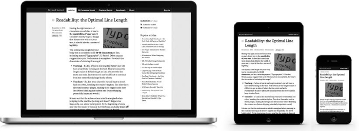
Figure 1 provides an example of a responsive website where the same website changes layout to fit the device it is being displayed on. On a laptop, the site has plenty of screen real estate and includes a sidebar with popular articles and generous article padding. On a tablet, the layout has changed and the sidebar has been pushed below the article (out of sight) and page margins have been decreased significantly. On a smartphone, font size is decreased and text no longer wraps around the image.
Figure 1 Sample website displayed at three different devices
Multiple Definitions
There are many definitions of adaptive and responsive websites; some of them are even conflicting. The two most prevalent definitions seem to be that adaptive websites will adapt to a fixed set of states at various breakpoints in the context (i.e., screen size), whereas responsive websites will continually respond to changes in the context and therefore change the layout fluidly to even the smallest of changes in context. However, there are many other definitions. For example, Jeffrey Zeldman argues that the goal is device agnosticism and that we should therefore not limit the definition of responsive design to technical concepts; because of this, he includes fixed breakpoints in his definition of responsive design (making the notion of “adaptive design” obsolete or interchangeable). Meanwhile, Aaron Gustafson argues that responsive design is actually a subset of adaptive design, as responsive design refers to fluid grids and media queries while adaptive design is a broader conceptual definition of interfaces that adapt both form and function to the user’s capabilities (a category under which responsive design falls).
...
- Adaptive Learning Systems
- Adaptive and Responsive Websites
- Adaptive Learning Software and Platforms
- Avatars and Agents in Virtual Systems
- Cloud-Based Adaptive Systems
- Data Mining and Recommendation Engines
- Design and Creation of Adaptive Educational Systems
- Dynamic Student Profiles
- Intelligent Tutoring Systems
- Learners and Instructional Control in Adaptive Systems
- Learning Analytics
- Learning Analytics for Programming Competencies
- Learning Analytics for Writing Competencies
- Personalized Learning and Instruction
- Student Modeling
- System and Learner Control in Adaptive Systems
- Technologies That Learn and Adapt to Users
- Adult Education and Workforce Development
- Diffusion of New Technologies in the Workplace
- Distance Learning for Degree Completion for Working Adults
- Distance Learning for Professional Development
- Education in Workplace Settings
- Information and Communication Technologies: Competencies in the 21st Century Workforce
- Information and Communication Technologies: Knowledge Management
- Information and Communication Technologies: Organizational Learning
- Learning in the Defense Sector With Simulated Systems
- Learning in the Health Sector With Simulated Systems
- Learning in the Manufacturing Sector With Simulated Systems
- Learning in the Marketing Sector With Simulated Systems
- Technology and Information Literacy
- Training Using Virtual Worlds
- Wearable Learning Environments
- Web 2.0/3.0 in the Workplace
- Agent Technologies
- Analysis of Educational Needs and Requirements
- Causal Influence Diagrams
- Cognitive Task Analysis
- Competency Models and Frameworks
- Critical Decision Method
- Knowledge and Skill Hierarchies
- Knowledge Elicitation
- Learning Analytics
- Learning Analytics for Programming Competencies
- Learning Analytics for Writing Competencies
- Skill Decomposition
- Structural Learning Theory
- Think Aloud Protocol Analysis
- Workflow Analysis
- Communication Technologies
- Asynchronous Tools and Technologies
- Blogs as a Communication Tool
- Collaborative Communication Tools and Technologies
- Cybersecurity
- Data Streaming
- Digital Identity
- Message Design for Digital Media
- Multimedia and Image Design
- Social Networking
- Socially Constructed Virtual Artifacts
- Synchronous Tools and Technologies
- Wikis as a Collaboration Tool
- Digital Literacy
- Assessing Literacy Skills in the 21st Century
- Digital Literacy and Adult Learners
- Digital Literacy and Critical Thinking
- Digital Literacy in Elementary and Secondary Education
- Digital Literacy in Higher Education
- Digital Literacy: Overview and Definition
- Information, Technology, and Media Literacies
- Measuring and Assessing Literacy Skills
- Media Literacies
- Methods for Teaching Digital Literacy Skills
- Technology and Information Literacy
- Twenty-First Century Technology Skills
- Verification and Validation of Digital Resources
- Visual Literacy Skills in Science, Technology, Engineering, and Mathematics Education
- Educational Technology Research
- Activity Theory
- Benefit-Cost Analysis
- Case Study Research in Educational Technology
- Cost Analysis in Assessments of Educational Technology
- Design and Development Research
- Design-Based Research
- Evaluation Research
- Experimental Research and Educational Technology
- Four-Component Instructional Design (4C/ID)
- Instructional Design Research
- Qualitative Research Tools for Educational Technology Research
- Research in Schools
- Emerging Tools and Technologies
- Evaluation, Assessment, and Testing
- Adaptive Testing
- Assessment of Attitudes and Predispositions
- Assessment of Problem Solving and Higher Order Thinking
- Automated Scoring of Essays
- Certification of Instructional Designers in Educational Technology
- Certification of Teachers in Educational Technology
- Criterion-Referenced Assessments
- Educational Data Mining
- Evaluation of Educational Technology Competencies
- Formative Assessment
- Item Response Theory
- Knowledge and Skill-Based Digital Badges
- Measuring and Assessing TPACK (Technological Pedagogical Content Knowledge)
- Natural Language Processing in Learning Environments
- Norm-Based Assessments
- Objectives-Based Assessments
- Performance Assessment
- Program Evaluation
- Stealth Assessment
- Summative Assessment
- Feedback and Measurement Tools and Technologies
- Data Sensing and Visualization Systems
- Diagnostic Feedback in Formal Educational Settings
- Diagnostic Feedback in Informal Educational Settings
- E-Portfolio Technologies
- E-Portfolios in Higher Education
- E-Portfolios in K–12 Education
- Learning Analytics
- Learning Analytics for Programming Competencies
- Learning Analytics for Writing Competencies
- Recommendation Engines
- Reflection and Preflection Prompts and Scaffolding
- Repair Theory
- Student Response Systems
- Game-Based Learning
- Alignment of Games and Learning Goals
- Assessment in Game-Based Learning
- Games and Transformational Play
- Games for Adult Learners
- Games in Business and Industry Settings
- Games in Elementary and Middle School Settings
- Games in High School Settings
- Games in Higher Education
- Games in Medical Training
- Games in Military Training
- Games to Promote Inquiry Learning
- Games: Impact on Interest and Motivation
- Games: Impact on Learning
- Gamification
- Management Flight Simulators
- Serious Games
- Video Games and Student Assessment
- History of Educational Technology
- Informal Learning
- Design of Engaging Informal Learning Places and Spaces
- Informal Learning Strategies
- Information and Communication Technologies for Informal Learning
- Integrating Informal Learning with Programs at the College/University Level
- Integrating Informal Learning with School Programs at the Secondary Level
- Learning in Museums
- Learning in Outdoor Settings
- Measuring Learning in Informal Contexts
- Seamless Learning
- Ubiquitous Learning
- Virtual Tours
- Information Tools and Technologies
- Cloud Computing
- Cloud-Based Adaptive Systems
- Collaborative Communication Tools and Technologies
- E-Book Standards
- Geographic Information Systems and Education
- Information and Communication Technologies for Formal Learning
- Information and Communication Technologies for Informal Learning
- Information and Communication Technologies in Developed Countries
- Information and Communication Technologies in Developing Countries
- Information and Communication Technologies in Multinational and Multicultural Contexts
- Information and Communication Technologies: Competencies in the 21st Century Workforce
- Information and Communication Technologies: Knowledge Management
- Information and Communication Technologies: Organizational Learning
- Mobile Tools and Technologies for Learning and Instruction
- Planning for Technology Upgrades and Improvements
- Podcasting for Learning and Information Sharing
- Radio Frequency Identification in Education
- Repositories for Learning and Instructional Apps
- Infrastructure Development
- Instructional Design
- Cognitive Apprenticeship
- Cognitive Flexibility Theory
- Cognitive Load Theory
- Component Display Theory
- Conditions of Learning: Gagné’s Nine Events of Instruction
- Curricula for Advanced Learning Technologies
- Four Component Instructional Design (4C/ID)
- Instructional Design Models
- Instructional Design Practice
- Instructional Design Research
- Instructional Designer Preparation
- Multimedia and Image Design
- Self-Regulated E-Learning Design Principles
- Technology-Facilitated Experiential Learning
- Instructional and Learning Strategies
- Anchored Instruction
- Case-Based Reasoning and Educational Technology
- Conditions of Learning
- Cultural Considerations in Technology-Enhanced Learning and Instruction
- Distributed Cognitions in Computer-Supported Collaborative Learning
- Elaboration Theory
- Embodied Learning Systems
- Engaged Learning
- Informal Learning Strategies
- Instructional Transaction Theory
- Mindtools
- Model-Based Approaches
- Multimedia and Image Design
- Problem- and Task-Centered Approaches
- Technology Support for Conceptual Change
- Technology-Enhanced Inquiry Learning
- Technology-Facilitated Experiential Learning
- Interactive and Immersive Multimedia
- 3D Immersive Environments
- Biofeedback Learning Environments
- Haptic Technologies to Support Learning
- Head-Mounted Displays in Learning and Instruction
- Holographic Imaging in Learning and Instruction
- New Visual World and Future Competencies
- Simulation-Based Learning
- Training Using Virtual Worlds
- Transmedia in Education
- Virtual Worlds
- Internet and Information Resources
- Cloud Computing
- Cloud-Based Adaptive Systems
- Creative Commons
- Desktop and Virtual Publishing
- Digital Archives
- Digital Curation
- Digital Storytelling
- Intellectual Property
- Internet of Things
- Internet: Impact and Potential for Learning and Instruction
- Metatagging of Learning Objects and Apps
- Online Mentoring
- Web Analytics
- Journals
- Mobile Technologies
- 3G and 4G Networks
- Apps for Use at the Elementary Level
- Apps for Use at the Secondary Level
- Apps for Use in Higher Education
- Integrated and Networked Mobile Devices for Learning and Instruction
- Learning and Instructional Apps
- Mobile Assistive Technologies
- Mobile Devices: Impact on Learning and Instruction
- Mobile Tools and Technologies for Learning and Instruction
- Radio Frequency Identification in Education
- Remote Sensing Technologies
- Tablet Devices in Education and Training
- Touch-Based and Gesture-Based Devices
- Wearable Learning Environments
- Open Access Resources
- Performance Technologies
- Psychological and Social Issues and Perspectives
- Accelerated Learning
- Affective Factors in Learning, Instruction, and Technology
- ARCS Model
- Behavioral Factors in Learning, Instruction, and Technology
- Cognition and Human Learning
- Cognitive Load Theory
- Constructivist Theory
- Cyberbullying
- Digital Divide
- Dual Coding Theory
- Educational Technology, Philosophical Perspectives on
- Experiential Learning
- Human-Computer Interaction
- Intersubjectivity and Educational Technology
- Motivation, Emotion Control, and Volition
- Neuroscience and Learning
- Situated Learning
- Vulnerability in Learning
- Simulation and Modeling Technologies
- Social Media
- Second Self
- Collaboration and Social Networking
- Integrating Social Media Into Learning and Instruction
- Measuring Contacts and Interactions in Social Networks
- New Visual World and Future Competencies
- Semantic Web
- Social Media and Networking
- Social Media in Elementary School Settings
- Social Media in Higher Education
- Social Media in Secondary School Settings
- Social Media in the Workplace
- Social Media, Identity in
- Social Network Analysis
- Social Networking
- Web 2.0 and Beyond
- Special Education
- Assistive Technology
- Assistive Technology for Persons With Autism Spectrum Disorder
- Gesture-Based Learning and Instructional Systems
- Technologies for Persons With Dyslexia
- Technologies for Persons With Hearing Impairments
- Technologies for Persons With Physical Disabilities
- Technologies for Persons With Visual Impairments
- Technologies for Students With Attention Deficit Disorder
- Technologies to Enhance Communication for Persons With Autism Spectrum Disorder
- Universal Design
- Universal Design for Learning
- Teaching and Learning With Technology
- Badges and Skill Certification
- Collaborative Learning and 21st-Century Skills
- Collaborative Learning With Technology
- Leadership in E-Learning
- Learning and Instructional Apps
- Learning by Modeling
- Learning Objects
- Massive Open Online Courses
- Measuring and Assessing TPACK (Technological Pedagogical Content Knowledge)
- Natural Language Processing in Learning Environments
- Pedagogical Knowledge
- Personal Learning Environments
- Seamless Learning
- Self-Regulated E-Learning Design Principles
- Technologies for Critical Thinking Development
- Technologies for Gifted Students
- Technologies in Arts Education
- Technologies in Humanities Education
- Technologies in Mathematics Education
- Technologies in Medical Education
- Technologies in Science Education
- Technologies Supporting Self-Regulated Learning
- Technologies to Support Engineering Education
- Technology Knowledge
- Technology, Pedagogy, and the Learning Society
- TPACK (Technological Pedagogical Content Knowledge)
- TPACK (Technological Pedagogical Content Knowledge): Implications for 21st-Century Teacher Education
- Twenty-First-Century Technology Skills
- Virtual Learning Environments
- Virtual Schools and Programs
- Virtual Teams
- Technology Diffusion and Integration
- Change Agency
- Diffusion of Distance Education
- Diffusion of New Technologies in the Workplace
- Disruptive Innovations
- Disruptive Technologies
- Early Adopters
- Emerging Educational Technologies
- Innovators and Risk Takers in Education
- Predicting Change and Adoption of Technology Innovations
- Systemic Change and Educational Technology
- Technology Integration
- Loading...
Get a 30 day FREE TRIAL
-
 Watch videos from a variety of sources bringing classroom topics to life
 -
Read modern, diverse business cases
-
Explore hundreds of books and reference titles

Read next

More like this
Sage Recommends
We found other relevant content for you on other Sage platforms.
Have you created a personal profile? Login or create a profile so that you can save clips, playlists and searches