Entry
Reader's guide
Entries A-Z
Subject index
Cumulative Frequency Polygon
A cumulative frequency polygon or ogive is a variation on the frequency polygon. Although both are used to describe a relatively large set of quantitative data, the distinction is that cumulative frequency polygons show cumulative frequencies on the y-axis, with frequencies expressed in either absolute (counts) or relative terms (proportions). Cumulative frequencies are useful for knowing the number or the proportion of values that fall above or below a given value.
In the sample cumulative frequency polygon in Figure 1, it is easy to judge the number of males shorter than 68 inches and the number at this height or above. Changing the y-axis values to proportions (200/1,000 = .20,400/1,000 = .40, etc.) would yield the proportion of males shorter than 68 inches and the proportion at this height and above. The same information cannot be obtained so easily in a frequency polygon because the y-axis yields a measure of the frequency (absolute or relative) of observations within a single category, not cumulatively across categories.
Figure 1 Adult Male Heights Displayed According to the Cumulative Frequency for Each 2-Inch Interval Between 52 and 82 Inches
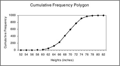
To create a cumulative frequency polygon, researchers first sort data from high to low and then group them into contiguous intervals. The upper limits to each interval are represented on the x-axis of a graph. The y-axis provides a measure of cumulative frequency. It shows either the number or the proportion of data values falling at or below each upper limit. For absolute frequencies, it is scaled from a minimum of 0 to a maximum that equals the number of measures in the data set. For relative frequencies, it is scaled from 0 to 1.00. Within the field of the figure, straight lines connect points that mark the cumulative frequencies.
Cumulative frequency polygons are used to represent quantitative data when the data intervals do not equal the number of distinct values in the data set. This is always the case for continuous data. When the data are discrete, it is possible to represent every value in the data set on the x-axis. In this case, a cumulative histogram would be used instead of a cumulative frequency polygon. The importance of the distinction is that points are connected with lines in the polygon to allow interpolation of frequencies for x-axis values not at the upper limits (e.g., 67 inches in the figure). When data have no values other than those represented on the x-axis, cumulative frequencies are simply marked by bars (or columns).
Some statisticians reserve the term cumulative frequency polygon just for graphs that show the absolute frequencies of values and prefer the term cumulative relative frequency polygon for graphs that show proportions. The alternative is to refer, as here, to two types of cumulative frequency polygons—one for counts and one for proportions.
- Analysis of Variance
- Association and Correlation
- Association
- Association Model
- Asymmetric Measures
- Biserial Correlation
- Canonical Correlation Analysis
- Correlation
- Correspondence Analysis
- Intraclass Correlation
- Multiple Correlation
- Part Correlation
- Partial Correlation
- Pearson's Correlation Coefficient
- Semipartial Correlation
- Simple Correlation (Regression)
- Spearman Correlation Coefficient
- Strength of Association
- Symmetric Measures
- Basic Qualitative Research
- Basic Statistics
- F Ratio
- N(n)
- t-Test
- X¯
- Y Variable
- z-Test
- Alternative Hypothesis
- Average
- Bar Graph
- Bell-Shaped Curve
- Bimodal
- Case
- Causal Modeling
- Cell
- Covariance
- Cumulative Frequency Polygon
- Data
- Dependent Variable
- Dispersion
- Exploratory Data Analysis
- Frequency Distribution
- Histogram
- Hypothesis
- Independent Variable
- Measures of Central Tendency
- Median
- Null Hypothesis
- Pie Chart
- Regression
- Standard Deviation
- Statistic
- Causal Modeling
- Discourse/Conversation Analysis
- Econometrics
- Epistemology
- Ethnography
- Evaluation
- Event History Analysis
- Experimental Design
- Factor Analysis and Related Techniques
- Feminist Methodology
- Generalized Linear Models
- Historical/Comparative
- Interviewing in Qualitative Research
- Latent Variable Model
- Life History/Biography
- Log-Linear Models (Categorical Dependent Variables)
- Longitudinal Analysis
- Mathematics and Formal Models
- Measurement Level
- Measurement Testing and Classification
- Multilevel Analysis
- Multiple Regression
- Qualitative Data Analysis
- Sampling in Qualitative Research
- Sampling in Surveys
- Scaling
- Significance Testing
- Simple Regression
- Survey Design
- Time Series
- ARIMA
- Box-Jenkins Modeling
- Cointegration
- Detrending
- Durbin-Watson Statistic
- Error Correction Models
- Forecasting
- Granger Causality
- Interrupted Time-Series Design
- Intervention Analysis
- Lag Structure
- Moving Average
- Periodicity
- Serial Correlation
- Spectral Analysis
- Time-Series Cross-Section (TSCS) Models
- Time-Series Data (Analysis/Design)
- Trend Analysis
- Loading...
Get a 30 day FREE TRIAL
-
 Watch videos from a variety of sources bringing classroom topics to life
 -
Read modern, diverse business cases
-
Explore hundreds of books and reference titles

Read next

More like this
Sage Recommends
We found other relevant content for you on other Sage platforms.
Have you created a personal profile? Login or create a profile so that you can save clips, playlists and searches