Entry
Reader's guide
Entries A-Z
Subject index
Column Graph
A column graph summarizes categorical data by presenting parallel vertical bars with a height (and hence area) proportionate to specific quantities of data for each category. This type of graph can be useful in comparing two or more distributions of nominal- or ordinal-level data.
Developing Column Graphs
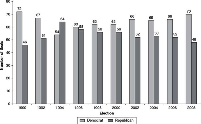
A column graph can and should provide an easy-to-interpret visual representation of a frequency or percentage distribution of a single (or multiple) variable(s). Column graphs present a series of vertical equal-width rectangles, each with a height proportional to the frequency (or percentage) of a specific category of observations. Categories are labeled on the x-axis (the horizontal axis), and frequencies are labeled on the y-axis (the vertical axis). For example, a column graph that displays the partisan distribution of a single session of a state legislature would consist of at least two rectangles, one representing the number of Democratic seats, one representing the number of Republican seats, and perhaps one representing the number of independent seats. The x-axis would consist of the “Democratic” and “Republican” labels while the y-axis would consist of labels representing intervals for the number of seats in the state legislature.
When developing a column graph, it is vital that the researcher present a set of categories that is both exhaustive and mutually exclusive. In other words, each potential value must belong to one and only one category. Developing such a category schema is relatively easy when the researcher is faced with discrete data, in which the number observations for a particular value can be counted (i.e. nominal and ordinal level data). For nominal data, the categories are unordered, with interchangeable values (e.g., gender, ethnicity, religion). For ordinal data, the categories exhibit some type of relation to each other, although the relation does not exhibit specificity beyond ranking the values (e.g., greater than vs. less than, agree strongly vs. agree vs. disagree vs. disagree strongly). Because nominal and ordinal data are readily countable, once the data are obtained, the counts can then be readily transformed into a column graph.
With continuous data (i.e., interval- and ratio-level data), an additional step is required. For interval data, the distance between observations is fixed (e.g., Carolyn makes $5,000 more per year than John does). For ratio-level data, the data can be measured as in relation to a fixed point (e.g., a family's income falls a certain percentage above or below the poverty line). For continuous data, the number of potential values can be infinite or, at the very least, extraordinarily high, thus producing a cluttered chart. Therefore, it is best to reduce interval- or ratio-level data to ordinal-level data by collapsing the range of potential values into a few select categories. For example, a survey that asks respondents for their age could produce dozens of potential answers, and therefore it is best to condense the variable into a select few categories (e.g., 18–25, 26–35, 36–45, 46–64, 65 and older) before making a column graph that summarizes the distribution.
Figure 1 1990–2009 Illinois House Partisan Distribution (Column Graph)
Multiple Distribution Column Graphs
Column graphs can also be used to compare multiple distributions of data. Rather than presenting a single set of vertical rectangles that represents a single distribution of data, column graphs present multiple sets of rectangles, one for each distribution. For ease of interpretation, each set of rectangles should be grouped together and separate from the other distributions. This type of graph can be particularly useful in comparing counts of observations across different categories of interest. For example, a researcher conducting a survey might present the aggregate distribution of self-reported partisanship, but the researcher can also demonstrate the gender gap by displaying separate partisan distributions for male and female respondents. By putting each distribution into a single graph, the researcher can visually present the gender gap in a readily understandable format.
...
- Descriptive Statistics
- Distributions
- Graphical Displays of Data
- Hypothesis Testing
- Alternative Hypotheses
- Beta
- Critical Value
- Decision Rule
- Hypothesis
- Nondirectional Hypotheses
- Nonsignificance
- Null Hypothesis
- One-Tailed Test
- p Value
- Power
- Power Analysis
- Significance Level, Concept of
- Significance Level, Interpretation and Construction
- Significance, Statistical
- Two-Tailed Test
- Type I Error
- Type II Error
- Type III Error
- Important Publications
- “Coefficient Alpha and the Internal Structure of Tests”
- “Convergent and Discriminant Validation by the Multitrait-Multimethod Matrix”
- “Meta-Analysis of Psychotherapy Outcome Studies”
- “On the Theory of Scales of Measurement”
- “Probable Error of a Mean, The”
- “Psychometric Experiments”
- “Sequential Tests of Statistical Hypotheses”
- “Technique for the Measurement of Attitudes, A”
- “Validity”
- Aptitudes and Instructional Methods
- Doctrine of Chances, The
- Logic of Scientific Discovery, The
- Nonparametric Statistics for the Behavioral Sciences
- Probabilistic Models for Some Intelligence and Attainment Tests
- Statistical Power Analysis for the Behavioral Sciences
- Teoria Statistica Delle Classi e Calcolo Delle Probabilità
- Inferential Statistics
- Association, Measures of
- Coefficient of Concordance
- Coefficient of Variation
- Coefficients of Correlation, Alienation, and Determination
- Confidence Intervals
- Margin of Error
- Nonparametric Statistics
- Odds Ratio
- Parameters
- Parametric Statistics
- Partial Correlation
- Pearson Product-Moment Correlation Coefficient
- Polychoric Correlation Coefficient
- Q-Statistic
- R2
- Randomization Tests
- Regression Coefficient
- Semipartial Correlation Coefficient
- Spearman Rank Order Correlation
- Standard Error of Estimate
- Standard Error of the Mean
- Student's t Test
- Unbiased Estimator
- Weights
- Item Response Theory
- Mathematical Concepts
- Measurement Concepts
- Organizations
- Publishing
- Qualitative Research
- Reliability of Scores
- Research Design Concepts
- Aptitude-Treatment Interaction
- Cause and Effect
- Concomitant Variable
- Confounding
- Control Group
- Interaction
- Internet-Based Research Method
- Intervention
- Matching
- Natural Experiments
- Network Analysis
- Placebo
- Replication
- Research
- Research Design Principles
- Treatment(s)
- Triangulation
- Unit of Analysis
- Yoked Control Procedure
- Research Designs
- A Priori Monte Carlo Simulation
- Action Research
- Adaptive Designs in Clinical Trials
- Applied Research
- Behavior Analysis Design
- Block Design
- Case-Only Design
- Causal-Comparative Design
- Cohort Design
- Completely Randomized Design
- Cross-Sectional Design
- Crossover Design
- Double-Blind Procedure
- Ex Post Facto Study
- Experimental Design
- Factorial Design
- Field Study
- Group-Sequential Designs in Clinical Trials
- Laboratory Experiments
- Latin Square Design
- Longitudinal Design
- Meta-Analysis
- Mixed Methods Design
- Mixed Model Design
- Monte Carlo Simulation
- Nested Factor Design
- Nonexperimental Design
- Observational Research
- Panel Design
- Partially Randomized Preference Trial Design
- Pilot Study
- Pragmatic Study
- Pre-Experimental Designs
- Pretest-Posttest Design
- Prospective Study
- Quantitative Research
- Quasi-Experimental Design
- Randomized Block Design
- Repeated Measures Design
- Response Surface Design
- Retrospective Study
- Sequential Design
- Single-Blind Study
- Single-Subject Design
- Split-Plot Factorial Design
- Thought Experiments
- Time Studies
- Time-Lag Study
- Time-Series Study
- Triple-Blind Study
- True Experimental Design
- Wennberg Design
- Within-Subjects Design
- Zelen's Randomized Consent Design
- Research Ethics
- Research Process
- Clinical Significance
- Clinical Trial
- Cross-Validation
- Data Cleaning
- Delphi Technique
- Evidence-Based Decision Making
- Exploratory Data Analysis
- Follow-Up
- Inference: Deductive and Inductive
- Last Observation Carried Forward
- Planning Research
- Primary Data Source
- Protocol
- Q Methodology
- Research Hypothesis
- Research Question
- Scientific Method
- Secondary Data Source
- Standardization
- Statistical Control
- Type III Error
- Wave
- Research Validity Issues
- Bias
- Critical Thinking
- Ecological Validity
- Experimenter Expectancy Effect
- External Validity
- File Drawer Problem
- Hawthorne Effect
- Heisenberg Effect
- Internal Validity
- John Henry Effect
- Mortality
- Multiple Treatment Interference
- Multivalued Treatment Effects
- Nonclassical Experimenter Effects
- Order Effects
- Placebo Effect
- Pretest Sensitization
- Random Assignment
- Reactive Arrangements
- Regression to the Mean
- Selection
- Sequence Effects
- Threats to Validity
- Validity of Research Conclusions
- Volunteer Bias
- White Noise
- Sampling
- Cluster Sampling
- Convenience Sampling
- Demographics
- Error
- Exclusion Criteria
- Experience Sampling Method
- Nonprobability Sampling
- Population
- Probability Sampling
- Proportional Sampling
- Quota Sampling
- Random Sampling
- Random Selection
- Sample
- Sample Size
- Sample Size Planning
- Sampling
- Sampling and Retention of Underrepresented Groups
- Sampling Error
- Stratified Sampling
- Systematic Sampling
- Scaling
- Software Applications
- Statistical Assumptions
- Statistical Concepts
- Autocorrelation
- Biased Estimator
- Cohen's Kappa
- Collinearity
- Correlation
- Criterion Problem
- Critical Difference
- Data Mining
- Data Snooping
- Degrees of Freedom
- Directional Hypothesis
- Disturbance Terms
- Error Rates
- Expected Value
- Fixed-Effects Models
- Inclusion Criteria
- Influence Statistics
- Influential Data Points
- Intraclass Correlation
- Latent Variable
- Likelihood Ratio Statistic
- Loglinear Models
- Main Effects
- Markov Chains
- Method Variance
- Mixed- and Random-Effects Models
- Models
- Multilevel Modeling
- Odds
- Omega Squared
- Orthogonal Comparisons
- Outlier
- Overfitting
- Pooled Variance
- Precision
- Quality Effects Model
- Random-Effects Models
- Regression Artifacts
- Regression Discontinuity
- Residuals
- Restriction of Range
- Robust
- Root Mean Square Error
- Rosenthal Effect
- Serial Correlation
- Shrinkage
- Simple Main Effects
- Simpson's Paradox
- Sums of Squares
- Statistical Procedures
- Accuracy in Parameter Estimation
- Analysis of Covariance (ANCOVA)
- Analysis of Variance (ANOVA)
- Barycentric Discriminant Analysis
- Bivariate Regression
- Bonferroni Procedure
- Bootstrapping
- Canonical Correlation Analysis
- Categorical Data Analysis
- Confirmatory Factor Analysis
- Contrast Analysis
- Descriptive Discriminant Analysis
- Discriminant Analysis
- Dummy Coding
- Effect Coding
- Estimation
- Exploratory Factor Analysis
- Greenhouse-Geisser Correction
- Hierarchical Linear Modeling
- Holm's Sequential Bonferroni Procedure
- Jackknife
- Latent Growth Modeling
- Least Squares, Methods of
- Logistic Regression
- Mean Comparisons
- Missing Data, Imputation of
- Multiple Regression
- Multivariate Analysis of Variance (MANOVA)
- Pairwise Comparisons
- Path Analysis
- Post Hoc Analysis
- Post Hoc Comparisons
- Principal Components Analysis
- Propensity Score Analysis
- Sequential Analysis
- Stepwise Regression
- Structural Equation Modeling
- Survival Analysis
- Trend Analysis
- Yates's Correction
- Statistical Tests
- Bartlett's Test
- Behrens-Fisher t′ Statistic
- Chi-Square Test
- Duncan's Multiple Range Test
- Dunnett's Test
- F Test
- Fisher's Least Significant Difference Test
- Friedman Test
- Honestly Significant Difference (HSD) Test
- Kolmogorov-Smirnov Test
- Kruskal-Wallis Test
- Mann-Whitney U Test
- Mauchly Test
- McNemar's Test
- Multiple Comparison Tests
- Newman-Keuls Test and Tukey Test
- Omnibus Tests
- Scheffé Test
- Sign Test
- t Test, Independent Samples
- t Test, One Sample
- t Test, Paired Samples
- Tukey's Honestly Significant Difference (HSD)
- Welch's t Test
- Wilcoxon Rank Sum Test
- z Test
- Theories, Laws, and Principles
- Bayes's Theorem
- Central Limit Theorem
- Classical Test Theory
- Correspondence Principle
- Critical Theory
- Falsifiability
- Game Theory
- Gauss-Markov Theorem
- Generalizability Theory
- Grounded Theory
- Item Response Theory
- Occam's Razor
- Paradigm
- Positivism
- Probability, Laws of
- Theory
- Theory of Attitude Measurement
- Weber-Fechner Law
- Types of Variables
- Validity of Scores
- Loading...
Get a 30 day FREE TRIAL
-
 Watch videos from a variety of sources bringing classroom topics to life
 -
Read modern, diverse business cases
-
Explore hundreds of books and reference titles

Read next

More like this
Sage Recommends
We found other relevant content for you on other Sage platforms.
Have you created a personal profile? Login or create a profile so that you can save clips, playlists and searches