Entry
Reader's guide
Entries A-Z
Subject index
Bar Chart
The term bar chart refers to a category of diagrams in which values are represented by the height or length of bars, lines, or other symbolic representations. Bar charts are typically used to display variables on a nominal or ordinal scale. Bar charts are a very popular form of information graphics often used in research articles, scientific reports, textbooks, and popular media to visually display relationships and trends in data. However, for this display to be effective, the data must be presented accurately, and the reader must be able to analyze the presentation effectively. This entry provides information on the history of the bar charts, the types of bar charts, and the construction of a bar chart.
History
The creation of the first bar chart is attributed to William Playfair and appeared in The Commercial and Political Atlas in 1786. Playfair's bar graph was an adaptation of Joseph Priestley's time-line charts, which were popular at the time. Ironically, Playfair attributed his creation of the bar graph to a lack of data. In his Atlas, Playfair presented 34 plates containing line graphs or surface charts graphically representing the imports and exports from different countries over the years. Since he lacked the necessary time-series data for Scotland, he was forced to graph its trade data for a single year as a series of 34 bars, one for each of the imports and exports of Scotland's 17 trading partners. However, his innovation was largely ignored in Britain for a number of years. Playfair himself attributed little value to his invention, apologizing for what he saw as the limitations of the bar chart. It was not until 1801 and the publication of his Statistical Breviary that Playfair recognized the value of his invention. Playfair's invention fared better in Germany and France. In 1811 the German Alexander von Humboldt published adaptations of Playfair's bar graph and pie charts in Essai Politique sur le Royaume de la Nouvelle Espagne. In 1821, Jean Baptiste Joseph Fourier adapted the bar chart to create the first graph of cumulative frequency distribution, referred to as an ogive. In 1833, A. M. Guerry used the bar chart to plot crime data, creating the first histogram. Finally, in 1859 Playfair's work began to be accepted in Britain when Stanley Jevons published bar charts in his version of an economic atlas modeled on Playfair's earlier work. Jevons in turn influenced Karl Pearson, commonly considered the “father of modern statistics,” who promoted the widespread acceptance of the bar chart and other forms of information graphics.
Types
Although the terms bar chart and bar graph are now used interchangeably, the term bar chart was reserved traditionally for corresponding displays that did not have scales, grid lines, or tick marks. The value each bar represented was instead shown on or adjacent to the data graphic.
Figure 1 Simple Bar Chart and Associated Data
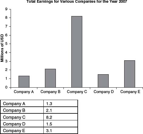
An example bar chart is presented in Figure 1. Bar charts can display data by the use of either horizontal or vertical bars; vertical bar charts are also referred to as column graphs. The bars are typically of a uniform width with a uniform space between bars. The end of the bar represents the value of the category being plotted. When there is no space between the bars, the graph is referred to as a joined bar graph and is used to emphasize the differences between conditions or discrete categories. When continuous quantitative scales are used on both axes of a joined bar chart, the chart is referred to as a histogram and is often used to display the distribution of variables that are of interval or ratio scale. If the widths of the bars are not uniform but are instead used to display some measure or characteristic of the data element represented by the bar, the graph is referred to as an area bar graph (see Figure 2). In this graph, the heights of the bars represent the total earnings in U.S. dollars, and the widths of the bars are used to represent the percentage of the earnings coming from exports. The information expressed by the bar width can be displayed by means of a scale on the horizontal axis or by a legend, or, as in this case, the values might be noted directly on the graph. If both positive and negative values are plotted on the quantitative axis, the graph is called a deviation graph. On occasion the bars are replaced with pictures or symbols to make the graph more attractive or to visually represent the data series; these graphs are referred to as pictographs or pictorial bar graphs.
...
- Descriptive Statistics
- Distributions
- Graphical Displays of Data
- Hypothesis Testing
- Alternative Hypotheses
- Beta
- Critical Value
- Decision Rule
- Hypothesis
- Nondirectional Hypotheses
- Nonsignificance
- Null Hypothesis
- One-Tailed Test
- p Value
- Power
- Power Analysis
- Significance Level, Concept of
- Significance Level, Interpretation and Construction
- Significance, Statistical
- Two-Tailed Test
- Type I Error
- Type II Error
- Type III Error
- Important Publications
- “Coefficient Alpha and the Internal Structure of Tests”
- “Convergent and Discriminant Validation by the Multitrait-Multimethod Matrix”
- “Meta-Analysis of Psychotherapy Outcome Studies”
- “On the Theory of Scales of Measurement”
- “Probable Error of a Mean, The”
- “Psychometric Experiments”
- “Sequential Tests of Statistical Hypotheses”
- “Technique for the Measurement of Attitudes, A”
- “Validity”
- Aptitudes and Instructional Methods
- Doctrine of Chances, The
- Logic of Scientific Discovery, The
- Nonparametric Statistics for the Behavioral Sciences
- Probabilistic Models for Some Intelligence and Attainment Tests
- Statistical Power Analysis for the Behavioral Sciences
- Teoria Statistica Delle Classi e Calcolo Delle Probabilità
- Inferential Statistics
- Association, Measures of
- Coefficient of Concordance
- Coefficient of Variation
- Coefficients of Correlation, Alienation, and Determination
- Confidence Intervals
- Margin of Error
- Nonparametric Statistics
- Odds Ratio
- Parameters
- Parametric Statistics
- Partial Correlation
- Pearson Product-Moment Correlation Coefficient
- Polychoric Correlation Coefficient
- Q-Statistic
- R2
- Randomization Tests
- Regression Coefficient
- Semipartial Correlation Coefficient
- Spearman Rank Order Correlation
- Standard Error of Estimate
- Standard Error of the Mean
- Student's t Test
- Unbiased Estimator
- Weights
- Item Response Theory
- Mathematical Concepts
- Measurement Concepts
- Organizations
- Publishing
- Qualitative Research
- Reliability of Scores
- Research Design Concepts
- Aptitude-Treatment Interaction
- Cause and Effect
- Concomitant Variable
- Confounding
- Control Group
- Interaction
- Internet-Based Research Method
- Intervention
- Matching
- Natural Experiments
- Network Analysis
- Placebo
- Replication
- Research
- Research Design Principles
- Treatment(s)
- Triangulation
- Unit of Analysis
- Yoked Control Procedure
- Research Designs
- A Priori Monte Carlo Simulation
- Action Research
- Adaptive Designs in Clinical Trials
- Applied Research
- Behavior Analysis Design
- Block Design
- Case-Only Design
- Causal-Comparative Design
- Cohort Design
- Completely Randomized Design
- Cross-Sectional Design
- Crossover Design
- Double-Blind Procedure
- Ex Post Facto Study
- Experimental Design
- Factorial Design
- Field Study
- Group-Sequential Designs in Clinical Trials
- Laboratory Experiments
- Latin Square Design
- Longitudinal Design
- Meta-Analysis
- Mixed Methods Design
- Mixed Model Design
- Monte Carlo Simulation
- Nested Factor Design
- Nonexperimental Design
- Observational Research
- Panel Design
- Partially Randomized Preference Trial Design
- Pilot Study
- Pragmatic Study
- Pre-Experimental Designs
- Pretest-Posttest Design
- Prospective Study
- Quantitative Research
- Quasi-Experimental Design
- Randomized Block Design
- Repeated Measures Design
- Response Surface Design
- Retrospective Study
- Sequential Design
- Single-Blind Study
- Single-Subject Design
- Split-Plot Factorial Design
- Thought Experiments
- Time Studies
- Time-Lag Study
- Time-Series Study
- Triple-Blind Study
- True Experimental Design
- Wennberg Design
- Within-Subjects Design
- Zelen's Randomized Consent Design
- Research Ethics
- Research Process
- Clinical Significance
- Clinical Trial
- Cross-Validation
- Data Cleaning
- Delphi Technique
- Evidence-Based Decision Making
- Exploratory Data Analysis
- Follow-Up
- Inference: Deductive and Inductive
- Last Observation Carried Forward
- Planning Research
- Primary Data Source
- Protocol
- Q Methodology
- Research Hypothesis
- Research Question
- Scientific Method
- Secondary Data Source
- Standardization
- Statistical Control
- Type III Error
- Wave
- Research Validity Issues
- Bias
- Critical Thinking
- Ecological Validity
- Experimenter Expectancy Effect
- External Validity
- File Drawer Problem
- Hawthorne Effect
- Heisenberg Effect
- Internal Validity
- John Henry Effect
- Mortality
- Multiple Treatment Interference
- Multivalued Treatment Effects
- Nonclassical Experimenter Effects
- Order Effects
- Placebo Effect
- Pretest Sensitization
- Random Assignment
- Reactive Arrangements
- Regression to the Mean
- Selection
- Sequence Effects
- Threats to Validity
- Validity of Research Conclusions
- Volunteer Bias
- White Noise
- Sampling
- Cluster Sampling
- Convenience Sampling
- Demographics
- Error
- Exclusion Criteria
- Experience Sampling Method
- Nonprobability Sampling
- Population
- Probability Sampling
- Proportional Sampling
- Quota Sampling
- Random Sampling
- Random Selection
- Sample
- Sample Size
- Sample Size Planning
- Sampling
- Sampling and Retention of Underrepresented Groups
- Sampling Error
- Stratified Sampling
- Systematic Sampling
- Scaling
- Software Applications
- Statistical Assumptions
- Statistical Concepts
- Autocorrelation
- Biased Estimator
- Cohen's Kappa
- Collinearity
- Correlation
- Criterion Problem
- Critical Difference
- Data Mining
- Data Snooping
- Degrees of Freedom
- Directional Hypothesis
- Disturbance Terms
- Error Rates
- Expected Value
- Fixed-Effects Models
- Inclusion Criteria
- Influence Statistics
- Influential Data Points
- Intraclass Correlation
- Latent Variable
- Likelihood Ratio Statistic
- Loglinear Models
- Main Effects
- Markov Chains
- Method Variance
- Mixed- and Random-Effects Models
- Models
- Multilevel Modeling
- Odds
- Omega Squared
- Orthogonal Comparisons
- Outlier
- Overfitting
- Pooled Variance
- Precision
- Quality Effects Model
- Random-Effects Models
- Regression Artifacts
- Regression Discontinuity
- Residuals
- Restriction of Range
- Robust
- Root Mean Square Error
- Rosenthal Effect
- Serial Correlation
- Shrinkage
- Simple Main Effects
- Simpson's Paradox
- Sums of Squares
- Statistical Procedures
- Accuracy in Parameter Estimation
- Analysis of Covariance (ANCOVA)
- Analysis of Variance (ANOVA)
- Barycentric Discriminant Analysis
- Bivariate Regression
- Bonferroni Procedure
- Bootstrapping
- Canonical Correlation Analysis
- Categorical Data Analysis
- Confirmatory Factor Analysis
- Contrast Analysis
- Descriptive Discriminant Analysis
- Discriminant Analysis
- Dummy Coding
- Effect Coding
- Estimation
- Exploratory Factor Analysis
- Greenhouse-Geisser Correction
- Hierarchical Linear Modeling
- Holm's Sequential Bonferroni Procedure
- Jackknife
- Latent Growth Modeling
- Least Squares, Methods of
- Logistic Regression
- Mean Comparisons
- Missing Data, Imputation of
- Multiple Regression
- Multivariate Analysis of Variance (MANOVA)
- Pairwise Comparisons
- Path Analysis
- Post Hoc Analysis
- Post Hoc Comparisons
- Principal Components Analysis
- Propensity Score Analysis
- Sequential Analysis
- Stepwise Regression
- Structural Equation Modeling
- Survival Analysis
- Trend Analysis
- Yates's Correction
- Statistical Tests
- Bartlett's Test
- Behrens-Fisher t′ Statistic
- Chi-Square Test
- Duncan's Multiple Range Test
- Dunnett's Test
- F Test
- Fisher's Least Significant Difference Test
- Friedman Test
- Honestly Significant Difference (HSD) Test
- Kolmogorov-Smirnov Test
- Kruskal-Wallis Test
- Mann-Whitney U Test
- Mauchly Test
- McNemar's Test
- Multiple Comparison Tests
- Newman-Keuls Test and Tukey Test
- Omnibus Tests
- Scheffé Test
- Sign Test
- t Test, Independent Samples
- t Test, One Sample
- t Test, Paired Samples
- Tukey's Honestly Significant Difference (HSD)
- Welch's t Test
- Wilcoxon Rank Sum Test
- z Test
- Theories, Laws, and Principles
- Bayes's Theorem
- Central Limit Theorem
- Classical Test Theory
- Correspondence Principle
- Critical Theory
- Falsifiability
- Game Theory
- Gauss-Markov Theorem
- Generalizability Theory
- Grounded Theory
- Item Response Theory
- Occam's Razor
- Paradigm
- Positivism
- Probability, Laws of
- Theory
- Theory of Attitude Measurement
- Weber-Fechner Law
- Types of Variables
- Validity of Scores
- Loading...
Get a 30 day FREE TRIAL
-
 Watch videos from a variety of sources bringing classroom topics to life
 -
Read modern, diverse business cases
-
Explore hundreds of books and reference titles

Read next

More like this
Sage Recommends
We found other relevant content for you on other Sage platforms.
Have you created a personal profile? Login or create a profile so that you can save clips, playlists and searches