
Entry
Reader's guide
Entries A-Z
Subject index
Pareto Chart
The Pareto chart, or Pareto diagram, is one of the seven basic tools of quality improvement. It is named after the Italian economist Vilfredo Pareto (1848–1923), who observed that a small minority of Italian citizens held the majority of the wealth and means of production. His studies led him to conclude that 20% of the people in Italy owned 80% of the wealth. Quality expert Dr. Joseph M. Juran applied the “Pareto principle” to industry, and to specific processes within industry, noting that whenever a number of individual factors contribute to some overall effect, relatively few of those items account for the bulk of that effect.
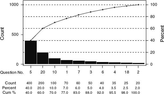
Figure 1 Pareto Chart
Using the Pareto principle has proven an effective technique in the health services sector. The principle reinforces the practical reality that, given limited resources, efforts must be concentrated on issues that have the most potential impact. A Pareto analysis can assist a quality improvement team in setting priorities on its actions and also helps the team define and focus the problem.
The Pareto chart is graphically depicted as a bar chart, with each bar representing a separate problem cause. In the chart, the bars are ordered from left to right according to height, which signifies frequency. Thus the tallest bar, the most frequently occurring factor, is on the far left. Often included in the Pareto chart is a line graph that shows the cumulative percentage for all the categories of problem causes. Throughout the quality improvement process, the Pareto chart serves as a useful tool for identifying those factors that may produce the greatest effect in quality improvement.
A hypothetical example of the Pareto principle follows. Hospital A is focusing its quality improvement efforts on eliminating sources of outpatient dissatisfaction. An analysis of its most recent outpatient satisfaction survey reveals that all the sources of patient dissatisfaction fall into one of 10 survey questions. Each survey question represents a distinctive issue or category of dissatisfaction, such as long wait for an appointment, lack of courtesy on the part of support personnel, and perceived lack of provider competence. The Pareto chart depicted in Figure 1 indicates that, from these 10 categories three (30%) account for 70% of the patient dissatisfaction. Thus from a purely practical perspective, the quality improvement team would initially focus its efforts on those three patient complaint categories. In a Pareto analysis, this is referred to as distinguishing “the vital few” from “the trivial many.”
Further Reading
- Accounting and Activity-Based Costing
- Accrual Based Accounting
- Accumulated Depreciation
- Activity Based Costing (ABC)
- Annual Percentage Rate
- Assets
- Average Collection Period
- Bad Debt Loss
- Balance Sheet
- Billing
- Book Value
- Breakeven Analysis
- Business Valuation
- Capital Asset Pricing Model
- Carve-outs
- Cash Basis of Accounting
- Compensating Differentials
- Compensation Systems
- Compound Growth Rate
- Contractual Adjustments
- Cost of Capital
- Cost-Based Reimbursement
- Credit Rating
- Days Cash on Hand
- Debt Service Coverage
- Deductible
- Depreciation
- Discounted Cash Flows
- Dividends
- Employee Compensation
- Equity
- Executive Compensation
- Factoring of Accounts Receivable
- Financial Performance Indicators (FPIs)
- Financial Statement
- Fixed Costs
- Fund Balance
- Generally Accepted Accounting Procedures
- Goodwill
- Income Statement
- Liability
- Line of Credit
- Net Present Value
- Net Working Capital
- Noncash Expense
- Operating Cash Flow
- Per Diem Payments
- Profits
- Ratio Analysis
- Return on Assets (ROA)
- Return on Owner's Equity
- Statement of Changes in Net Assets
- Throughput Accounting (TA)
- Time Value of Money
- Worker's Compensation Insurance
- Economics
- Aging Society
- Capacity and Capacity Utilization
- Comparative Statics
- Competitive Bidding
- Competitive Equilibrium
- Consumer Price Index (CPI)
- Cost Shifting
- Cost-Benefit Analysis (CBA)
- Demand
- Diffusion of Innovation
- Economic Order Quantity (EOQ)
- Economies of Scale
- Elasticity of Demand
- Full Price of Medical Care
- Gross Domestic Product
- Health Care
- Health Care as Luxury Goods
- Health Insurance
- Health Production Functions
- Labor Markets
- Monopoly
- Monopsony
- National Health Expenditures (NHEs)
- Opportunity Cost
- Phillips Curve
- Price Discrimination
- Price Sensitivity in Health Care Insurance
- Price Sensitivity in Health Care Services
- Production Possibilities Curve
- Productivity
- Public Goods
- Public Sector
- Rationing
- Self-Insurance
- Spending on Health Care
- Technology Assessment
- Technology Change
- Finance
- Activity-Based Costing (ABC)
- Annual Percentage Rate
- Asset
- Average Collection Period
- Bad Debt Loss
- Balance Sheet
- Balanced Scorecard
- Book Value
- Business Valuation
- Capital Asset Pricing Model
- Cash Basis of Accounting
- Compensation Systems
- Compound Growth Rate
- Consumer Price Index (CPI)
- Contractual Adjustment
- Cost of Capital
- Cost-Based Reimbursement
- Cost-Benefit Analysis (CBA)
- Credit Rating
- Days Cash on Hand
- Debt Service Coverage
- Deductible
- Depreciation
- Discounted Cash Flows
- Dividends
- Employee Compensation
- Equity
- Executive Compensation
- Expected Rate of Return
- Factoring of Accounts Receivable
- Fee-for-Service (FFS) Payment
- Financial Performance Indicators (FPIs)
- Financial Statement
- Fixed Costs
- Full Price of Medical Care
- Fund Balance
- Generally Accepted Accounting Procedures
- Goodwill
- Healthcare Financial Management Association (HFMA)
- Income Statement
- Initial Public Offering (IPO)
- Internal Rate of Return
- Investments
- Liability
- Line of Credit
- Long-Term Investments
- Net Present Value
- Net Working Capital
- Noncash Expense
- Operating Cash Flow
- Opportunity Cost
- Per Member Per Month (PMPM)
- Philanthropy in Health Care
- Profit Sharing
- Profits
- Prospective Payment System (PPS)
- Rate of Return
- Ratio Analysis
- Return on Assets
- Return on Owner's Equity
- Risk Adjustment
- Risk Selection
- Statement of Changes in Net Assets
- Time Value of Money
- Venture Capital Investment
- Workers' Compensation Insurance
- Health Policy
- Access
- Autonomous Health Care Plan/Structure
- Bed Occupancy
- Bioterrorism
- Case Mix
- Case Rate Reimbursement
- Chronic Disease
- Clinical Practice Guidelines/Pathways
- Community Health
- Community Health Status Indicators
- Competitive Bidding
- Continuity of Care
- Disenrollment
- Electrocardiogram (EKG or ECG)
- Emergency Room
- Enrollee
- Enrollment
- Entitlement Programs
- Environmental Health Science
- Episodes of Care and Disease
- Evidence-Based Medicine (EBM)
- Family-Oriented Care
- Feasibility Study
- Genomics
- Global Blood Safety Project
- Graduate Medical Education (GME)
- Health
- Health Care
- Health Care as Luxury Goods
- Health Care Provider
- Health Care Reform
- Health Care Services
- Health Care Utilization
- Health Insurance
- Health Officer and Health Commissioner
- Health Policy
- Health Status Indicators
- Healthy People 2010
- Hippocratic Oath
- Home Health Care
- Home Health Care Agencies
- Hospice
- Indigent Health Care
- Infant Mortality
- Inpatient Services
- Long-Term Care
- Mandated Coverage
- Maternal and Child Health (MCH)
- Medicaid
- Medical Appropriateness of Care
- Medical Savings Accounts (MSAs)
- Mobile Health Units
- Morbidity
- Mortality
- Neonatal Care
- Outcomes Research
- Philanthropy in Health Care
- Price Control in Pharmaceutical Industry
- Price Discrimination
- Primary Care
- Privilege
- Public Health
- Public Health Core Disciplines
- Referral
- Rehabilitation
- Release
- Residency Programs
- Risk Adjustment
- Risk Selection
- Safety-Net Providers
- Self-Insurance
- Self-Referral
- Subacute Care
- Tertiary Care
- Trauma
- U. S. Departmenf of Health and Human Services (DHHS)
- U. S. Health Care System
- Underserved Populations
- Uninsured Patients
- Human Resources
- Academic Degrees
- Affirmative Action in Employment
- Aging Society
- Benefit Package
- Collective Bargaining
- Compressed Workweeks
- Conflict Management
- Employee Absenteeism
- Employee Assistance Program (EAP)
- Employee Health
- Employee Orientation Programs
- Employee Recruitment
- Employee Stock Ownership Plan (ESOP)
- Employee Turnover
- Employment Interview
- Employment References
- Empowerment (Delegation of Authority)
- Equal Pay Act
- Flextime
- Full-Time Equivalent Employee
- Group Norms
- Group Performance
- Group Think
- Healthy People 2010
- Human Resource Planning
- Human Resources
- Improving Employee Productivity
- Incentive Pay
- Job Analysis
- Job Design
- Job Satisfaction
- Labor Markets
- Labor Unions
- Leaderless Group Discussion
- Leadership
- Management Development
- Measuring Training Outcomes
- Mentoring
- Negotiation
- Organizational Behavior Management
- Organizational Communication
- Organizational Performance and Work Design
- Performance Appraisal
- Performance Management
- Performance Rating Errors
- Physician Extender
- Power
- Profit Sharing
- Progressive Discipline System
- Psychological Contracts
- Succession Planning
- Task Forces
- Team Building
- Team-Based Compensation
- Team-Based Organization
- Teamwork
- Telecommuting
- U. S. Department of Labor (DOL)
- Information Technology
- Database
- E-Health
- Electronic Claims
- Electronic Commerce
- Electronic Data Interchange (EDI)
- Electronic Medical Record
- Encryption
- Hacker
- Health Information Portability & Accountability Act (HIPAA)
- Health Information Systems
- Health Plan and Employer Data and Info Set (HEDIS)
- Information Technology
- Networks
- Positron Emission Tomography (PET)
- Strategic Issue Diagnosis (SID)
- Telecommuting
- Telemedicine
- Virtual Private Network (VPN)
- Institutions and Organizations
- Academic Medical Center
- Administrative Service Only (ASO)
- American Board of Medical Specialties
- American Board of Preventive Medicine
- American College of Healthcare Execs (ACHE)
- American Dental Association (ADA)
- American Hospital Association (AHA)
- American Medical Association (AMA)
- American Nurses Association (ANA)
- American Public Health Association (APHA)
- American Red Cross (ARC)
- Birthing Centers
- Blue Cross and Blue Shield (BCBS)
- Boards of Directors
- Boards of Health
- Bureau of Labor Statistics (BLS)
- Center For Medicare & Medicaid Srvices (CMS)
- Chief Medical Officer/Medical Director
- Community Health
- Community-Based Hospital
- Contract Research Organization (CRO)
- Disproportionate Share Hospital (DSH)
- Equal Employment Opportunity Commission (EEOC)
- Exclusive Provider Organization (EPO)
- Food and Drug Administration (FDA)
- Genomics
- Health Insurance Purchasing Cooperative (HIPC)
- Health Maintenance Organizations (HMOs)
- Healthcare Financial Management Association (HFMA)
- Hospitals
- Institute of Medicine (IOM)
- Institutional Review Board (IRB)
- Integrated Delivery System
- Integrated Service Network (ISN)
- Intermediate Care Facility (ICF)
- Learning Organizations
- Limited Liability Company (LLC)
- Local Public Health Agencies (LPHAS)
- Managed Care Organizations (MCO)
- March of Dimes
- Medical Supply Organization (MSO)
- National Institutes of Health (NIH)
- National Labor Relations Board (NLRB)
- Not-for-Profit Organization
- Office For Human Research Protections (OHRP)
- Peer Review Organizations (PROs)
- Physician-Hospital Organizations (PHOs)
- Point-Of-Service Systems (POS)
- Preferred Provider Organizations (PPO)
- Professional Standards Review Orgs (PSRO)
- Provider
- Provider-Sponsored Organizations (PSO)
- Psychiatric Centers
- Public Hospital
- Residency Review Committee (RRC)
- Single-Specialty Group Practice
- Solo Practice
- Step-Down Facility
- Third-Party Administrators (TPA)
- U. S. Department of Health and Human Services (DHHS)
- U. S. Department of Labor (DOL)
- U.S. Agency for International Development (USAID)
- Visiting Nurses Association (VNA)
- World Health Organization (WHO)
- International Health Care Issues
- Legal and Regulatory Issues
- Qui Tam Actions
- Advance Health Care Directives
- Age Discrimination in Employment
- Aid To Families with Dependent Children (AFDC)
- Americans with Disabilities Act of 1990
- Assurance of Compliance (Federal Wide Assurance, FWA)
- Balanced Budget Act of 1997 (BBA)
- Civil Rights Acts of 1964 and 1991
- Claim
- Claims Management
- Code of Ethics
- Collective Bargaining
- Compliance
- Credentialing
- Durable Power of Attorney For Health Care (DPAHC)
- Employee Retirement Income Security Act (ERISA)
- Employee Rights
- Employee Selection and Hiring
- Employment Discrimination
- Employment Law
- Employment Testing and Evaluation
- Equal Pay Act
- Ethical Issues Faced by Managers
- Ethics Officer
- Excess Liability Coverage
- Executive Order 11246 on Affirmative Action
- Exposure
- Fair Employment and Public Policy
- Family and Medical Leave Act (FMLA)
- Federal Regulating Agencies
- Health Information Portability and Accountability Act (HIPAA)
- Immigration Reform and Control Act of 1986
- Incident
- Indemnification
- Individuals With Disabilities Education Act (IDEA)
- Joint Commission on Accreditation of Healthcare Organizations (JCAHO)
- Judgment
- Kickbacks
- Limited Liability Corporation (LLC)
- Limited Liability Partnership (LLP)
- Living Wills
- Malpractice
- Medical Savings Accounts (MSAs)
- Medicare Risk Contract
- National Committee on Quality Assurance (NCQA)
- Negligence
- Noncompete Agreements
- Occupational Safety and Health Act (OSHA)
- Occurrence Coverage
- Occurrence Screening
- Premium
- Privacy Issues
- Professional Corporation
- Professional Standards Review Organizations
- Referral
- Rehabilitation Act of 1973
- Scope of Practice
- Self-Referral
- Sentinel Event
- Settlement
- Standard of Care
- Stark Law
- Statute of Limitations
- Structured Settlement
- Summons
- Tail Coverage
- Title VII of the Civil Rights Act of 1964
- Unanticipated Outcome Disclosure
- Vicarious Liability
- Women, Infants, and Children (WIC) Program
- Managed Care
- Ambulatory Care
- Carve-Out
- Compensating Differentials
- Enrollee
- Enrollment
- Evidence-Based Medicine
- Fee-for-Service
- Health Care Reform
- Health Maintenance Organizations (HMOs)
- Length of Stay
- Managed Care
- Managed Care Plans
- Mandated Coverage
- Medical Care
- Out-Of-Network Services
- Patterns of Care
- Per Diem Payments
- Per Member Per Month (PMPM)
- Prospective Payment System (PPS)
- Marketing and Customer Value
- Adopter Categories
- Advertising
- Ambulatory Care
- Comparative Advertising
- Complementary Products
- Customer
- Customer Relationship Management (CRM)
- Customer Satisfaction Research
- Customer Value
- Database Marketing
- Direct Marketing
- Environmental Scanning/Analysis
- Exclusive Distribution
- Expansion Strategies
- First-Mover Advantage
- Franchising
- Goods-Services Continuum
- Hypercompetition
- Integrated Marketing Communications
- Intensive Distribution
- Licensing
- Loyalty in Health Care Consumer
- Maintenance of Scope
- Market Entry Strategies
- Market Opportunity Analysis
- Market Segmentation
- Marketing Concept
- Marketing Mix
- Marketing Plan
- Marketing Research
- Marketing Value
- Mass Customization
- Mystery Shoppers
- Non Price Competition in Hospitals
- One-to-One Marketing
- Patient Expectations
- Perceptual Gaps in Services Quality
- Physician-Patient Relationship
- Press Releases
- Product
- Product Classes
- Product Life Cycle (PLC) Analysis
- Product Line Extensions
- Product Mix
- Public Relations
- Sales Forecasting
- Selective Distribution
- Service Area Competitor Analysis
- Service Quality
- Services
- Social Marketing
- Substitute Product
- Wellness
- Women as Major Health Care Consumers
- Operations and Decision Making
- Capacity and Capacity Utilization
- Clinical Decision Making
- Decentralization of Decision Making
- Decision
- Decision Support Systems
- Economic Order Quantity (EOQ)
- Empowerment (Delegation of Authority)
- Enterprise Resource Planning
- Excess Capacity
- Facilities Management
- Future Search
- Geographic Information System
- Health Care Service Operation
- Health Production Functions
- Just In Time and Health Care Management
- Mass Customization
- Nominal Group Technique (NGT)
- Operations Management
- Outsourcing
- Production Possibilities Curve
- Queuing
- Root Cause Analysis
- Sales Forecasting
- Service Operation
- Statement of Operations
- Supply Chain Management
- Technology Assessment
- Technology Change
- Theory of Constraints
- Utilization Review
- Value Chain for Health Care
- Waiting Time
- Pharmaceuticals and Clinical Trials
- Adverse Drug Reaction (ADR)
- Adverse Event (AE)
- Adverse Selection and Impact
- Alternative Medicine (Complementary Medicine, Integrative Medicine, Unconventional Medicine)
- Assurance
- Belmont Report
- Biotechnology
- Blinding
- Case Report Form (CRF)
- Clinical Research
- Clinical Trials
- Contract Research Organization (CRO)
- Control Group
- Critical Paths
- Data Management
- Declaration of Helsinki Laws
- Demographics
- Drug Coverage
- Effective Dose
- Efficacy
- Exclusion Criteria
- Food and Drug Administration (FDA)
- Formularies
- Generic Drug
- Good Clinical Practices (GCPs)
- In Vitro Testing
- In Vivo Testing
- Inclusion Criteria
- Informed Consent
- Investigational New Drug Application (IND)
- Investigator (Principal Investigator)
- Kefauver-Harris Amendments
- Longitudinal Study
- Medical Genetics
- MedWatch Program
- National Institutes of Health (NIH)
- New Drug Application (NDA)
- Off Label
- Open-Ended Study
- Open-Label Study
- Orphan Drug
- Out-of-Network Services
- Over-the-Counter (OTC)
- Phase I Study (Phase I Clinical Trial)
- Phase II Study
- Phase III Study
- Phase IV Study
- Pivotal Studies
- Placebo
- Preclinical Testing
- Premedicate (Premedication)
- Prescription
- Price Control in the Pharmaceutical Industry
- Protocol (Involving Human Subjects)
- Quality Assurance
- Randomization
- Recruitment
- Standard Operating Procedures (SOPs)
- Standard Treatment
- Study Arms
- Subinvestigator
- Subject, Human Research
- Vital Signs
- Vulnerable Research Subject Population
- Quality
- Academic Degrees
- Care Management
- Case Management
- Clinical Practice Guidelines/Pathways
- Common Cause Variation
- Continuous Quality Improvement (CQI)
- Control Chart
- Disease Management
- Electrocardigram (EKG or ECG)
- Flowchart
- Global Blood Safety Projects
- Health Status Indicators
- Hippocratic Oath
- Length of Stay
- Maternal and Child Health
- Medical Care
- Medical Errors
- Morbidity
- Mortality
- National Committee on Quality Assurance (NCQA)
- Outcomes Research
- Pareto Chart
- Patterns of Care
- Plan-Do-Study-Act Cycle
- Quality Assurance
- Quality Improvement Cycle
- Quality Management
- Root Cause Analysis
- Run Chart
- Service Quality
- Six-Sigma Program
- Special Cause Variation
- Statistical Process Control (SPC)
- Statistical Thinking
- Supply Chain Management (SCM)
- Utilization Review
- Wellness
- Zero Defects
- Statistics and Data Mining
- Strategy
- Alliances
- Authority
- Balanced Scorecard
- BCG Portfolio Analysis
- Boards of Directors
- Breakeven Analysis
- Business Plan
- Co-opetition
- Coalitions
- Collaborative Partnership
- Competitive Advantage
- Competitive Strategy and Groups
- Contraction Strategy
- Cooperation Strategies
- Critical Success Factors
- Culture and Culture Change
- Culture and Strategy
- Diversification Strategies
- Divestiture Strategies
- Emergent Strategy
- Environmental Analysis
- Expansion Strategies
- Generic Strategies
- Harvesting Strategies
- Horizontal Integration
- Industry Analysis
- Internal Environmental Analysis
- Long-Range Planning
- Managed Competition
- Managing Organizational Change
- Market Entry Strategies
- Merger and Acquisition
- Mission
- Networks
- Niche Strategies
- Nonprice Competition in Hospitals
- Objectives
- Organizational Change
- Organizational Design and Discontinuous Change
- Product Life Cycle Analysis
- Service Area Competitor Analysis
- Strategic Alternatives
- Strategic Assumptions
- Strategic Business Units (SBU)
- Strategic Change
- Strategic Control
- Strategic Decision
- Strategic Fit
- Strategic Group
- Strategic Issue Diagnosis (SID)
- Strategic Leadership
- Strategic Management
- Strategic Management Process
- Strategic Service Unit (SSU)
- Strategic Thinking
- Strategy
- Structure
- Subsidiary Corporations
- SWOT (Strength-Weakness-Opportunity-Threat) Analysis
- Synergy
- Value Chain for Health Care
- Values (Guiding Principles)
- Vertical Integration
- Vision
- Loading...
Get a 30 day FREE TRIAL
-
 Watch videos from a variety of sources bringing classroom topics to life
 -
Read modern, diverse business cases
-
Explore hundreds of books and reference titles

Read next

More like this
Sage Recommends
We found other relevant content for you on other Sage platforms.
Have you created a personal profile? Login or create a profile so that you can save clips, playlists and searches