Entry
Reader's guide
Entries A-Z
Subject index
Inequality, Global
After decades of self-conscious development and market liberalization, the average income for the global South in the early 2000s was only around 15% of that of the global North in purchasing power parity terms and more like 5% in foreign exchange rate terms (see Figure 1). Also, growth in the South has been typically much more erratic than in the North, with periods of relatively fast growth followed by deeper and longer recessions.
To make these gaps more tangible, take as an index of economic hardship the number of hours (hr) that an adult male entry-level employee of McDonald's must work to earn the equivalent of one Big Mac. In the core zone of western Europe, North America, and Japan, the figure in 2007 was in the range of 15 to 30 minutes (min); in Seoul-Taipei-Singapore, 47–51 min; San Jose (Costa Rica) and Santiago (Chile), 1 hr 25 min; Shanghai, 1 hr 48 min; Delhi, 3 hr; Hyderabad (India), 3 hr 54 min. A job in McDonald's is well up the prestige ranking in low-income countries; most people work in less desirable jobs.
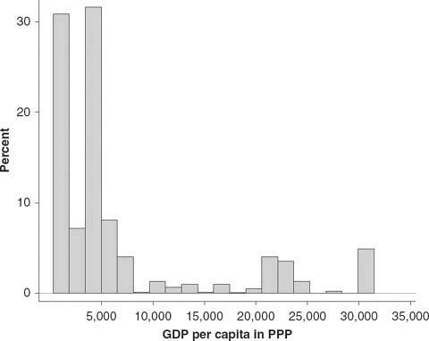
Figure 1 shows the distribution of world population by average country income (in purchasing power parity [PPP] dollars rather than market exchange rate dollars). Notice the “twin peaks” and “missing middle.” One peak contains the 70% of the world's population living in countries whose gross domestic product (GDP) per capita is below PPP$5,000. The other peak is the 14% who live in countries with GDP per capita above PPP$20,000—the rich world. Only 4% live in the missing middle, in countries with average incomes between PPP$8,000 and PPP$20,000. Talk of the middle-income countries can be misleading, for it suggests, wrongly, that they are midway between the low-and the high-income countries. In fact, the middle-income countries fall toward the low end. The distribution of world population by the income of individuals or households is much more skewed toward the tail than the distribution by countries’ average income.
Figure 1 International income distribution. The distribution of people according to the GDP per capita of the country in which they live (year 2000). GDP is shown in 1995 international dollars.
Weighting countries by population, income level, and growth rates, we get a “1:3:2” world. There are roughly 1 billion people in the high-income countries; 3 billion in countries where growth rates have been substantially faster than in the high-income countries over the past two decades, although starting from very low income levels and remaining at low levels (mainly China and India); and 2 billion where growth rates have been lower than in the high-income countries, some of these in middle-income countries, others in low-income countries. The large majority of developing countries are in the non-catch-up category.
Two hundred years ago, in the early decades of the industrial revolution, most of the income inequality between the world's people was due to class inequality within each state, reflecting the relative equality of average incomes between states. The global expansion of capitalism since the industrial (or energy) revolution has generated a steep rise in income inequality between countries, described by some scholars as the Great Divergence. Today, most of the inequality between individuals is due to geographical inequality in average incomes between developed and developing states and regions. Cecil Rhodes, the 19th-century champion of British imperialism, captured the point when he declared, “Remember that you are an Englishman, and have consequently won first prize in the lottery of life.”
...
- Activism, Transnational
- Amnesty International
- Anti-Apartheid Movement
- Antiglobalization Movements and Critics
- Antislavery Movements
- Associations
- Charities, Charity
- Civil Society, Global
- Civility
- Connectedness, Global
- Elites
- Foundations
- Foundations, Asian: International Activities
- Foundations, European: International Activities
- Foundations, U.S.: International Activities
- Gay and Lesbian Movement
- Humanitarian Intervention
- Humanitarianism
- Humanity, Concepts of
- Indigenous Peoples' Rights
- International Nongovernment Organizations (INGOs)
- International Nongovernment Organizations, Quasi-Forms
- Open Society Institute
- Opinion, World
- Philanthropy
- Publics and Polis, Global
- Red Cross
- Social Capital
- Social Entrepreneurship
- Social Movements
- Social Networking
- Solidarity Movements
- State–Civil Society Relations
- Uncivil Society
- UN–Civil Society Relations
- Waqfs
- Women's Movement
- World Economic Forum
- World Social Forum
- Air Travel
- Airlines
- Civil Aviation
- Communicative Power
- Computing
- Computing, Personal
- Containerization
- Cybernetics
- Global Communications and Technology
- Handheld Devices
- Information Age
- International Air Transportation Association
- Internet
- Internet Corporation for Assigned Names and Numbers
- Inventions and Discoveries
- Media, Global
- Morse Code
- Nanotechnology
- Navigation Systems
- Postal System, World
- Radio
- Railroads
- Road Signage Systems
- Roads and Routeways
- Silk Road, New
- Space, Outer
- Telegraph, Telegram
- Telephone
- Telephony
- Television
- Transportation Systems
- Universal Postal Union
- Web 2.0
- American Revolution
- Apartheid
- Cold War
- Conflict and Conflict Resolution
- Conquests
- Cooperation
- Cyberconflict
- Deterrence
- Failed States
- French Revolution
- Geneva Conventions
- Genocides
- Global Conflict and Security
- Hiroshima
- Holocaust
- Intelligence Agencies
- Military
- Pariahs, Global
- Peace
- Peace Activism
- Peacekeeping Forces
- Private Security Firms
- Refugees
- Religious Politics
- Revolutions
- Security
- September 11, 2001 (9/11)
- Soft Power Diplomacy
- Terrorism
- Treaties
- War
- War, Civil
- War, Urban
- Wars, New
- Wars, World
- Weapons
- Academy Awards
- Aesthetics
- Al Jazeera
- Americanization
- Architecture
- Art
- Artists
- Blogs
- British Broadcasting Corporation (BBC)
- Cable News Network (CNN)
- Cartoons, Comix, Manga
- Cinema
- Creativity and Innovation
- Creolization
- Cuisine
- Cultural Commons
- Cultural Destruction
- Cultural Diversity, Convention on
- Cultural Hybridity
- Cultural Industries
- Cultural Observatories
- Culture, Notions of
- Educational Systems
- Events, Global
- Film Festivals
- Games
- Genius, Notion of
- Geographic Informational Systems (GIS)
- Global Culture, Media
- Global Intellectuals
- Global Positioning System (GPS)
- Hajj
- Heritage
- Hollywood
- Homogenization
- Journalism
- Knowledge Management Systems
- Knowledge Production Systems
- Leisure
- Lifestyles
- Literature
- McDonaldization, McWorld
- Maps and Map-Making
- Memory
- Memory Wars
- Music
- Myths
- News
- Nobel Prize
- Olympic Movement
- Postmodernity
- Prizes and Awards, International
- Scripts and Writing Systems
- Sites, Global
- Soccer
- Sports, Recreation
- Standards and Standard Setting, Global
- Theater
- Think Tanks
- United Nations Educational, Scientific and Cultural Organization (UNESCO)
- Universities and Higher Learning
- Virtual Worlds
- Wikipedia
- Work
- World Cultures
- World's Fairs
- Acculturation
- Aging Societies
- Assimilation
- Baby Boomers
- Beirut
- Cities
- Communities, Transnational
- Contraception
- Demographic Change
- Demographic Transition
- Deterritorialization and Reterritorialization
- Diasporas
- Dubai
- Family Policies
- Family Systems, Kinship
- Fertility
- Hong Kong
- Immigration
- Immigration and Transnationalism
- Intergenerational Relations
- Johannesburg
- Landless Persons
- London
- Los Angeles
- Malthusian Idea
- Migrant Shopping Patterns
- Migration
- Migration, Illegal
- Migration Policies, Types of
- Mortality
- Mumbai
- New York City
- Overpopulation
- Paris
- Population and Demographic Change
- Population Control Policies
- Population Growth and Population Explosion
- Retirement Systems
- Rio de Janeiro
- Rurality
- Shanghai
- Shelter and Housing
- Singapore
- 68 Generation
- Tokyo
- Undocumented Persons
- Urban Diseconomies
- Urbanization
- Accounting Systems
- Agriculture Sector
- Asian Tiger Phenomenon
- Banking, Offshore
- Banks
- Capitalism
- Consumer Protest
- Consumerism
- Corporations, Transnational
- Currencies
- Data Systems and Reporting, Global
- Dependency
- Dependency Theory
- Depression, Great
- Depression, Recession, and Stagnation
- Deskilling
- Distribution of Wealth, Equitability of
- Dollar
- Economic Crises
- Economic Development
- Economic Ethics
- Economics, Keynesian
- Economy, Informal
- Entrepreneurship
- Euro
- European Central Bank
- Extractive Industries Sector
- Finance, Financial Systems
- Fordism
- Franchise Systems
- Global Economic Issues
- Globalization, Managed (China)
- Gold Standard
- Hedge Funds
- Illegal Trade, Arms
- Illegal Trade, Children
- Illegal Trade, Drugs
- Illegal Trade, Precious Metals
- Industrialization
- Inequality, Global
- Inequality, Global Economic
- International Labour Organization (ILO)
- International Monetary Fund (IMF)
- Investments
- Labor
- Local Exchange and Trading Systems (LETS)
- Longue Durrée, Long Wave Theories of Development
- Manufacturing Sector
- Maquiladoras
- Marketing
- Markets
- Marshall Plan
- McDonaldization, McWorld
- Mercantilism
- Microsoft
- Monetary Policy
- Organisation for Economic Co-operation and Development (OECD)
- Outsourcing
- Peasant Economies
- Petroleum Geopolitics
- Petroleum Economy
- Pharmaceutical Sector
- Poverty and Poverty Alleviation
- Private-Public Partnerships
- Privatization
- Production and Innovation Networks, Global
- Professions
- Protectionism
- Public Goods, Global
- Remittances
- Service Sector
- Sex Trafficking
- Slavery
- Tax Havens
- Taxation
- Technology Sector
- Tobin Tax
- Tourism Sector
- Trade
- Trade Agreements
- Value/Commodity Chains, Global
- Walmart
- World Bank
- World Trade Organization (WTO)
- Acid Rain
- Alternative Energy Sources
- Biofuels
- Biohazards
- Biological Diversity
- Biosphere
- Climate Change
- Deforestation
- Desertification
- Earth Summit
- Electricity
- Energy Efficiency
- Environmental Carrying Capacity
- Environmental Change
- Environmental Movement
- Environmental Rights
- Environmental Security
- Environmental Treaties, Conventions, and Protocols
- Extractive Industries Transparency Initiative
- Fisheries
- Floods, Tsunamis
- Forests
- Global Commons
- Global Environmental and Energy Issues
- Global Warming
- Greenhouse Gases
- International Maritime Organization
- Kyoto Protocol
- Land Use
- Natural Gas
- Nature, Concepts of
- Nuclear Power
- Oceans
- Oil
- Organization of Petroleum Exporting Countries (OPEC)
- Parks, Reserves, and Refuges
- Petroleum Geopolitics
- Polar Regions
- Remediation
- Sustainability
- United Nations Environment Programme (UNEP)
- Waste Management
- Water
- Accountability
- Arab League
- Association of Southeast Asian Nations (ASEAN)
- Borders
- Bretton Woods Agreements/System
- Caliphate
- Charismatic Leaders
- Civilization
- Colonialism
- Democracy
- Dynasties
- Empires
- Empires, Modern
- European Union
- Failed States
- Global Governance and World Order
- Global Order
- Global South
- Governance Networks, Transnational
- Hegemonic Power
- Hollow State
- Independence Movements
- International Relations
- Leadership
- League of Nations
- Legitimacy
- Methodological Nationalism
- Nation-State
- Neocolonialism
- Non-Aligned Movement
- North Atlantic Treaty Organization (NATO)
- Organization of American States (OAS)
- Pan African Union
- Petroleum Geopolitics
- Political Parties, Transnational
- Power, Global Contexts of
- Regional Governance
- Regionalism
- Republics
- Social Democracy
- Sovereignty
- Subsidiarity
- Summits, Summitry
- Transparency
- Treaty of Rome
- United Nations
- Utopia, Dystopia
- Vatican
- Welfare State
- Westphalia, Treaty of, and the Post-Westphalian World
- World Federalist Movement
- World Government
- World Order, Visions of
- Abortion
- Birth Control
- Burial and Crematory Practices
- Diseases
- Drugs and Pharmaceuticals
- Food
- Food and Agriculture Organization of the United Nations
- Global Health and Nutrition
- Health Care Access
- Health Care Systems
- HIV/AIDS
- Hygiene
- Infant Mortality
- Malnutrition
- Medical Systems
- Public Health
- Sexually Transmitted Diseases
- Tuberculosis
- Viruses, Killer
- Viruses and Diseases, Emerging
- World Food Program
- World Health Organization
- Global Historical Antecedents
- Global History, Studies in
- Animal Rights
- Arbitration
- Asylum
- Citizenship
- Civil Rights
- Constitutionalism
- Crime, Transnational
- Dharma
- Free Speech
- Gay Rights
- Global Justice and Legal Issues
- Human Rights, International
- Indigenous Peoples' Rights
- Intellectual Property Rights
- International Court of Justice
- International Criminal Tribunals
- Interpol
- Justice, Transitional
- Justice Movements, Transnational
- Labor Rights
- Law, International
- Law, Regional
- Law, Transnational
- Law, World
- Law of Arctic Regions
- Law of the Sea
- Legal Systems
- Lex Mercatoria
- Natural Law
- Nuremburg Precedent
- Penal Systems
- Policing Systems
- Prisoners' Rights
- Shari'a (Islamic Law)
- Truth Commission
- Universal Jurisdiction
- Women's Rights
- African Diaspora Religions
- African Religions
- Baha'i
- Battle of Badr
- Buddhism
- Capitalism
- Christianity
- Christianity-Related Movements
- Communism, as International Movement
- Communist International
- Communitarianism
- Confucianism
- Cosmopolitanism
- Crusades
- Darwinism and Social Darwinism
- Enlightenment, The
- Ethics, Global
- Fascism
- Feminism
- Freemasons
- Global Religions, Beliefs, Ideologies
- Hare Krishna (International Society for Krishna Consciousness)
- Hinduism
- Hindu-Related Movements
- Humanism
- Idealism
- Ideologies, Global
- Imperialism
- Indigenous Religions, Globalization of
- Individualism
- Islam
- Islam-Related Movements
- Jainism
- Judaism
- Liberalism, Neoliberalism
- Marxism and Neo-Marxism
- Modernization
- Mormonism
- Myths
- Nationalism, Neo-Nationalism
- Neoconservatism
- Populism
- Postmodernism
- Protestant Reformation
- Religious Conversion
- Religious Movements, New and Syncretic
- Secularism
- Shinto
- Sikhism
- Socialism
- Socialist International
- Third Way Movements
- World Religions, Concept of
- Zionism
- Zoroastrianism
- Civil Society, Global
- Demographic Change
- Global Communications and Technology
- Global Conflict and Security
- Global Culture, Media
- Global Economic Issues
- Global Environmental and Energy Issues
- Global Governance and World Order
- Global Health and Nutrition
- Global Historical Antecedents
- Global History, Studies in
- Global Justice and Legal Issues
- Global Order
- Global Religions, Beliefs, and Ideologies
- Global Reporting Initiatives
- Global Studies
- Global Studies, Current Academic Approaches to
- Global Studies, Early Academic Approaches to
- Global Terminology
- Globalization, Approaches to
- Globalization, Measurement of
- Globalization, Phenomenon of
- Globalization and Transnationality Indexes
- Hyperglobalism
- Identities in Global Society
- Inequality, Global
- Proto-Globalization
- Shrinking World Concepts
- World Order, Visions of
- World Society Theory
- World-Systems Perspective
- Class
- Community
- Corporate Identity
- Cosmopolitan Identity
- Ethnic Identity
- Ethnocentrism
- Family
- Family Systems, Kinship
- Gender Identity
- Global Village
- Homophobia
- Identities, Traditional
- Identities in Global Society
- Linguistic Identities
- Marginality
- Modern Identities
- Multiculturalism
- Multiracial Identities
- National Identities
- Otherness
- Racial Identity
- Racial Supremacy
- Regional Identities
- Religious Identities
- Secret Societies
- Tribal Identities
- Universalism
- Values
- Xenophobia
- Loading...
Get a 30 day FREE TRIAL
-
 Watch videos from a variety of sources bringing classroom topics to life
 -
Read modern, diverse business cases
-
Explore hundreds of books and reference titles

Read next

More like this
Sage Recommends
We found other relevant content for you on other Sage platforms.
Have you created a personal profile? Login or create a profile so that you can save clips, playlists and searches