Entry
Reader's guide
Entries A-Z
Subject index
Cartograms
Cartograms are maps in which symbol sizes represent some measured quantity. Maps that use areapreserving projections can be considered cartograms; however, the term usually refers to a combination of statistical map and graph distorted to represent social phenomena. This involves a coordinate transformation to ensure that aspects of the original geography are preserved, while areas representing the chosen phenomenon and symbols do not overlap.
It is impossible to retain the locations, shapes, and adjacencies of the original map in a cartogram. Various techniques aim to minimize errors in these characteristics and aid recognition, while ensuring computational efficiency. Cartograms are used in spatial analysis, modeling, and geovisualization when studying social phenomena. Most are equal population cartograms, whereby the sizes of discrete areas relate to the numbers of inhabitants.
Figure 1 shows a choropleth map and a noncontinuous population cartogram shaded by land area, with darker areas having fewer people. The people in the smaller, but more densely populated zones are evidently visually underemphasized in the choropleth map—indeed, it may be difficult to believe that these are maps of the same phenomenon.
Hand-drawn cartograms gained popularity in the 1930s, but examples have been reported from as early as 300AD. Various analog techniques exist for producing equal population maps, including use of a rolling pin and modeling clay and thousands of ball-bearings. Tobler developed some of the early mathematical techniques for describing cartogram transformations. We can now compute cartograms for large numbers of areas using these and other methods.
Figure 1 Land Area (Choropleth) Map and Noncontinuous Population Cartogram of Leicestershire, U.K
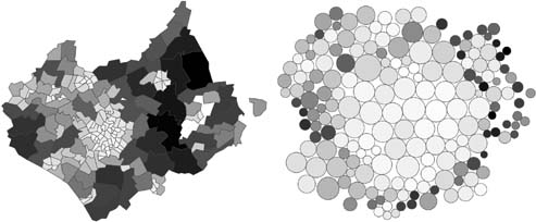
Both maps are shaded by land area. Circle size in the right-hand figure is proportional to population.
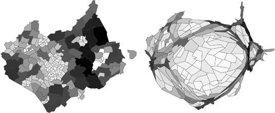
Cartograms may be continuous or noncontinuous. The former are space-filling, and a single transformation is applied to a region of interest. Topology is preserved, but shapes are distorted. This may make it difficult to recognize zones and compare area sizes (see Figure 2). Noncontinuous cartograms, such as that shown in Figure 1, contain gaps. Some resize areas according to population and map them at their original locations, retaining shape and location, but not contiguity. Similar to Figure 1, Daniel Dorling's New Social Atlas of Britain uses circle symbols to represent populations for each area, keeping symbols as near to the positions of the original zones as possible, while maintaining adjacencies between neighbors.
You can see a huge range of detailed cartograms and other graphics in the New Social Atlas of Britain. Online resources that use cartograms include the WorldMapper project, which explored global inequalities with a different cartogram for each day of 2006. Michael Gastner's cartograms of the 2004 U.S. presidential election map voting patterns according to population. Bettina Speckmann and Adrian Herzog's online applications generate cartograms. Daniel Keim's group has developed a number of techniques for generating cartograms and pixel-repositioning techniques to address overplotting issues in large, pixel-based geospatial data sets on large displays.
Figure 2 Land Area (Choropleth) Map and Continuous Population Cartogram of Leicestershire, U.K.
...
- Analytical Methods
- Analytical Cartography
- Cartographic Modeling
- Cost Surface
- Cost-Benefit Analysis
- Data Mining, Spatial
- Density
- Diffusion
- Ecological Fallacy
- Effects, First- and Second-Order
- Error Propagation
- Exploratory Spatial Data Analysis (ESDA)
- Fragmentation
- Geocoding
- Geodemographics
- Geographical Analysis Machine (GAM)
- Geographically Weighted Regression (GWR)
- Georeferencing, Automated
- Geostatistics
- Geovisualization
- Image Processing
- Interpolation
- Intervisibility
- Kernel
- Location-Allocation Modeling
- Minimum Bounding Rectangle
- Modifiable Areal Unit Problem (MAUP)
- Multicriteria Evaluation
- Multidimensional Scaling (MDS)
- Multivalued Logic
- Network Analysis
- Optimization
- Outliers
- Pattern Analysis
- Polygon Operations
- Qualitative Analysis
- Regionalized Variables
- Slope Measures
- Spatial Analysis
- Spatial Autocorrelation
- Spatial Econometrics
- Spatial Filtering
- Spatial Interaction
- Spatial Statistics
- Spatial Weights
- Spatialization
- Spline
- Structured Query Language (SQL)
- Terrain Analysis
- Cartography and Visualization
- Analytical Cartography
- Cartograms
- Cartography
- Choropleth Map
- Classification, Data
- Datum
- Generalization, Cartographic
- Geovisualization
- Isoline
- Legend
- Multiscale Representations
- Multivariate Mapping
- National Map Accuracy Standards (NMAS)
- Normalization
- Projection
- Scale
- Shaded Relief
- Symbolization
- Three-Dimensional Visualization
- Tissot's Indicatrix
- Topographic Map
- Virtual Environments
- Visual Variables
- Conceptual Foundations
- Accuracy
- Aggregation
- Cognitive Science
- Direction
- Discrete versus Continuous Phenomena
- Distance
- Elevation
- Extent
- First Law of Geography
- Fractals
- Geographic Information Science (GISci)
- Geographic Information Systems (GIS)
- Geometric Primitives
- Isotropy
- Layer
- Logical Expressions
- Mathematical Model
- Mental Map
- Metaphor, Spatial and Map
- Nonstationarity
- Ontology
- Precision
- Representation
- Sampling
- Scale
- Scales of Measurement
- Semantic Interoperability
- Semantic Network
- Spatial Autocorrelation
- Spatial Cognition
- Spatial Heterogeneity
- Spatial Reasoning
- Spatial Relations, Qualitatitve
- Topology
- Uncertainty and Error
- Data Manipulation
- Data Modeling
- z-Values
- Computer-Aided Drafting (CAD)
- Data Modeling
- Data Structures
- Database Management System (DBMS)
- Database, Spatial
- Digital Elevation Model (DEM)
- Discrete versus Continuous Phenomena
- Elevation
- Extensible Markup Language (XML)
- Geometric Primitives
- Index, Spatial
- Integrity Constraints
- Layer
- Linear Referencing
- Network Data Structures
- Object Orientation (OO)
- Open Standards
- Raster
- Scalable Vector Graphics (SVG)
- Spatiotemporal Data Models
- Structured Query Language (SQL)
- Tessellation
- Three-Dimensional GIS
- Topology
- Triangulated Irregular Networks (TIN)
- Virtual Reality Modeling Language (VRML)
- Design Aspects
- Geocomputation
- Geospatial Data
- Accuracy
- Address Standard, U.S.
- Attributes
- BLOB
- Cadastre
- Census
- Census, U.S.
- Computer-Aided Drafting (CAD)
- Coordinate Systems
- Data Integration
- Datum
- Digital Chart of the World (DCW)
- Digital Elevation Model (DEM)
- Framework Data
- Gazetteers
- Geodesy
- Geodetic Control Framework
- Geography Markup Language (GML)
- Geoparsing
- Georeference
- Global Positioning System (GPS)
- Interoperability
- LiDAR
- Linear Referencing
- Metadata, Geospatial
- Metes and Bounds
- Minimum Mapping Unit (MMU)
- National Map Accuracy Standards (NMAS)
- Natural Area Coding System (NACS)
- Photogrammetry
- Postcodes
- Precision
- Projection
- Remote Sensing
- Scale
- Semantic Network
- Spatial Data Server
- Standards
- State Plane Coordinate System
- TIGER
- Topographic Map
- Universal Transverse Mercator (UTM)
- Organizational and Institutional Aspects
- Address Standard, U.S.
- Association of Geographic Information Laboratories for Europe (AGILE)
- Canada Geographic Information System (CGIS)
- Census, U.S.
- Chorley Report
- Coordination of Information on the Environment (CORINE)
- COSIT Conference Series
- Data Access Policies
- Data Warehouse
- Digital Chart of the World (DCW)
- Digital Earth
- Digital Library
- Distributed GIS
- Enterprise GIS
- Environmental Systems Research Institute, Inc. (ESRI)
- ERDAS
- Experimental Cartography Unit (ECU)
- Federal Geographic Data Committee (FGDC)
- Framework Data
- Geomatics
- Geospatial Intelligence
- GIS/LIS Consortium and Conference Series
- Google Earth
- GRASS
- Harvard Laboratory for Computer Graphics and Spatial Analysis
- IDRISI
- Intergraph
- Interoperability
- Land Information Systems
- Life Cycle
- Location-Based Services (LBS)
- Manifold GIS
- MapInfo
- Metadata, Geospatial
- MicroStation
- National Center for Geographic Information and Analysis (NCGIA)
- National Geodetic Survey (NGS)
- National Mapping Agencies
- Open Geospatial Consortium (OGC)
- Open Source Geospatial Foundation (OSGF)
- Open Standards
- Ordnance Survey (OS)
- Quantitative Revolution
- Software, GIS
- Spatial Data Infrastructure
- Spatial Decision Support Systems
- Standards
- U.S. Geological Survey (USGS)
- University Consortium for Geographic Information Science (UCGIS)
- Web GIS
- Web Service
- Societal Issues
- Access to Geographic Information
- Copyright and Intellectual Property Rights
- Critical GIS
- Cybergeography
- Data Access Policies
- Digital Library
- Economics of Geographic Information
- Ethics in the Profession
- Geographic Information Law
- Historical Studies, GIS for
- Liability Associated With Geographic Information
- Licenses, Data and Software
- Location-Based Services (LBS)
- Privacy
- Public Participation GIS (PPGIS)
- Qualitative Analysis
- Quantitative Revolution
- Spatial Literacy
- Loading...
Get a 30 day FREE TRIAL
-
 Watch videos from a variety of sources bringing classroom topics to life
 -
Read modern, diverse business cases
-
Explore hundreds of books and reference titles

Read next

More like this
Sage Recommends
We found other relevant content for you on other Sage platforms.
Have you created a personal profile? Login or create a profile so that you can save clips, playlists and searches