Entry
Reader's guide
Entries A-Z
Subject index
Atlas of the World: A Brief Cartographic Overview (8.2 MB)
The Encyclopedia of Geography includes the following 18-page atlas as a convenient source for political maps of the world. This section also includes a global topographical map of the world and examples of some of the principal map projections used in depicting the world. In addition, the A–Z entries include numerous world maps relevant to both physical geography (e.g., angiosperm family richness, global distribution of deserts, ecoregions, the Köppen-Geiger climate classification) and human geography (e.g., colonial migrations, human development, famine-prone regions, Internet penetration rate). See the entries under “World maps” in the index at the end of this volume for a complete listing.
The maps included here offer a basic overview; however, space limitations do not allow for detailed depictions of countries and major cities. The College Atlas of the World published by Wiley and National Geographic is a useful source not only for more extensive political maps and other information in human geography but also for a global view of many aspects of physical geography.
For more detailed maps in human and physical geography:
For updated information on the global population:
The International Data Base of the U.S. Census Bureau, available online at http://www.census.gov/ipc/www/idb. Click on the Data Access tab on this Web site to view a variety of demographic indicators for each country, including past, present, and estimated population from 1950 to 2050. Country data can be viewed both as a table and as a population pyramid. The U.S. and World Population Clocks, which are constantly updated, can be found at http://www.census.gov/main/www/popclock.html.
Contents of the Atlas
Political Maps:
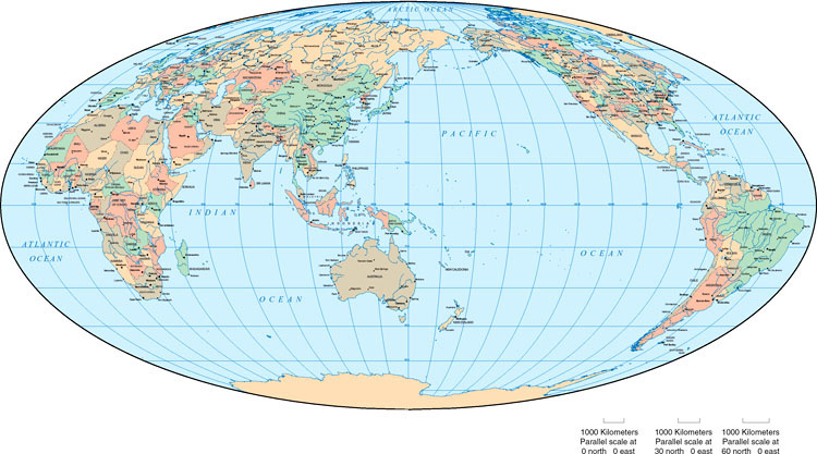
| World Map, Mollweide Projection | 3152–3153 |
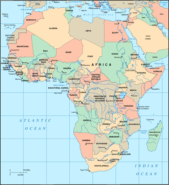
| Africa | 3154 |
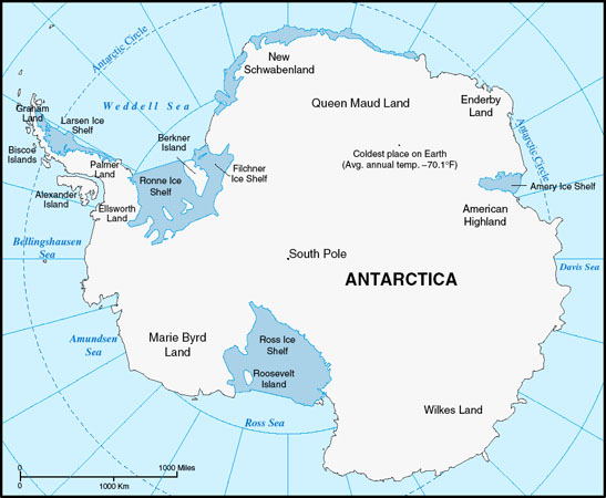
| Antarctica | 3155 |
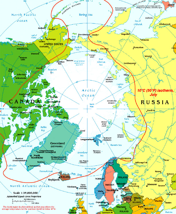
| Arctic Region | 3156 |
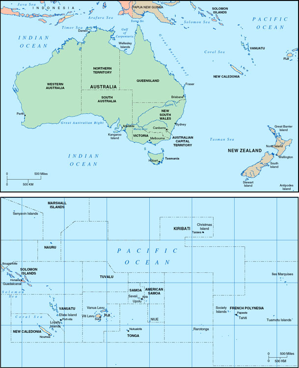
| Australia, New Zealand, and Oceania | 3157 |
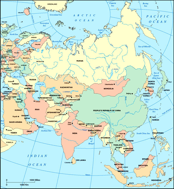
| Asia | 3158 |
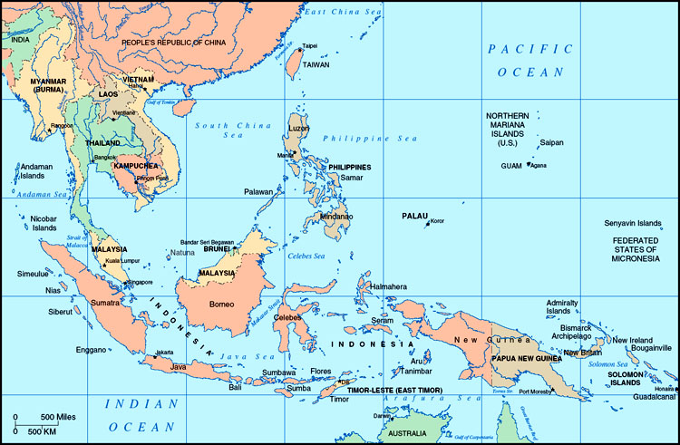
| Southeast Asia | 3159 |
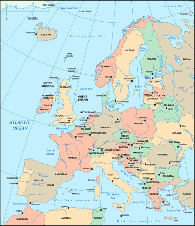
| Western Europe | 3160 |
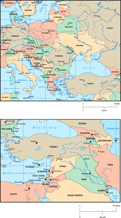
| Eastern Europe | 3161 |
| Caribbean | 3162 |
| North America: United States and Canada | 3163 |
| North America: Mexico and Central America | 3164 |
| South America | 3165 |
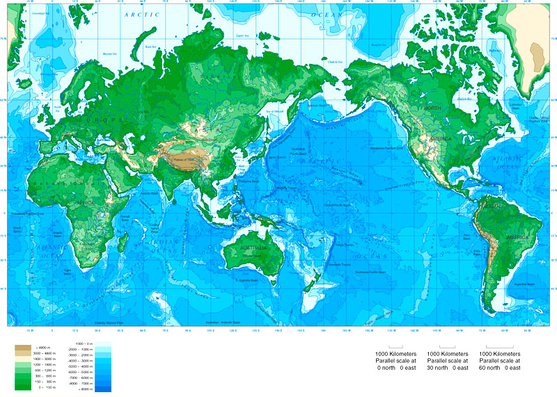
| Topographical Map of the World | 3166–3167 |
| Map Projections | 3168–3169 |
Map Sources
Political map of the world, Mollweide projection: © Map Resources.
Political maps of Africa, Antarctica, Australia, Asia, Southeast Asia, Oceania, Western Europe, Eastern Europe, Oceania, North America, the Caribbean, Mexico, Central America, and South America: Adapted by Sandra Sauvajot from Maps for Graphic Design, © Map Resources.
Political map of the Arctic: Perry-Casteñada Library Map Collection, University of Texas Libraries.
Global topographical map: © Map Resources.
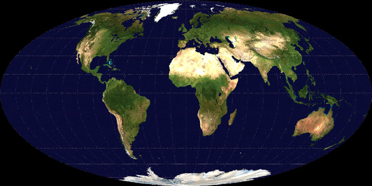
World Map, Mollweide Projection
Africa
Antarctica
Arctic Region
Australia, New Zealand, and Oceania
Asia
Southeast Asia
Western Europe
Eastern Europe
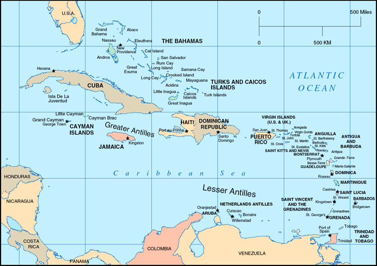
Caribbean
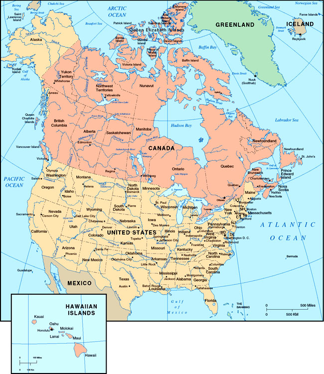
North America: United States and Canada
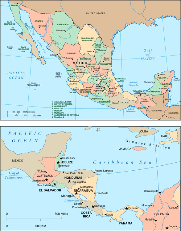
North America: Mexico and Central America
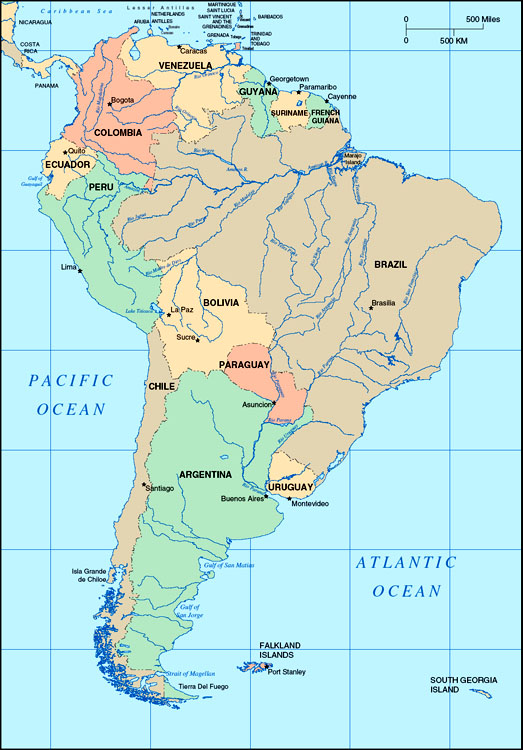
South America
Topographical Map of the World
Map Projections
Cartographers use a variety of projections to represent the spherical surface of Earth on a flat map. Because it is mathematically impossible to render a globe on a plane without changing the spatial configuration of the data involved, all such mapping involves some degree of distortion, so in choosing a projection, the cartographer will consider what properties are most important to preserve, at the cost of some other properties. For example, projections may accurately represent or distort the area (equivalence), shape (conformality), direction, distance, and scale of Earth's features, but not all of these simultaneously. Projections are important because maps shape how we view the world, and their distortions often enter into our geographical imaginations. Different types of projections are useful for different cartographic purposes. See the Map Projections entry in this encyclopedia for a detailed description of different types of projections.
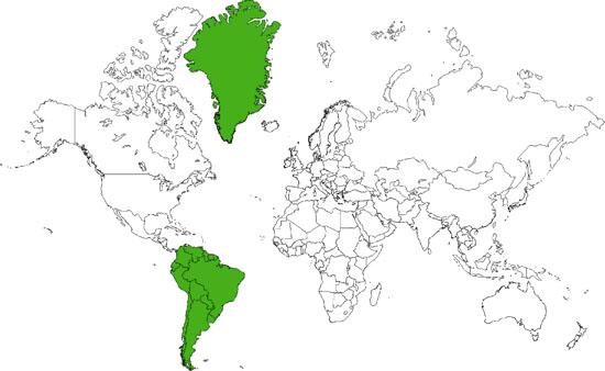
The majority of the maps in this encyclopedia use the Mercator projection, developed in the 16th century by Gerardus Mercator, a Flemish cartographer. Intended for navigation, it uses a rectangular grid that shows constant bearings as straight lines, and hence became popular among navigators. It remains the most commonly used map projection today, reproduced in countless classrooms, atlases, and textbooks. However, the Mercator projection greatly exaggerates the size of areas at higher latitudes (for example, Greenland is only as eighth as large as South America, but its area appears much greater on a Mercator map). In 1989, several North American geographical organizations passed a resolution urging the use of alternative projections.
The Mollweide projection, created in 1805 by the German mathematician Carl B. Mollweide, is a more accurate representation of the size of areas, but distances and shapes are distorted.
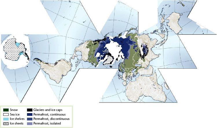
The Fuller dymaxion projection, created by R. Buckminster Fuller in the mid 20th century, is useful in showing the interconnectedness of Earth's landmasses and has less distortion of areas than the Mercator projection. It is used in this encyclopedia to show Earth's cryosphere (see Ice entry).
Developed in 1923 by John Paul Goode, the interrupted Goode homosoline projection presents the world in discrete regions in order to minimize distortions of size and shape. It is useful for showing raster data, in which a geographical area is divided into cells identified by row and column.
Mercator projection: This projection distorts the size of regions far from the equator. For example, Greenland appears to be larger than South America, but in fact, South America is eight times larger.
Mollweide projection: A Visible Earth image collected by the Earth Observatory experiment of the U.S. government's NASA space agency. The reticle is 15 degrees in latitude and longitude.

Buckminster Fuller or “Dymaxion map” projection: Earth's cryosphere. Snow cover extent for Northern Hemisphere is represented by the 1966–2005 February average, for Southern Hemisphere by the 1987–2003 August average. Sea ice extent for Northern Hemisphere is represented by the 1979–2003 March average, for Southern Hemisphere by the 1979–2002 September average. Permafrost data for mountain areas and for the Southern Hemisphere are not represented in this map; neither are river and lake ice.
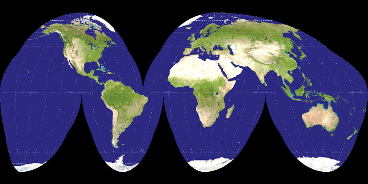
Interrupted Goode homolosine projection: A Goode projection of a Visible Earth image collected by the Earth Observatory experiment of the U.S. government's NASA space agency.

- Physical Geography: Biogeography
- Adaptive Radiation
- Animal Geographies
- Biodiversity
- Biogeochemical Cycles
- Biogeography
- Biome: Boreal Forest
- Biome: Desert
- Biome: Midlatitude Deciduous Forest
- Biome: Midlatitude Grassland
- Biome: Tropical Deciduous Forest
- Biome: Tropical Rain Forest
- Biome: Tropical Savanna
- Biome: Tropical Scrub
- Biome: Tundra
- Bioregionalism
- Biosphere Reserves
- Biota and Climate
- Biota and Soils
- Biota and Topography
- Biota Migration and Dispersal
- Coral Reef
- Ecoregions
- Ecoshed
- Ecosystem Decay
- Ecosystems
- Ecotone
- Exotic Species
- Extinctions
- Gaia Theory
- Great American Exchange
- Human-Induced Invasion of Species
- Invasion and Succession
- Island Biogeography
- Keystone Species
- Nutrient Cycles
- Organophosphates
- Peat
- Permaculture
- Phosphorus Cycle
- Prairies
- Pyrogeography
- Resilience
- Single Large or Several Small (SLOSS) Debate
- Species-Area Relationship
- Taphonomy
- Wetlands
- Physical Geography: Climatology
- Adiabatic Temperature Changes
- Air Masses
- Albedo
- Anthropogenic Climate Change
- Atmospheric Circulation
- Atmospheric Composition and Structure
- Atmospheric Energy Transfer
- Atmospheric Moisture
- Atmospheric Particulates across Scales
- Atmospheric Pressure
- Atmospheric Variations in Energy
- Carbon Cycle
- Carbon Trading and Carbon Offsets
- Carbonation
- Chinooks/Foehns
- Chlorinated Hydrocarbons
- Chlorofluorocarbons
- Climate Change
- Climate Policy
- Climate Types
- Climate: Dry
- Climate: Midlatitude, Mild
- Climate: Midlatitude, Severe
- Climate: Mountain
- Climate: Polar
- Climate: Tropical Humid
- Climatic Relict
- Climatology
- Clouds
- Coriolis Force
- Cyclones: Extratropical
- Cyclones: Occluded
- Derechos
- Differential Heating
- El Niño
- Equinox
- Filtration
- Fronts
- Global Sea-Level Rise
- Hadley Cell
- Humidity
- Hurricanes, Physical Geography of
- Köppen-Geiger Climate Classification
- Krummholtz
- La Niña
- Land-Water Breeze
- Lapse Rate
- Latent Heat
- Lightning
- Monsoons
- Precipitation Formation
- Precipitation, Global
- Radiation: Solar and Terrestrial
- Solar Energy
- Solstices
- Stratospheric Ozone Depletion
- Symptoms and Effects of Climate Change
- Teleconnections
- Temperature Patterns
- Thunderstorms
- Tornadoes
- Urban Heat Island
- Weather and Climate Controls
- Wind
- Physical Geography: Geomorphology
- Archipelago
- Arid Topography
- Atoll
- Barrier Islands
- Basin and Range Topography
- Caverns
- Coastal Erosion and Deposition
- Coral Reef Geomorphology
- Creep
- Delta
- Diastrophism
- Dunes
- Earthquakes
- Faulting
- Fjords
- Flocculation
- Floodplain
- Flow
- Folding
- Geologic Timescale
- Geomorphic Cycle
- Geomorphology
- Geothermal Features
- Glaciers: Continental
- Glaciers: Mountain
- Groundwater
- Gully Erosion
- Hydrological Connectivity
- Hydrology
- Ice
- Impermeable Surfaces
- Islands, Small
- Karst Topography
- Landforms
- Mass Wasting
- Minerals
- Nitrogen Cycle
- Oceanic Circulation
- Oceans
- Periglacial Environments
- Permafrost
- Plate Tectonics
- Playas
- Rill Erosion
- Rivers
- Rock Weathering
- Sedimentary Rock
- Sedimentation
- Soils
- Surface Water
- Volcanoes
- Wind Erosion
- Human Geography: Economic Geography
- Agglomeration Economies
- Applied Geography
- Automobile Industry
- Aviation and Geography
- Biotechnology Industry
- Business Cycles and Geography
- Business Geography
- Central Business District
- Central Place Theory
- Circuits of Capital
- Clusters
- Commodity Chains
- Comparative Advantage
- Competitive Advantage
- Cost-Benefit Analysis
- Crisis
- Debt and Debt Crisis
- Deindustrialization
- Dependency Theory
- Developing World
- Development Theory
- Division of Labor
- E-Commerce and Geography
- Economic Base Analysis
- Economic Geography
- Economies of Scale
- Economies of Scope
- Electronics Industry, Geography of
- Emerging Markets
- Euromarket
- Export Processing Zones
- Export-Led Development
- Externalities
- Factors Affecting Location of Firms
- Finance, Geography of
- Flexible Production
- Food, Geography of
- Fordism
- Foreign Aid
- Foreign Direct Investment
- Geospatial Industry
- Globalization
- Glocalization
- Gravity Model
- Gross Domestic Product/Gross National Product
- Growth Poles
- High Technology
- Import Substitution Industrialization
- Incubator Zones
- Industrial Districts
- Industrial Revolution
- Industrialization
- Informal Economy
- Information Society
- Infrastructure
- Innovation, Geography of
- Input-Output Models
- Knowledge Spillovers
- Knowledge, Geography of
- Labor, Geography of
- Learning Regions
- Location Theory
- Manufacturing Belt
- Marginal Regions
- Military Spending
- Modernization Theory
- Money, Geographies of
- Most Favored Nation Status
- Neocolonialism
- Neoliberalism
- New International Division of Labor
- Newly Industrializing Countries
- Offshore Finance
- Outsourcing
- Peasants and Peasantry
- Plantations
- Political Economy
- Ports and Maritime Trade
- Postindustrial Society
- Poverty
- Producer Services
- Product Cycle
- Railroads and Geography
- Real Estate, Geography and
- Regional Economic Development
- Regulation Theory
- Remittances
- Research and Development, Geographies of
- Restructuring
- Retail Trade, Geography of
- Rural Development
- Rural Geography
- Satellites and Geography
- Space of Flows
- Spatial Fix
- Steel Industry, Geography of
- Structural Adjustment
- Sustainable Development
- Sustainable Development Alternatives
- Technological Change, Geography of
- Telecommunications and Geography
- Textile Industry
- Thünen Model
- Trade
- Transnational Corporation
- Transportation Geography
- Underdevelopment
- Uneven Development
- Human Geography: Geographical Theory
- Absolute Space
- Actor-Network Theory
- Anarchism and Geography
- Behavioral Geography
- Complex Systems Models
- Complexity Theory
- Cosmopolitanism
- Critical Human Geography
- Cultural Turn
- Cyborg Ecologies
- Difference, Geographies of
- Discourse and Geography
- Empiricism
- Epistemology
- Ethics, Geography and
- Ethnocentrism
- Eurocentrism
- Existentialism and Geography
- Feminist Geographies
- Feminist Methodologies
- Gender and Geography
- Historicism
- Humanistic Geography
- Hybrid Geographies
- Idiographic
- Locality
- Logical Positivism
- Malthusianism
- Marxism, Geography and
- Models and Modeling
- Nomothetic
- Nonrepresentational Theory
- Ontology
- Orientalism
- Other/Otherness
- Panopticon
- Path Dependence
- Phenomenology
- Place
- Postcolonialism
- Postmodernism
- Poststructuralism
- Production of Space
- Queer Theory
- Race and Racism
- Radical Geography
- Realism
- Regional Geography
- Regional Science
- Regions and Regionalism
- Relative/Relational Space
- Representations of Space
- Scale, Social Production of
- Science and Technology Studies
- Sense of Place
- Situated Knowledge
- Spaces of Representation/Representational Spaces
- Spatial Turn
- Spatially Integrated Social Sciences
- Structuralism
- Structuration Theory
- Subaltern Studies
- Text/Textuality
- Time-Geography
- Time-Space Compression
- Vision and Geography
- Human Geography: Medical Geography
- Human Geography: Political Geography
- Borderlands
- Borders and Boundaries
- Cold War, Geography of
- Colonialism
- Communism and Geography
- Critical Geopolitics
- Cross-Border Cooperation
- Decolonization
- Democracy
- Deterritorialization and Reterritorialization
- Domino Theory
- Electoral Geography
- Frontiers
- Geopolitics
- Governance
- Hegemony
- Imperialism
- Military Geography
- Nation
- Nationalism
- Political Geography
- Public Policy, Geography of
- Redistricting
- Regional Governance
- Socialism and Geography
- Sovereignty
- State
- Supranational Integration
- Territory
- Transnationalism
- War, Geography of
- World-Systems Theory
- Human Geography: Social and Cultural Geography
- Accessibility
- Antiglobalization
- Antisystemic Movements
- Architecture and Geography
- Art and Geography
- Automobility
- Blindness and Geography
- Body, Geography of
- Built Environment
- Census
- Census Tracts
- Childhood Spatial and Environmental Learning
- Children, Geography of
- Citizenship
- Civil Society
- Class, Geography and
- Communications Geography
- Consumption, Geographies of
- Crime, Geography of
- Cultural Geography
- Cultural Landscape
- Cyberspace
- Demographic Transition
- Diaspora
- Diffusion
- Digital Divide
- Disability, Geography of
- Distance Decay
- Drugs, Geography of
- Education, Geographies of
- Elderly, Geography and the
- Emotions, Geography and
- Ethnic Segregation
- Ethnicity
- Everyday Life, Geography and
- Extreme Geography
- Famine, Geography of
- Fear, Geographies of
- Fertility Rate
- Film and Geography
- Folk Culture and Geography
- Gays and Lesbians, Geography and/of
- Genocide, Geographies of
- Geodemographics
- Geographical Ignorance
- Geographical Imagination
- Geography Education
- Geomancy
- Geophagy
- Geoslavery
- Hate, Geographies of
- Historical Geography
- Home
- Human Rights, Geography and
- Hunger
- Identity, Geography and
- Immigration
- Indigeneity
- Inequality and Geography
- Justice, Geography of
- Languages, Geography and/of
- Law, Geography of
- Literature, Geography and
- Masculinities and Geography
- Media and Geography
- Mental Maps
- Migration
- Mobility
- Mortality Rate
- Music and Sound, Geography and
- Natural Growth Rate
- Nonvisual Geographies
- Palimpsest
- Patriarchy, Geography and
- Photography, Geography and
- Pilgrimage
- Place Names
- Place Promotion
- Popular Culture, Geography and
- Population Density
- Population Geography
- Population Pyramid
- Psychoanalysis, Geography and
- Racial Segregation
- Refugees
- Religion, Geography and
- Resistance, Geographies of
- Segregation and Geography
- Sexuality, Geography and/of
- Social Geography
- Social Justice
- Spatial Cognition
- Spatial Cognitive Engineering
- Spatial Inequality
- Sports, Geography of
- Surveillance
- Symbolism and Place
- Television and Geography
- Terrorism, Geography of
- Time, Geographies of
- Toponymy
- Topophilia
- Tourism
- Travel Writing, Geography and
- Vernacular Landscapes as Expressions of Environmental Ideas
- Video Games, Geography and
- Virtual Geographies
- Wayfinding
- Whiteness
- Wine, Geography of
- Human Geography: Urban Geography
- Commuting
- Counterurbanization
- Exurbs
- Filtering
- Gated Community
- Gentrification
- Ghetto
- Growth Machine
- Historic Preservation
- Homelessness
- Housing and Housing Markets
- Housing Policy
- Los Angeles School
- Metropolitan Area
- Neighborhood
- New Urbanism
- Not in My Backyard (NIMBY)
- Participatory Planning
- Primate Cities
- Public Housing
- Public Space
- Public-Private Partnerships
- Rank-Size Rule
- Rent-Gap
- Rural-Urban Migration
- Settlement Geography
- Smart Growth
- Squatter Settlements
- Suburban Land Use
- Suburbs and Suburbanization
- Sunbelt
- Sustainable Cities
- Township and Range System
- Urban and Regional Development
- Urban and Regional Planning
- Urban Ecology
- Urban Environmental Studies
- Urban Gardens
- Urban Geography
- Urban Green Space
- Urban Hierarchy
- Urban Land Use
- Urban Planning and Geography
- Urban Policy
- Urban Spatial Structure
- Urban Sprawl
- Urban Underclass
- Urbanization
- World Cities
- Zoning
- Nature and Society: Agriculture
- Agricultural Biotechnology
- Agricultural Intensification
- Agricultural Land Use
- Agriculture, Industrialized
- Agriculture, Preindustrial
- Agrobiodiversity
- Agrochemical Pollution
- Agroecology
- Agrofoods
- Agroforestry
- Aquaculture
- Bush Fallow Farming
- Centers of Domestication
- Crop Genetic Diversity
- Crop Rotation
- Environmental Impacts of Agriculture
- Fish Farming
- Genetically Modified Organisms (GMOs)
- Indigenous Agriculture
- Marine Aquaculture
- Mixed Farming
- Organic Agriculture
- Shifting Cultivation
- Sustainable Agriculture
- Nature and Society: Environment and People
- Adaptive Harvest Management
- Biotechnology and Ecological Risk
- Carrying Capacity
- Chipko Movement
- Class, Nature and
- Corporate Voluntary Environmental Initiatives and Self-Regulation
- Coupled Human and Animal Systems
- Coupled Human and Natural Systems
- Critical Studies of Nature
- Cultural Ecology
- Deep Ecology Movements
- Deforestation
- Desertification
- Domestication of Animals
- Domestication of Plants
- Ecofeminism
- Ecological Economics
- Ecological Footprint
- Ecological Imaginaries
- Ecological Justice
- Ecological Modernization
- Ecological Regimes
- Ecological Risk Analysis
- Ecological Zones
- Ecotourism
- Energy Models
- Energy Policy
- Environment and Development
- Environmental Certification
- Environmental Discourse
- Environmental Entitlements
- Environmental Ethics
- Environmental History
- Environmental Imaginaries
- Environmental Impact Assessment
- Environmental Impact Statement
- Environmental Impacts of Cities
- Environmental Impacts of Manufacturing
- Environmental Impacts of Oil Fields
- Environmental Impacts of Pipelines
- Environmental Impacts of Roads
- Environmental Impacts of Tourism
- Environmental Impacts of War
- Environmental Justice
- Environmental Law
- Environmental Management
- Environmental Management: Drylands
- Environmental Perception
- Environmental Planning
- Environmental Protection
- Environmental Racism
- Environmental Refugees
- Environmental Restoration
- Environmental Rights
- Environmental Security
- Environmental Services
- Ethnicity and Nature
- Everglades Restoration
- Fair Trade and Environmental Certification
- Feminist Environmental Geographies
- Feminist Environmentalism
- Feminist Political Ecology
- Forest Degradation
- Forest Fragmentation
- Forest Land Use
- Forest Restoration
- Game Ranching
- Gender and Nature
- Global Environmental Change
- Human Dimensions of Global Environmental Change
- Human Ecology
- Hunting and Gathering
- Hybridization of Plant and Animal Species
- Indigenous and Community Conserved Areas
- Indigenous Environmental Knowledge
- Indigenous Environmental Practices
- Indigenous Forestry
- Indigenous Reserves
- Industrial Ecology
- Intergovernmental Environmental Organizations and Initiatives
- Land Degradation
- Land Reform
- Land Tenure
- Land Tenure Reform
- Land Use
- Land Use Analysis
- Land Use and Cover Change (LUCC)
- Land Use History
- Land Use Planning
- Landscape Architecture
- Landscape Biodiversity
- Landscape Design
- Landscape Ecology
- Landscape Interpretation
- Landscape Quality Assessment
- Landscape Restoration
- Locally Unwanted Land Uses (LULUs)
- Market-Based Environmental Regulation
- Mining and Geography
- Multistakeholder Participation
- Nature
- Nature-Society Theory
- Neo-Malthusianism
- Neoliberal Environmental Policy
- Nomadic Herding
- Nomadism
- Open Space
- Parks and Reserves
- Pest Management
- Pesticides
- Political Ecology
- Population and Land Degradation
- Population and Land Use
- Population, Environment, and Development
- Prairie Restoration
- Race and Nature
- Regional Environmental Planning
- Science, Technology, and Environment
- Social and Economic Impacts of Climate Change
- Social Construction of Nature
- Social Forestry
- Soil Conservation
- Soil Degradation
- Soil Depletion
- Soil Erosion
- Suitability Analysis
- Sustainability Science
- Sustainable Fisheries
- Sustainable Forestry
- Sustainable Production
- Urban Metabolism
- Urban Storm Water Management
- Urban Sustainability
- Urban Water Supply
- Wilderness
- Wine Terroir
- Wise Use Movement
- Xeriscaping
- Nature and Society: Hazards and Disasters
- Avalanches
- Bhopal, India, Chemical Disaster
- Chernobyl Nuclear Accident
- Coastal Hazards
- Differential Vulnerabilities to Hazards
- Disaster Prediction and Warning
- Disaster Preparedness
- Drought Risk and Hazard
- Flash Floods
- Floods
- Gender and Environmental Hazards
- Hurricane Katrina
- Hurricanes, Risk and Hazard
- Landslide
- Natural Hazards and Risk Analysis
- Oil Spills
- Remote Sensing in Disaster Response
- Risk Analysis and Assessment
- Three Mile Island Nuclear Accident
- Tsunami
- Tsunami of 2004, Indian Ocean
- Volcanic Eruptions as Risk and Hazard
- Vulnerability, Risks, and Hazards
- Wildfires: Risk and Hazard
- Nature and Society: Pollution and Waste
- Acid Rain
- Ambient Air Quality
- Atmospheric Pollution
- Brownfields
- Chemical Spills, Environment, and Society
- Coastal Dead Zones
- Coastal Zone and Marine Pollution
- Greenhouse Gases
- Heavy Metals as Pollutants
- Herbicides
- Landfills
- Love Canal
- Nonpoint Sources of Pollution
- Photochemical Smog
- Point Sources of Pollution
- Polychlorinated Biphenyls (PCBs)
- Recycling of Municipal Solid Waste
- Urban Solid Waste Management
- Waste Incineration
- Wastewater Management
- Water Pollution
- Nature and Society: Resources and Conservation
- Biofuels
- Coal
- Common Pool Resources
- Common Property Resource Management
- Commons, Tragedy of the
- Community Forestry
- Community-Based Conservation
- Community-Based Environmental Planning
- Community-Based Natural Resource Management
- Conservation
- Conservation Zoning
- Distribution of Resource Access
- Energy Resources
- Extractive Reserves
- Geothermal Energy
- Governmentality and Conservation
- Green Building
- Green Design and Development
- Greenbelts
- Hydroelectric Power
- Landscape and Wildlife Conservation
- Nonrenewable Resources
- Nuclear Energy
- Open-Pit Mining
- Patches and Corridors in Wildlife Conservation
- Petroleum
- Political Economy of Resources
- Renewable Resources
- Resource Economics
- Resource Geography
- Resource Management, Decision Models in
- Resource Tenure
- Spatial Strategies of Conservation
- Strip Mining
- Timber Plantations
- Tree Farming
- Wind Energy
- Woodfuel
- Nature and Society: Water
- Methods, Models, and GIS: Cartography
- Altitude
- Argumentation Maps
- Cadastral Systems
- Cartograms
- Cartography
- Choropleth Maps
- Color in Map Design
- Coordinate Geometry
- Coordinate Systems
- Coordinate Transformations
- Countermapping
- Dasymetric Maps
- Data Classification Schemes
- Datums
- Dot Density Maps
- Earth's Coordinate Grid
- Ecological Mapping
- Electronic Atlases
- Environmental Mapping
- Equator
- Flow Maps
- Gazetteers
- Geodesy
- Geolibraries
- Geometric Correction
- Geometric Measures
- Indigenous Cartographies
- Isopleth Maps
- Land Use and Land Cover Mapping
- Latitude
- Longitude
- Map Algebra
- Map Animation
- Map Design
- Map Evaluation and Testing
- Map Generalization
- Map Projections
- Map Visualization
- Multimedia Mapping
- Multivariate Mapping
- Participatory Mapping
- Poles, North and South
- Portolan Charts
- Resource Mapping
- Self-Organizing Maps
- Surveying
- Trap Streets
- Typography in Map Design
- Virtual Globes
- Voronoi Diagrams
- Methods, Models, and GIS: GIS
- Analytical Operations in GIS
- Business Models for Geographic Information Systems
- CAD Systems
- Cellular Automata
- Client-Server Architecture
- Collaborative GIS
- Conflation
- Critical GIS
- Data Compression Methods
- Data Editing
- Data Format Conversion
- Data Indexing
- Data Querying in GIS
- Database Management Systems
- Database Versioning
- Digital Terrain Model
- Digitizing
- Distributed Computing
- Dynamic and Interactive Displays
- Enterprise GIS
- Error Propagation
- Exploratory Spatial Data Analysis
- Geocoding
- Geocollaboration
- Geocomputation
- Geographic Information Systems
- Geospatial Semantic Web
- GIS Design
- GIS Implementation
- GIS in Archaeology
- GIS in Disaster Response
- GIS in Environmental Management
- GIS in Health Research and Health Care
- GIS in Land Use Management
- GIS in Local Government
- GIS in Public Policy
- GIS in Transportation
- GIS in Urban Planning
- GIS in Utilities
- GIS in Water Management
- GIS Software
- GIS Web Services
- GIS, Environmental Model Integration and
- GIScience
- Global Positioning System
- Google Earth
- Ground Reference Data
- Heuristic Methods in Spatial Analysis
- High-Performance Computing
- Humanistic GIScience
- Internet GIS
- Interoperability and Spatial Data Standards
- Legal Aspects of Geospatial Information
- Linear Referencing and Dynamic Segmentation
- Location-Based Services
- Metadata
- Mobile GIS
- Neogeography
- Network Analysis
- Network Data Model
- Ontological Foundations of Geographical Data
- Open Geodata Standards
- Open Source GIS
- Privacy and Security of Geospatial Information
- Public Participation GIS
- Scale in GIS
- Semantic Interoperability
- Semantic Reference Systems
- Spatial Data Infrastructures
- Spatial Data Integration
- Spatial Data Mining
- Spatial Data Models
- Spatial Data Structures
- Spatial Decision Support Systems
- Spatialization
- Supervised Classification
- Temporal GIS
- Temporal Resolution
- Terrain Analysis
- Three-Dimensional Data Models
- Topological Relationships
- Triangulated Irregular Network (TIN) Data Model
- Unsupervised Classification
- Usability of Geospatial Information
- Vagueness in Spatial Data
- Vectorization
- Viewshed Analysis
- Virtual and Immersive Environments
- Web Geoprocessing Workflows
- Web Service Architectures for GIS
- Methods, Models, and GIS: Qualitative Techniques
- Methods, Models, and GIS: Quantitative Models
- Agent-Based Models
- Bayesian Statistics in Spatial Analysis
- Ecological Fallacy
- Fieldwork in Physical Geography
- Geographically Weighted Regression
- Geostatistics
- Location Quotients
- Location-Allocation Modeling
- Modifiable Areal Unit Problem
- Multivariate Analysis Methods
- Point Pattern Analysis
- Quantitative Methods
- Shortest-Path Problem
- Spatial Analysis
- Spatial Autocorrelation
- Spatial Econometrics
- Spatial Interaction Models
- Spatial Interpolation
- Spatial Multicriteria Evaluation
- Spatial Optimization Methods
- Spatial Statistics
- Methods, Models, and GIS: Remote Sensing
- Aerial Imagery: Data
- Aerial Imagery: Interpretation
- Atmospheric Remote Sensing
- Biophysical Remote Sensing
- Energy and Human Ecology
- Geosensor Networks
- Image Enhancement
- Image Fusion
- Image Interpretation
- Image Processing
- Image Registration
- Image Texture
- Imaging Spectroscopy
- LiDAR and Airborne Laser Scanning
- Microwave/RADAR Data
- Multispectral Imagery
- Multitemporal Imaging
- Object-Based Image Analysis
- Panchromatic Imagery
- Photogrammetric Methods
- Radiometric Correction
- Radiometric Normalization
- Radiometric Resolution
- Remote Sensing
- Remote Sensing: Platforms and Sensors
- Spatial Resolution
- Spectral Characteristics of Terrestrial Surfaces
- Spectral Resolution
- Spectral Transformations
- Stereoscopy and Orthoimagery
- Thermal Imagery
- History of Geography
- Annales School
- Anthropogeography
- Antipodes
- Berkeley School
- Biblical Mapping
- Cartography, History of
- Chicago School
- Chorology
- Darwinism and Geography
- Enlightenment
- Environmental Determinism
- Exploration
- GIS, History of
- Human Geography, History of
- Lewis and Clark Expedition
- Modernity
- Physical Geography, History of
- Quantitative Revolution
- Race and Empire
- Sequent Occupance
- Social Darwinism
- T-in-O Maps
- People, Organizations, and Movements: Biographies
- Abler, Ronald
- Agamben, Giorgio
- Agnew, John
- al-Idrisi
- Anaximander
- Anselin, Luc
- Antevs, Ernst
- Aristotle
- Armstrong, Marc
- Barrows, Harlan
- Batty, Michael
- Berry, Brian
- Biruni
- Blaikie, Piers
- Blaut, James
- Bourghassi, Carmina
- Bowman, Isaiah
- Bunge, William
- Buttimer, Anne
- Câmara, Gilberto
- Castells, Manuel
- Chorley, Richard
- Chrisman, Nicholas
- Christaller, Walter
- Clark, Andrew
- Clark, William
- Columbus, Christopher
- Cook, Captain James
- Cosgrove, Denis
- Dangermond, Jack
- Darby, Henry Clifford
- Davis, William Morris
- Dear, Michael
- Dendrochronology
- Desert Varnish
- Diamond, Jared
- Earle, Carville
- Eastman, Ronald
- Egenhofer, Max
- Eratosthenes
- Febvre, Lucien
- Fisher, Peter
- Fotheringham, A. Stewart
- Frank, Andrew
- Gama, Vasco da
- Getis, Arthur
- Giddens, Anthony
- Gilbert, Grove Karl
- Golledge, Reginald
- Goodchild, Michael
- Goode, J. Paul
- Gottmann, Jean
- Gould, Peter
- Gregory, Derek
- Guyot, Arnold
- Hägerstrand, Torsten
- Haggett, Peter
- Hanson, Susan
- Harley, Brian
- Hartshorne, Richard
- Harvey, David
- Haushofer, Karl
- Hayden, Ferdinand
- Herodotus
- Hettner, Alfred
- Hipparchus
- Hou Renzhi
- Hoyt, Homer
- Humboldt, Alexander von
- Huntington, Ellsworth
- Ibn Battuta
- Ibn Khaldün
- Isard, Walter
- Jackson, John Brinckerhoff
- Jefferson, Thomas
- Johnston, R. J.
- Köppen, Wladimir
- Kant, Immanuel
- Kates, Robert
- Kropotkin, Peter
- Kuhn, Werner
- Kwan, Mei-Po
- Lösch, August
- Lefebvre, Henri
- Lewis, Peirce
- Ley, David
- Lillesand, Thomas
- Livingstone, David
- Lynch, William
- MacEachren, Alan
- Mackinder, Sir Halford
- Magellan, Ferdinand
- Mahan, Alfred Thayer
- Marcus, Melvin G.
- Mark, David M.
- Marsh, George Perkins
- Massey, Doreen
- Mather, John Russell
- Maury, Matthew Fontaine
- McKnight, Tom L.
- Meinig, Donald
- Mercator, Gerardus
- Miller, Harvey J.
- Mitchell, Don
- Monmonier, Mark
- Morrill, Richard
- Morse, Jedediah
- Nyerges, Timothy
- Okabe, Atsuyuki
- Olsson, Gunnar
- Ortelius
- Parsons, James
- Peet, Richard
- Penck, Walther
- Peuquet, Donna
- Pickles, John
- Powell, John Wesley
- Pred, Allan
- Ptolemy
- Raisz, Erwin
- Ratzel, Friedrich
- Reclus, Élisée
- Relph, Edward
- Ritter, Carl
- Rose, Gillian
- Sauer, Carl
- Schaefer, Fred
- Scott, Allen
- Semple, Ellen Churchill
- Smith, Neil
- Soja, Edward
- Storper, Michael
- Strabo
- Strahler, Arthur
- Sui, Daniel
- Taylor, Griffith
- Taylor, Peter
- Thales
- Thornthwaite, C. Warren
- Thrift, Nigel
- Tobler, Waldo
- Tomlinson, Roger
- Trewartha, Glenn
- Troll, Carl
- Tuan, Yi-Fu
- Turner, Billie Lee, II
- Unwin, David
- Vance, James
- Varenius
- Vidal de la Blache, Paul
- Virilio, Paul
- Waldseemüller, Martin
- Walker, Richard
- Watts, Michael
- Weber, Alfred
- White, Gilbert
- Whittlesey, Derwent
- Wilson, John
- Wittfogel, Karl
- Wood, Denis
- Wright, Dawn
- Wright, John Kirtland
- Zelinsky, Wilbur
- People, Organizations, and Movements: Geographical Organizations
- American Geographical Society
- Association of American Geographers
- Association of Geographic Information Laboratories for Europe
- Canadian Association of Geographers
- Conference of Latin Americanist Geographers
- Institute of British Geographers
- International Geographical Union
- National Center for Geographic Information and Analysis
- National Council for Geographic Education
- National Geographic Society
- Open Geospatial Consortium (OGC)
- Open Source Geospatial Foundation
- Regional Science Association International (RSAI)
- Royal Geographical Society
- Russian Geographical Society
- University Consortium for Geographic Information Science
- People, Organizations, and Movements: Political and Economic Organizations
- African Union
- Asia-Pacific Economic Cooperation
- Association of Southeast Asian Nations
- Commonwealth of Independent States
- Council for Mutual Economic Assistance (COMECON)
- European Union
- Food and Agriculture Organization (FAO)
- International Criminal Court
- International Monetary Fund
- National Aeronautics and Space Administration (NASA)
- North American Free Trade Agreement (NAFTA)
- North Atlantic Treaty Organization (NATO)
- Organisation for Economic Co-operation and Development (OECD)
- Organization of the Petroleum Exporting Countries (OPEC)
- United Nations
- World Bank
- World Court
- World Trade Organization (WTO)
- People, Organizations, and Movements: Scientific Organizations
- People, Organizations, and Movements: Social Movements
- Loading...
Get a 30 day FREE TRIAL
-
 Watch videos from a variety of sources bringing classroom topics to life
 -
Read modern, diverse business cases
-
Explore hundreds of books and reference titles
Read next

More like this
Sage Recommends
We found other relevant content for you on other Sage platforms.
Have you created a personal profile? Login or create a profile so that you can save clips, playlists and searches