Entry
Reader's guide
Entries A-Z
Subject index
Graphical Presentation of Data
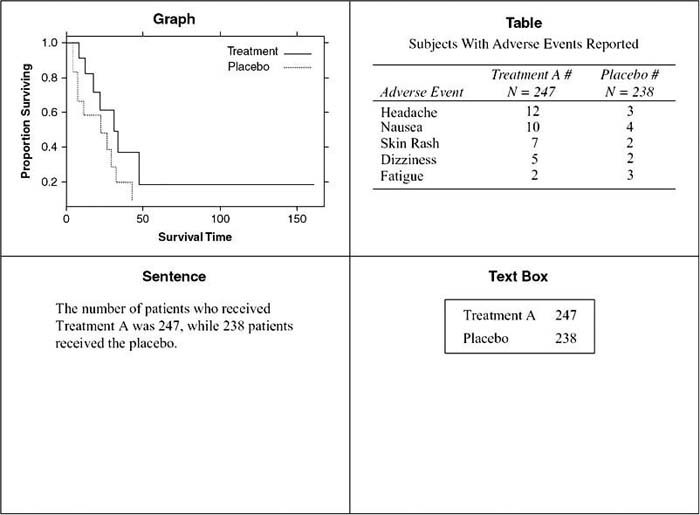
Graphs, tables, text boxes, and sentences can all be used to communicate quantitative information in epidemiology. Graphs present the big picture; they show patterns and trends. Tables contain the details, so they are useful for looking up specific values. Although sentences can provide a small amount of numerical data clearly, the numbers are easily lost in a page of text. Therefore, text boxes are useful for highlighting these numbers. This entry discusses how to choose between tables and graphs, the advantages of each, and guidelines for effective tables and graphs.
Choosing Tables or Graphs
Graphs are preferable for some situations and tables for others. The following list points out the advantages of each:
- Graphs show the big picture: patterns, trends, correlations, and the general shape of the data, while tables show exact values and offer precision.
- It is easy to detect extreme values such as the maximum and the minimum in a graph, while it is more difficult to do so with a table.
- Outliers, which are data points far from the rest of the data, are easier to spot on a graph, while they are more difficult to detect on a table.
- Graphs help discover data errors since problems such as an average value greater than a maximum value can be spotted easily. Tables are less effective in highlighting data errors.
- A great deal of information can be shown in a small space with a graph, while this is not true with tables.
- Graphs are appropriate for paper documents, Web documents, computer screens, or projector screens, while large tables are not appropriate for projector screens since the audience cannot see the details.
- Tables are useful for looking up values, while graphs offer only approximate values.
- Tables can accommodate a number of variables with different units of measures more easily than can graphs.
- The reader can use the data from tables for other purposes such as calculations and drawing other figures. This is more difficult with data from graphs.
Designing Graphs
Good graphs are powerful tools to visualize and understand data. Unfortunately, graphs can also confuse, mislead, or even deceive. This section provides principles of graph design to enable the reader to design effective graphs and to avoid common mistakes.
The data stand out in an effective graph. The designer should emphasize the data and de-emphasize everything else. Grid lines, if used, should be in the background. This can be achieved by making them a pale gray or by using adotted line. The plotting symbols and lines should be visually prominent; care must be taken so that the symbols are not hidden by tick marks, axes, grid lines, other data points, or other graphical elements. Clutter has no place in a graph. Too many tick marks or tick mark labels are a form of clutter. So are too many decimal places. The number of decimal places in labels should be appropriate for the data.
Figure 1 Examples of a Graph, a Table, a Sentence, and a Text Box (Not All the Same Data)
One form of clutter is adding a pseudo third dimension to bars, pies, lines, or other graphical elements. The unnecessary dimension often distorts the data. It always adds clutter. If bars are drawn with depth, the reader does not know how to read the bar. Is the value read from the front where the arrow on the X bar points or from the back where the arrow on the Y bar points? It turns out that the way to read these bars depends on the software that was used to create them, but the reader rarely knows what software was used. Two-dimensional bar charts are unambiguous. If the designer chooses to use a bar chart and knows the categories and values of the data, then a two-dimensional bar chart should always be the choice.
...
- Behavioral and Social Science
- Acculturation
- Bioterrorism
- Community Health
- Community Trial
- Community-Based Participatory Research
- Cultural Sensitivity
- Demography
- Determinants of Health Model
- Ecological Fallacy
- Epidemiology in Developing Countries
- EuroQoL EQ-5D Questionnaire
- Functional Status
- Genocide
- Geographical and Social Influences on Health
- Health Behavior
- Health Belief Model
- Health Communication
- Health Communication in Developing Countries
- Health Disparities
- Health Literacy
- Health, Definitions of
- Life Course Approach
- Locus of Control
- Medical Anthropology
- Network Analysis
- Participatory Action Research
- Poverty and Health
- Quality of Life, Quantification of
- Quality of Well-Being Scale (QWB)
- Race and Ethnicity, Measurement Issues With
- Race Bridging
- Rural Health Issues
- Self-Efficacy
- SF-36® Health Survey
- Social Capital and Health
- Social Epidemiology
- Social Hierarchy and Health
- Social Marketing
- Social-Cognitive Theory
- Socioeconomic Classification
- Spirituality and Health
- Targeting and Tailoring
- Theory of Planned Behavior
- Transtheoretical Model
- Urban Health Issues
- Urban Sprawl
- Branches of Epidemiology
- Applied Epidemiology
- Chronic Disease Epidemiology
- Clinical Epidemiology
- Descriptive and Analytic Epidemiology
- Disability Epidemiology
- Disaster Epidemiology
- Eco-Epidemiology
- Environmental and Occupational Epidemiology
- Field Epidemiology
- Genetic Epidemiology
- Injury Epidemiology
- Maternal and Child Health Epidemiology
- Molecular Epidemiology
- Neuroepidemiology
- Nutritional Epidemiology
- Pharmacoepidemiology
- Psychiatric Epidemiology
- Reproductive Epidemiology
- Social Epidemiology
- Veterinary Epidemiology
- Diseases and Conditions
- Alzheimer's Disease
- Anxiety Disorders
- Arthritis
- Asthma
- Autism
- Avian Flu
- Bipolar Disorder
- Bloodborne Diseases
- Cancer
- Cardiovascular Disease
- Diabetes
- Foodborne Diseases
- Gulf War Syndrome
- Hepatitis
- HIV/AIDS
- Hypertension
- Influenza
- Insect-Borne Disease
- Malaria
- Measles
- Oral Health
- Osteoporosis
- Parasitic Diseases
- Plague
- Polio
- Post-Traumatic Stress Disorder
- Schizophrenia
- Severe Acute Respiratory Syndrome (SARS)
- Sexually Transmitted Diseases
- Sick Building Syndrome
- Sleep Disorders
- Smallpox
- Suicide
- Toxic Shock Syndrome
- Tuberculosis
- Vector-Borne Disease
- Vehicle-Related Injuries
- Vitamin Deficiency Diseases
- Waterborne Diseases
- Yellow Fever
- Zoonotic Disease
- Epidemiological Concepts
- Attack Rate
- Attributable Fractions
- Biomarkers
- Birth Cohort Analysis
- Birth Defects
- Case Definition
- Case Reports and Case Series
- Case-Cohort Studies
- Case-Fatality Rate
- Cohort Effects
- Community Trial
- Competencies in Applied Epidemiology for Public Health Agencies
- Cumulative Incidence
- Direct Standardization
- Disease Eradication
- Effect Modification and Interaction
- Effectiveness
- Efficacy
- Emerging Infections
- Epidemic
- Etiology of Disease
- Exposure Assessment
- Fertility, Measures of
- Fetal Death, Measures of
- Gestational Age
- Health, Definitions of
- Herd Immunity
- Hill's Considerations for Causal Inference
- Incidence
- Indirect Standardization
- Koch's Postulates
- Life Course Approach
- Life Expectancy
- Life Tables
- Malnutrition, Measurement of
- Mediating Variable
- Migrant Studies
- Mortality Rates
- Natural Experiment
- Notifiable Disease
- Outbreak Investigation
- Population Pyramid
- Preclinical Phase of Disease
- Preterm Birth
- Prevalence
- Prevention: Primary, Secondary, and Tertiary
- Public Health Surveillance
- Qualitative Methods in Epidemiology
- Quarantine and Isolation
- Screening
- Sensitivity and Specificity
- Sentinel Health Event
- Syndemics
- Epidemiologic Data
- Administrative Data
- American Cancer Society Cohort Studies
- Behavioral Risk Factor Surveillance System
- Biomedical Informatics
- Birth Certificate
- Cancer Registries
- Death Certificate
- Framingham Heart Study
- Global Burden of Disease Project
- Harvard Six Cities Study
- Health Plan Employer Data and Information Set
- Healthcare Cost and Utilization Project
- Healthy People 2010
- Honolulu Heart Program
- Illicit Drug Use, Acquiring Information on
- Medical Expenditure Panel Survey
- Monitoring the Future Survey
- National Ambulatory Medical Care Survey
- National Death Index
- National Health and Nutrition Examination Survey
- National Health Care Survey
- National Health Interview Survey
- National Immunization Survey
- National Maternal and Infant Health Survey
- National Mortality Followback Survey
- National Survey of Family Growth
- Physicians' Health Study
- Pregnancy Risk Assessment and Monitoring System
- Relational Database
- Rochester Epidemiology Project
- Sampling Techniques
- Secondary Data
- Spreadsheet
- Youth Risk Behavior Surveillance System
- Ethics
- Genetics
- Association, Genetic
- Chromosome
- Epigenetics
- Family Studies in Genetics
- Gene
- Gene-Environment Interaction
- Genetic Counseling
- Genetic Disorders
- Genetic Epidemiology
- Genetic Markers
- Genomics
- Genotype
- Hardy-Weinberg Law
- Heritability
- Human Genome Project
- Icelandic Genetics Database
- Linkage Analysis
- Molecular Epidemiology
- Multifactorial Inheritance
- Mutation
- Newborn Screening Programs
- Phenotype
- Teratogen
- Twin Studies
- Health Care Economics and Management
- Biomedical Informatics
- EuroQoL EQ-5D Questionnaire
- Evidence-Based Medicine
- Formulary, Drug
- Functional Status
- Health Care Delivery
- Health Care Services Utilization
- Health Economics
- International Classification of Diseases
- International Classification of Functioning, Disability, and Health
- Managed Care
- Medicaid
- Medicare
- Partner Notification
- Quality of Life, Quantification of
- Quality of Well-Being Scale (QWB)
- SF-36® Health Survey
- Health Risks and Health Behaviors
- Agent Orange
- Alcohol Use
- Allergen
- Asbestos
- Bioterrorism
- Child Abuse
- Cholesterol
- Circumcision, Male
- Diabetes
- Drug Abuse and Dependence, Epidemiology of
- Eating Disorders
- Emerging Infections
- Firearms
- Foodborne Diseases
- Harm Reduction
- Hormone Replacement Therapy
- Intimate Partner Violence
- Lead
- Love Canal
- Malnutrition, Measurement of
- Mercury
- Obesity
- Oral Contraceptives
- Pain
- Physical Activity and Health
- Pollution
- Poverty and Health
- Radiation
- Sexual Risk Behavior
- Sick Building Syndrome
- Social Capital and Health
- Social Hierarchy and Health
- Socioeconomic Classification
- Spirituality and Health
- Stress
- Teratogen
- Thalidomide
- Tobacco
- Urban Health Issues
- Urban Sprawl
- Vehicle-Related Injuries
- Violence as a Public Health Issue
- Vitamin Deficiency Diseases
- War
- Waterborne Diseases
- Zoonotic Disease
- History and Biography
- Budd, William
- Doll, Richard
- Ehrlich, Paul
- Epidemiology, History of
- Eugenics
- Farr, William
- Frost, Wade Hampton
- Genocide
- Goldberger, Joseph
- Graunt, John
- Hamilton, Alice
- Hill, Austin Bradford
- Jenner, Edward
- Keys, Ancel
- Koch, Robert
- Lind, James
- Lister, Joseph
- Nightingale, Florence
- Pasteur, Louis
- Public Health, History of
- Reed, Walter
- Ricketts, Howard
- Rush, Benjamin
- Snow, John
- Tukey, John
- Tuskegee Study
- Infrastructure of Epidemiology and Public Health
- American College of Epidemiology
- American Public Health Association
- Association of Schools of Public Health
- Centers for Disease Control and Prevention
- Council of State and Territorial Epidemiologists
- European Public Health Alliance
- European Union Public Health Programs
- Food and Drug Administration
- Governmental Role in Public Health
- Healthy People 2010
- Institutional Review Board
- Journals, Epidemiological
- Journals, Public Health
- National Center for Health Statistics
- National Institutes of Health
- Pan American Health Organization
- Peer Review Process
- Public Health Agency of Canada
- Publication Bias
- Society for Epidemiologic Research
- Surgeon General, U.S.
- U.S. Public Health Service
- United Nations Children's Fund
- World Health Organization
- Medical Care and Research
- Allergen
- Apgar Score
- Barker Hypothesis
- Birth Defects
- Body Mass Index (BMI)
- Carcinogen
- Case Reports and Case Series
- Clinical Epidemiology
- Clinical Trials
- Community Health
- Community Trial
- Comorbidity
- Complementary and Alternative Medicine
- Effectiveness
- Efficacy
- Emerging Infections
- Etiology of Disease
- Evidence-Based Medicine
- Gestational Age
- Intent-to-Treat Analysis
- International Classification of Diseases
- International Classification of Functioning, Disability, and Health
- Latency and Incubation Periods
- Life Course Approach
- Malnutrition, Measurement of
- Medical Anthropology
- Organ Donation
- Pain
- Placebo Effect
- Preclinical Phase of Disease
- Preterm Birth
- Public Health Nursing
- Quarantine and Isolation
- Screening
- Vaccination
- Specific Populations
- African American Health Issues
- Aging, Epidemiology of
- American Indian Health Issues
- Asian American/Pacific Islander Health Issues
- Breastfeeding
- Child and Adolescent Health
- Epidemiology in Developing Countries
- Hormone Replacement Therapy
- Immigrant and Refugee Health Issues
- Latino Health Issues
- Maternal and Child Health Epidemiology
- Men's Health Issues
- Oral Contraceptives
- Race and Ethnicity, Measurement Issues With
- Race Bridging
- Rural Health Issues
- Sexual Minorities, Health Issues of
- Urban Health Issues
- Women's Health Issues
- Statistics and Research Methods
- F Test
- p Value
- Additive and Multiplicative Models
- Analysis of Covariance
- Analysis of Variance
- Bar Chart
- Bayes's Theorem
- Bayesian Approach to Statistics
- Bias
- Binomial Variable
- Birth Cohort Analysis
- Box-and-Whisker Plot
- Capture-Recapture Method
- Categorical Data, Analysis of
- Causal Diagrams
- Causation and Causal Inference
- Censored Data
- Central Limit Theorem
- Chi-Square Test
- Classification and Regression Tree Models
- Cluster Analysis
- Coefficient of Determination
- Cohort Effects
- Collinearity
- Community Trial
- Community-Based Participatory Research
- Confidence Interval
- Confounding
- Control Group
- Control Variable
- Convenience Sample
- Cox Model
- Critical Value
- Cumulative Incidence
- Data Management
- Data Transformations
- Decision Analysis
- Degrees of Freedom
- Dependent and Independent Variables
- Diffusion of Innovations
- Discriminant Analysis
- Dose-Response Relationship
- Doubling Time
- Dummy Coding
- Dummy Variable
- Ecological Fallacy
- Economic Evaluation
- Effect Modification and Interaction
- Factor Analysis
- Fisher's Exact Test
- Geographical and Spatial Analysis
- Graphical Presentation of Data
- Halo Effect
- Hawthorne Effect
- Hazard Rate
- Healthy Worker Effect
- Hill's Considerations for Causal Inference
- Histogram
- Hypothesis Testing
- Inferential and Descriptive Statistics
- Intent-to-Treat Analysis
- Internet Data Collection
- Interquartile Range
- Interrater Reliability
- Intervention Studies
- Interview Techniques
- Kaplan-Meier Method
- Kappa
- Kurtosis
- Latent Class Models
- Life Tables
- Likelihood Ratio
- Likert Scale
- Log-Rank Test
- Logistic Regression
- Longitudinal Research Design
- Matching
- Measurement
- Measures of Association
- Measures of Central Tendency
- Measures of Variability
- Meta-Analysis
- Missing Data Methods
- Multilevel Modeling
- Multiple Comparison Procedures
- Multivariate Analysis of Variance
- Natural Experiment
- Network Analysis
- Nonparametric Statistics
- Normal Distribution
- Null and Alternative Hypotheses
- Observational Studies
- Overmatching
- Panel Data
- Participatory Action Research
- Pearson Correlation Coefficient
- Percentiles
- Person-Time Units
- Pie Chart
- Placebo Effect
- Point Estimate
- Probability Sample
- Program Evaluation
- Propensity Score
- Proportion
- Qualitative Methods in Epidemiology
- Quasi Experiments
- Questionnaire Design
- Race Bridging
- Random Variable
- Random-Digit Dialing
- Randomization
- Rate
- Ratio
- Receiver Operating Characteristic (ROC) Curve
- Regression
- Relational Database
- Reliability
- Response Rate
- Robust Statistics
- Sample Size Calculations and Statistical Power
- Sampling Distribution
- Sampling Techniques
- Scatterplot
- Secondary Data
- Sensitivity and Specificity
- Sequential Analysis
- Simpson's Paradox
- Skewness
- Spreadsheet
- Stem-and-Leaf Plot
- Stratified Methods
- Structural Equation Modeling
- Study Design
- Survival Analysis
- Target Population
- Time Series
- Type I and Type II Errors
- Unit of Analysis
- Validity
- Volunteer Effect
- Loading...
Get a 30 day FREE TRIAL
-
 Watch videos from a variety of sources bringing classroom topics to life
 -
Read modern, diverse business cases
-
Explore hundreds of books and reference titles

Read next

More like this
Sage Recommends
We found other relevant content for you on other Sage platforms.
Have you created a personal profile? Login or create a profile so that you can save clips, playlists and searches