Entry
Reader's guide
Entries A-Z
Subject index
Bar Chart
A bar chart is a pictorial representation of the information in a frequency distribution. It displays the classes on the horizontal axis and the frequencies or relative frequencies of the classes on the vertical axis. The height of a bar represents how common a particular value or category is in a distribution. A frequency is the number of observations that fall in a class—that is, counts. A relative frequency is the ratio of the frequency of a class to the total number of observations—that is, the proportion or percentage of cases that fall into a class.
One may create either a frequency or a relative frequency bar chart. A frequency bar chart is a graph that displays the classes on the horizontal axis and the frequencies on the vertical axis. The frequency of each class is represented by a vertical bar whose height is equal to the number of times that class occurs in the data set. A relative frequency bar chart is a graph that displays the classes on the horizontal axis and the relative frequencies of the classes on the vertical axis. The only necessary difference between the two types of bar charts is the label on the y-axis: For a frequency bar chart, it will be counts, while for the relative frequency bar chart, it will be percentages.
It is also possible, although less common, to create a horizontal bar chart, which may display either frequency or a relative frequency. A horizontal bar chart displays the classes on the vertical axis and the frequencies or relative frequency on the horizontal axis.
Bar charts are distinguished in two primary ways from histograms:
- Bar charts are customarily used for discrete or categorical data, while histograms are used only for quantitative data. When histograms are used for continuous data, it usually needs to be grouped into categories.
- In a bar chart, space is left between the bars, that is, they do not touch each other, while in a histogram, bars may be connected to each other without space.
The second rule emphasizes the discrete or categorical nature of the data presented by the bar chart.
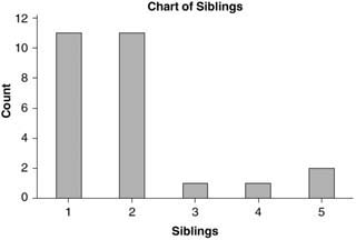
Consider the data given in Table 1, which were collected in a survey from a class of 26 students at Columbus State University.
The classes for grouping the data of sex are ‘Male’ and ‘Female,’ while the classes for grouping the data of siblings are numbers from 1 to 5. Tallying the data sets in Tables 2 and 3, we obtain the frequency and relative frequency distributions for sex and siblings, respectively.
A frequency bar chart and relative frequency bar chart for sex and siblings are displayed in Figures 1 and 2.
| Table 1 Survey Information Collected From a Class of Students at Columbus State University | ||
|---|---|---|
| Student | Siblings | Sex |
| 1 | 1 | Female |
| 2 | 1 | Female |
| 3 | 1 | Male |
| 4 | 1 | Male |
| 5 | 2 | Male |
| 6 | 1 | Male |
| 7 | 1 | Male |
| 8 | 2 | Male |
| 9 | 2 | Female |
| 10 | 2 | Male |
| 11 | 1 | Female |
| 12 | 2 | Male |
| 13 | 2 | Female |
| 14 | 2 | Female |
| 15 | 2 | Male |
| 16 | 2 | Male |
| 17 | 1 | Female |
| 18 | 5 | Male |
| 19 | 4 | Male |
| 20 | 1 | Female |
| 21 | 1 | Male |
| 22 | 2 | Male |
| 23 | 1 | Female |
| 24 | 3 | Female |
| 25 | 5 | Male |
| 26 | 2 | Female |
| Source: These data were collected in a survey by the author in an introductory stat class at Columbus State University. | ||
| Table 2 Frequency and Relative Frequency Table for Sex | ||
|---|---|---|
| Sex | Frequency | Relative Frequency |
| Male | 11 | 42% |
| Female | 15 | 58% |
| Total | 26 | 100 |
| Table 3 Frequency and Relative Frequency Table for Siblings | ||
|---|---|---|
| Siblings | Frequency | Relative Frequency |
| 1 | 11 | 42% |
| 2 | 11 | 42% |
| 3 | 1 | 4% |
| 4 | 1 | 4 |
| 5 | 2 | 8 |
| Total | 26 | 100% |
Figure 1 Number of Male and Female Students in a Class of Students at Columbus State University
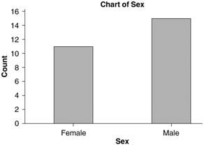
Figure 2 Number of Siblings for Students in a Class at Columbus State University
...
- Behavioral and Social Science
- Acculturation
- Bioterrorism
- Community Health
- Community Trial
- Community-Based Participatory Research
- Cultural Sensitivity
- Demography
- Determinants of Health Model
- Ecological Fallacy
- Epidemiology in Developing Countries
- EuroQoL EQ-5D Questionnaire
- Functional Status
- Genocide
- Geographical and Social Influences on Health
- Health Behavior
- Health Belief Model
- Health Communication
- Health Communication in Developing Countries
- Health Disparities
- Health Literacy
- Health, Definitions of
- Life Course Approach
- Locus of Control
- Medical Anthropology
- Network Analysis
- Participatory Action Research
- Poverty and Health
- Quality of Life, Quantification of
- Quality of Well-Being Scale (QWB)
- Race and Ethnicity, Measurement Issues With
- Race Bridging
- Rural Health Issues
- Self-Efficacy
- SF-36® Health Survey
- Social Capital and Health
- Social Epidemiology
- Social Hierarchy and Health
- Social Marketing
- Social-Cognitive Theory
- Socioeconomic Classification
- Spirituality and Health
- Targeting and Tailoring
- Theory of Planned Behavior
- Transtheoretical Model
- Urban Health Issues
- Urban Sprawl
- Branches of Epidemiology
- Applied Epidemiology
- Chronic Disease Epidemiology
- Clinical Epidemiology
- Descriptive and Analytic Epidemiology
- Disability Epidemiology
- Disaster Epidemiology
- Eco-Epidemiology
- Environmental and Occupational Epidemiology
- Field Epidemiology
- Genetic Epidemiology
- Injury Epidemiology
- Maternal and Child Health Epidemiology
- Molecular Epidemiology
- Neuroepidemiology
- Nutritional Epidemiology
- Pharmacoepidemiology
- Psychiatric Epidemiology
- Reproductive Epidemiology
- Social Epidemiology
- Veterinary Epidemiology
- Diseases and Conditions
- Alzheimer's Disease
- Anxiety Disorders
- Arthritis
- Asthma
- Autism
- Avian Flu
- Bipolar Disorder
- Bloodborne Diseases
- Cancer
- Cardiovascular Disease
- Diabetes
- Foodborne Diseases
- Gulf War Syndrome
- Hepatitis
- HIV/AIDS
- Hypertension
- Influenza
- Insect-Borne Disease
- Malaria
- Measles
- Oral Health
- Osteoporosis
- Parasitic Diseases
- Plague
- Polio
- Post-Traumatic Stress Disorder
- Schizophrenia
- Severe Acute Respiratory Syndrome (SARS)
- Sexually Transmitted Diseases
- Sick Building Syndrome
- Sleep Disorders
- Smallpox
- Suicide
- Toxic Shock Syndrome
- Tuberculosis
- Vector-Borne Disease
- Vehicle-Related Injuries
- Vitamin Deficiency Diseases
- Waterborne Diseases
- Yellow Fever
- Zoonotic Disease
- Epidemiological Concepts
- Attack Rate
- Attributable Fractions
- Biomarkers
- Birth Cohort Analysis
- Birth Defects
- Case Definition
- Case Reports and Case Series
- Case-Cohort Studies
- Case-Fatality Rate
- Cohort Effects
- Community Trial
- Competencies in Applied Epidemiology for Public Health Agencies
- Cumulative Incidence
- Direct Standardization
- Disease Eradication
- Effect Modification and Interaction
- Effectiveness
- Efficacy
- Emerging Infections
- Epidemic
- Etiology of Disease
- Exposure Assessment
- Fertility, Measures of
- Fetal Death, Measures of
- Gestational Age
- Health, Definitions of
- Herd Immunity
- Hill's Considerations for Causal Inference
- Incidence
- Indirect Standardization
- Koch's Postulates
- Life Course Approach
- Life Expectancy
- Life Tables
- Malnutrition, Measurement of
- Mediating Variable
- Migrant Studies
- Mortality Rates
- Natural Experiment
- Notifiable Disease
- Outbreak Investigation
- Population Pyramid
- Preclinical Phase of Disease
- Preterm Birth
- Prevalence
- Prevention: Primary, Secondary, and Tertiary
- Public Health Surveillance
- Qualitative Methods in Epidemiology
- Quarantine and Isolation
- Screening
- Sensitivity and Specificity
- Sentinel Health Event
- Syndemics
- Epidemiologic Data
- Administrative Data
- American Cancer Society Cohort Studies
- Behavioral Risk Factor Surveillance System
- Biomedical Informatics
- Birth Certificate
- Cancer Registries
- Death Certificate
- Framingham Heart Study
- Global Burden of Disease Project
- Harvard Six Cities Study
- Health Plan Employer Data and Information Set
- Healthcare Cost and Utilization Project
- Healthy People 2010
- Honolulu Heart Program
- Illicit Drug Use, Acquiring Information on
- Medical Expenditure Panel Survey
- Monitoring the Future Survey
- National Ambulatory Medical Care Survey
- National Death Index
- National Health and Nutrition Examination Survey
- National Health Care Survey
- National Health Interview Survey
- National Immunization Survey
- National Maternal and Infant Health Survey
- National Mortality Followback Survey
- National Survey of Family Growth
- Physicians' Health Study
- Pregnancy Risk Assessment and Monitoring System
- Relational Database
- Rochester Epidemiology Project
- Sampling Techniques
- Secondary Data
- Spreadsheet
- Youth Risk Behavior Surveillance System
- Ethics
- Genetics
- Association, Genetic
- Chromosome
- Epigenetics
- Family Studies in Genetics
- Gene
- Gene-Environment Interaction
- Genetic Counseling
- Genetic Disorders
- Genetic Epidemiology
- Genetic Markers
- Genomics
- Genotype
- Hardy-Weinberg Law
- Heritability
- Human Genome Project
- Icelandic Genetics Database
- Linkage Analysis
- Molecular Epidemiology
- Multifactorial Inheritance
- Mutation
- Newborn Screening Programs
- Phenotype
- Teratogen
- Twin Studies
- Health Care Economics and Management
- Biomedical Informatics
- EuroQoL EQ-5D Questionnaire
- Evidence-Based Medicine
- Formulary, Drug
- Functional Status
- Health Care Delivery
- Health Care Services Utilization
- Health Economics
- International Classification of Diseases
- International Classification of Functioning, Disability, and Health
- Managed Care
- Medicaid
- Medicare
- Partner Notification
- Quality of Life, Quantification of
- Quality of Well-Being Scale (QWB)
- SF-36® Health Survey
- Health Risks and Health Behaviors
- Agent Orange
- Alcohol Use
- Allergen
- Asbestos
- Bioterrorism
- Child Abuse
- Cholesterol
- Circumcision, Male
- Diabetes
- Drug Abuse and Dependence, Epidemiology of
- Eating Disorders
- Emerging Infections
- Firearms
- Foodborne Diseases
- Harm Reduction
- Hormone Replacement Therapy
- Intimate Partner Violence
- Lead
- Love Canal
- Malnutrition, Measurement of
- Mercury
- Obesity
- Oral Contraceptives
- Pain
- Physical Activity and Health
- Pollution
- Poverty and Health
- Radiation
- Sexual Risk Behavior
- Sick Building Syndrome
- Social Capital and Health
- Social Hierarchy and Health
- Socioeconomic Classification
- Spirituality and Health
- Stress
- Teratogen
- Thalidomide
- Tobacco
- Urban Health Issues
- Urban Sprawl
- Vehicle-Related Injuries
- Violence as a Public Health Issue
- Vitamin Deficiency Diseases
- War
- Waterborne Diseases
- Zoonotic Disease
- History and Biography
- Budd, William
- Doll, Richard
- Ehrlich, Paul
- Epidemiology, History of
- Eugenics
- Farr, William
- Frost, Wade Hampton
- Genocide
- Goldberger, Joseph
- Graunt, John
- Hamilton, Alice
- Hill, Austin Bradford
- Jenner, Edward
- Keys, Ancel
- Koch, Robert
- Lind, James
- Lister, Joseph
- Nightingale, Florence
- Pasteur, Louis
- Public Health, History of
- Reed, Walter
- Ricketts, Howard
- Rush, Benjamin
- Snow, John
- Tukey, John
- Tuskegee Study
- Infrastructure of Epidemiology and Public Health
- American College of Epidemiology
- American Public Health Association
- Association of Schools of Public Health
- Centers for Disease Control and Prevention
- Council of State and Territorial Epidemiologists
- European Public Health Alliance
- European Union Public Health Programs
- Food and Drug Administration
- Governmental Role in Public Health
- Healthy People 2010
- Institutional Review Board
- Journals, Epidemiological
- Journals, Public Health
- National Center for Health Statistics
- National Institutes of Health
- Pan American Health Organization
- Peer Review Process
- Public Health Agency of Canada
- Publication Bias
- Society for Epidemiologic Research
- Surgeon General, U.S.
- U.S. Public Health Service
- United Nations Children's Fund
- World Health Organization
- Medical Care and Research
- Allergen
- Apgar Score
- Barker Hypothesis
- Birth Defects
- Body Mass Index (BMI)
- Carcinogen
- Case Reports and Case Series
- Clinical Epidemiology
- Clinical Trials
- Community Health
- Community Trial
- Comorbidity
- Complementary and Alternative Medicine
- Effectiveness
- Efficacy
- Emerging Infections
- Etiology of Disease
- Evidence-Based Medicine
- Gestational Age
- Intent-to-Treat Analysis
- International Classification of Diseases
- International Classification of Functioning, Disability, and Health
- Latency and Incubation Periods
- Life Course Approach
- Malnutrition, Measurement of
- Medical Anthropology
- Organ Donation
- Pain
- Placebo Effect
- Preclinical Phase of Disease
- Preterm Birth
- Public Health Nursing
- Quarantine and Isolation
- Screening
- Vaccination
- Specific Populations
- African American Health Issues
- Aging, Epidemiology of
- American Indian Health Issues
- Asian American/Pacific Islander Health Issues
- Breastfeeding
- Child and Adolescent Health
- Epidemiology in Developing Countries
- Hormone Replacement Therapy
- Immigrant and Refugee Health Issues
- Latino Health Issues
- Maternal and Child Health Epidemiology
- Men's Health Issues
- Oral Contraceptives
- Race and Ethnicity, Measurement Issues With
- Race Bridging
- Rural Health Issues
- Sexual Minorities, Health Issues of
- Urban Health Issues
- Women's Health Issues
- Statistics and Research Methods
- F Test
- p Value
- Additive and Multiplicative Models
- Analysis of Covariance
- Analysis of Variance
- Bar Chart
- Bayes's Theorem
- Bayesian Approach to Statistics
- Bias
- Binomial Variable
- Birth Cohort Analysis
- Box-and-Whisker Plot
- Capture-Recapture Method
- Categorical Data, Analysis of
- Causal Diagrams
- Causation and Causal Inference
- Censored Data
- Central Limit Theorem
- Chi-Square Test
- Classification and Regression Tree Models
- Cluster Analysis
- Coefficient of Determination
- Cohort Effects
- Collinearity
- Community Trial
- Community-Based Participatory Research
- Confidence Interval
- Confounding
- Control Group
- Control Variable
- Convenience Sample
- Cox Model
- Critical Value
- Cumulative Incidence
- Data Management
- Data Transformations
- Decision Analysis
- Degrees of Freedom
- Dependent and Independent Variables
- Diffusion of Innovations
- Discriminant Analysis
- Dose-Response Relationship
- Doubling Time
- Dummy Coding
- Dummy Variable
- Ecological Fallacy
- Economic Evaluation
- Effect Modification and Interaction
- Factor Analysis
- Fisher's Exact Test
- Geographical and Spatial Analysis
- Graphical Presentation of Data
- Halo Effect
- Hawthorne Effect
- Hazard Rate
- Healthy Worker Effect
- Hill's Considerations for Causal Inference
- Histogram
- Hypothesis Testing
- Inferential and Descriptive Statistics
- Intent-to-Treat Analysis
- Internet Data Collection
- Interquartile Range
- Interrater Reliability
- Intervention Studies
- Interview Techniques
- Kaplan-Meier Method
- Kappa
- Kurtosis
- Latent Class Models
- Life Tables
- Likelihood Ratio
- Likert Scale
- Log-Rank Test
- Logistic Regression
- Longitudinal Research Design
- Matching
- Measurement
- Measures of Association
- Measures of Central Tendency
- Measures of Variability
- Meta-Analysis
- Missing Data Methods
- Multilevel Modeling
- Multiple Comparison Procedures
- Multivariate Analysis of Variance
- Natural Experiment
- Network Analysis
- Nonparametric Statistics
- Normal Distribution
- Null and Alternative Hypotheses
- Observational Studies
- Overmatching
- Panel Data
- Participatory Action Research
- Pearson Correlation Coefficient
- Percentiles
- Person-Time Units
- Pie Chart
- Placebo Effect
- Point Estimate
- Probability Sample
- Program Evaluation
- Propensity Score
- Proportion
- Qualitative Methods in Epidemiology
- Quasi Experiments
- Questionnaire Design
- Race Bridging
- Random Variable
- Random-Digit Dialing
- Randomization
- Rate
- Ratio
- Receiver Operating Characteristic (ROC) Curve
- Regression
- Relational Database
- Reliability
- Response Rate
- Robust Statistics
- Sample Size Calculations and Statistical Power
- Sampling Distribution
- Sampling Techniques
- Scatterplot
- Secondary Data
- Sensitivity and Specificity
- Sequential Analysis
- Simpson's Paradox
- Skewness
- Spreadsheet
- Stem-and-Leaf Plot
- Stratified Methods
- Structural Equation Modeling
- Study Design
- Survival Analysis
- Target Population
- Time Series
- Type I and Type II Errors
- Unit of Analysis
- Validity
- Volunteer Effect
- Loading...
Get a 30 day FREE TRIAL
-
 Watch videos from a variety of sources bringing classroom topics to life
 -
Read modern, diverse business cases
-
Explore hundreds of books and reference titles

Read next

More like this
Sage Recommends
We found other relevant content for you on other Sage platforms.
Have you created a personal profile? Login or create a profile so that you can save clips, playlists and searches