Entry
Reader's guide
Entries A-Z
Subject index
Multiple Correspondence Analysis
Correspondence analysis is a method for interpreting tabular data visually in the form of spatial maps in which the rows and columns of the table are depicted as points. The basic form of the method visualizes cross-tabulations found typically in the social sciences, for example, education groups cross-tabulated
with political party voted for or a table of counts of the number of consumers that associate each of a set of brands with a set of attributes. Multiple correspondence analysis generalizes this method to many variables, typically questions in a survey, showing how the response categories interrelate.
As a first example, we use data from Tawnya Covert's article “Consumption and Citizenship during World War II: Product Advertisements in Women's Magazines,” a study in the Journal of Consumer Culture on consumption during the period of the Second World War after Pearl Harbor, as observed through a sample of advertisements aimed at American women. From their wording, the advertisements could be categorized into three types of advertising appeal: unrestricted consumption ads, rationing ads, deferred payment ads, and an additional fourth category gathering other appeals. Table 1 reproduces two tables from this article, stacked one on top of the other: cross-tabulations of product type by appeal and of year by appeal. Since there are no missing data, the column totals of the two tables are identical. The author interprets these data by calculating percentages in each row; for example, of the 540 advertisements for food, 439 (81.3%) correspond to unrestricted consumption, 11 (2.0%) to deferred spending, 82 (15.2%) to rationed supplies, and 8 (1.5%) to others. This type of table is perfect for the application of correspondence analysis, a method for visualizing count data.
| Table 1 Cross-Tabulations of Product Type by Appeal and Year by Appeal; World War II Data | |||||
|---|---|---|---|---|---|
| Unrestricted Consumption | Deferred Spending | Rationed Supplies | Other Appeals | Sum | |
| Cosmetics | 219 | 0 | 0 | 1 | 220 |
| Personal hygiene | 254 | 1 | 14 | 4 | 273 |
| Household | 173 | 9 | 15 | 4 | 201 |
| Baby | 65 | 0 | 2 | 1 | 68 |
| Food | 439 | 11 | 82 | 8 | 540 |
| Small appliancess | 1 | 11 | 2 | 1 | 15 |
| Large appliances | 1 | 55 | 9 | 7 | 72 |
| Clothes | 99 | 4 | 17 | 1 | 121 |
| Cigarettes | 45 | 0 | 0 | 0 | 45 |
| Linens | 13 | 9 | 18 | 2 | 42 |
| Mattresses | 14 | 5 | 3 | 0 | 22 |
| Silverware | 0 | 32 | 2 | 0 | 34 |
| Home decor | 45 | 24 | 4 | 3 | 76 |
| Miscellaneous | 42 | 45 | 5 | 26 | 118 |
| Sum | 1410 | 206 | 173 | 58 | 1847 |
| 1942 | 126 | 7 | 4 | 3 | 140 |
| 1943 | 549 | 59 | 65 | 18 | 691 |
| 1944 | 549 | 112 | 87 | 25 | 773 |
| 1945 | 186 | 28 | 17 | 12 | 243 |
| Sum | 1410 | 206 | 173 | 58 | 1847 |
| Source: Covert 2003, 327, 330. | |||||
Figure 1 Correspondence Analysis Map of the Cross-Tabulations in Table 1
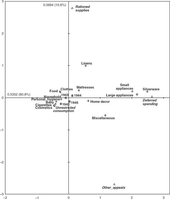
Figure 1 is the correspondence analysis (CA) of the first table (product type by appeal), with the second table (years by appeal) also visualized as so-called supplementary, or passive, points. The basic properties of the method are explained through the interpretation of this map, followed by a description of the extension to multivariate categorical data, called multiple correspondence analysis (MCA).
Simple Correspondence Analysis
The simple form of correspondence analysis (CA) applies primarily to cross-tabulations such as those in Table 1. The method visualizes the information in the table by depicting the rows and columns as points in a spatial map (see Greenacre 2007). In the same way that this table is interpreted numerically by calculating proportions, or equivalently percentages, relative to the row (product) totals, so CA visualizes these sets of relative frequencies as points in a space to facilitate comparison of the products. The reason why silverware and large and small appliances are grouped together on the right side in Figure 1 is because their proportions across the appeal categories are similar. And the reason why personal hygiene, baby, cosmetics, et cetera, on the left side, are far from those on the right is because their proportions are quite different from those. In fact, the horizontal axis in this map coincides with the largest differences in the data set. The value 0.5302 on this axis quantifies how much of the total interproduct difference is “explained” by this axis, being 80.8% of that total. The vertical axis is not as important as the first, as shown by the value of 0.0694 (10.6% of total), but together they explain 91.4% of the interproduct differences. This percentage is analogous to the explained variance concept in multiple regression—the two axes can be considered two new variables, with values for the products equal to their coordinates, and these two variables predict the proportions in the data with an accuracy of 91.4%, with only 8.6% of the “variance” unexplained.
...
- Everyday Life
- Addiction
- Adornment
- Aestheticization of Everyday Life
- Aesthetics
- Alternative Medicine
- Americanization
- Anorexia
- Architecture
- Art and Cultural Worlds
- Asceticism
- Authenticity
- Barbie Dolls
- Body Shop, The
- Body, The
- Bricolage
- Car Cultures
- Childhood
- Cinema
- Civilizing Processes
- Clothing Consumption
- Clubbing
- Coffee Shops
- Collecting and Collectibles
- Consumer Dissatisfaction
- Consumer Illnesses and Maladies
- Consumer Socialization
- Convenience
- Cool Hunters
- Cosmetic Surgery
- Cosmetics
- Cultural Flows
- Dandyism
- Desire
- Dieting
- Dining Out
- Discount Stores
- Downshifting
- Emotions
- Family Meal
- Fans
- Fashion
- Food Consumption
- Gambling
- Gardening
- Glastonbury/Woodstock
- Hair Care/Hairdressing
- Happiness
- Harried Leisure Class
- Hedonism
- Higher Education
- Hobbyists and Amateurs
- Imaginative Hedonism
- Inventing Tradition
- Jeans
- Leisure
- Mass Tourism
- Memorials
- Memory
- Metrosexual
- Multiculturalism
- Nostalgia
- Obesity
- Organic Food
- Pubs and Wine Bars
- Recreation
- Retro
- Routines and Habits
- Satiation
- Seaside Resorts
- Senses
- Sex
- Sex Tourism
- Slow Food Movement
- Sociability
- Souvenirs
- Sports
- Style
- Supermodels
- T-Shirts
- Tamed Hedonism
- Taste
- Thrift
- Toys
- Typologies of Shoppers
- Waste
- Weddings
- Well-Being
- Work-and-Spend Cycle
- Youth Culture
- Geographies and Histories of Consumer Culture
- Air and Rail Travel
- Automobiles
- Bicycles
- British Empire
- Car-Boot Sales and Flea Markets
- Caribbean and the Slave Trade
- Carnivals
- Christianity
- Coffee
- Cold War
- Colonialism
- Confectionery
- Consumer Co-Operatives
- Consumer Culture in Africa
- Consumer Culture in East Asia
- Consumer Culture in Latin America
- Consumer Nationalism
- Consumer Revolution in Eighteenth-Century Britain
- Consumption in Postsocialist China
- Consumption in Postsocialist Societies: Eastern Europe
- Consumption in the United States: Colonial Times to the Cold War
- Delocalization
- Department Stores
- Diaspora
- Disney
- Do-It-Yourself
- Enlightenment
- European Union
- Famine
- Flaneur/euse
- Franchising
- Gendering of Public and Private Space
- Ghettos
- Grand Tour
- Great Depression (U.S.)
- Hinduism
- History of Food
- Home Computer
- Islam
- Italian Fascism and Fashion
- Japan as a Consumer Culture
- Liminality
- Locality
- Medieval Consumption
- Metropole
- Moral Geography
- National Cultures
- Opium Trade
- Porcelain
- Radio
- Rationing
- Sears, Roebuck and Company
- Shopping
- Smuggling and Black Markets
- Socialism and Consumption
- Spaces and Places
- Spaces of Shopping
- Spas
- Spices
- Suburbia
- Sugar
- Tea
- Textiles
- Tobacco
- Tourist Gaze
- Transnational Capitalism
- Tupperware
- Urban Cultures
- Voluntary Associations
- Walmart
- Wine
- World Exhibitions
- Zoos and Wildlife Parks
- Methods and Trends
- Actor-Network Theory
- Attitude Surveys
- Autoethnography
- Comparing Consumer Cultures
- Consumer Expenditure Surveys
- Consumer Interviews
- Consumption and Time Use
- Consumption Patterns and Trends
- Content Analysis
- Conversation Analysis
- Databases and Consumers
- Discourse Analysis
- Econometrics
- Economic Indicators
- Ethnography
- Focus Groups
- Historical Analysis
- Lifestyle Typologies
- Likert Scales
- Longitudinal Studies
- Mass Observation
- Measuring Satisfaction
- Measuring Standards of Living
- Measuring the Environmental Impact of Consumption
- Methodologies for Studying Consumer Culture
- Methods of Market Research
- Motivation Research
- Multiple Correspondence Analysis
- Multisited Ethnography
- Multivariate Analysis
- Object Biographies
- Opinion Polls
- Production of Culture
- Social Network Analysis
- Spatial Analysis
- Surveys
- Time-Use Diaries
- Persons
- Adorno, Theodor
- Althusser, Louis
- Bakhtin, Mikhail
- Barthes, Roland
- Bataille, Georges
- Baudrillard, Jean
- Benjamin, Walter
- Bourdieu, Pierre
- Braudel, Fernand
- de Certeau, Michel
- Douglas, Mary
- Durkheim, Émile
- Elias, Norbert
- Freud, Sigmund
- Galbraith, John Kenneth
- Goffman, Erving
- Gramsci, Antonio
- Horkheimer, Max
- Kant, Immanuel
- Keynes, John Maynard
- Kyrk, Hazel
- Lévi-Strauss, Claude
- Lasch, Christopher
- Lazarsfeld, Paul Felix
- Lefebvre, Henri
- Linder, Staffan Burenstam
- Lyotard, Jean-François
- Mandeville, Bernard
- Marcuse, Herbert
- Marshall, Alfred
- Marx, Karl
- Maslow, Abraham
- Mauss, Marcel
- McLuhan, Marshall
- Mead, George Herbert
- Patten, Simon Nelson
- Rostow, Walt Whitman
- Silverstone, Roger
- Simmel, Georg
- Smith, Adam
- Sombart, Werner
- Veblen, Thorstein Bunde
- Weber, Max
- Politics and Consumption
- Alternative Consumption
- Carbon Trading
- Citizenship
- Civil Society
- Consumer Apathy
- Consumer Culture in the USSR
- Consumer Policy (China)
- Consumer Policy (European Union)
- Consumer Policy (Japan)
- Consumer Policy (United States)
- Consumer Policy (World Trade Organization)
- Consumer Protest: Animal Welfare
- Consumer Protest: Anticapitalism
- Consumer Protest: Environment
- Consumer Protest: Water
- Consumer Rights and the Law
- Culture Jamming
- Culture-Ideology of Consumerism
- Feminist Movement
- Food Scares
- Governmentality
- Inequalities
- Life(style) Politics
- Luxury Taxes
- New Right
- Organ and Blood Donations
- Philanthropy
- Political and Ethical Consumption
- Prosumption
- Public Goods
- Public Sphere
- Resistance
- Responsible Consumption
- Social Movements
- State Provisioning
- Subversion
- Voting Behaviors
- Production, Exchange, and Distribution
- Advertising
- Branding
- Celebrity
- Channels of Desire
- Christmas
- Coca-Cola
- Collective Consumption
- Companies as Consumers
- Consumer Education
- Consumer Regulation
- Consumer Testing and Protection Agencies
- Counterfeited Goods
- Craft Production
- Credit
- Cultural Intermediaries
- Culture Industries
- Cycles of Production and Consumption
- De-Skilling, Re-Skilling, and Up-Skilling
- Debt
- Division of Labor
- Domestic Services
- E-Commerce
- Eco-Labeling
- Electronic Point of Sale (EPOS)
- Emotional Labor
- Energy Consumption
- Environmental Footprinting
- Fair Trade
- Fashion Forecasters
- Fashion Industry
- Global Cities
- Global Institutions
- Health Care
- Hire-Purchase and Rental Goods
- Household Budgets
- Industrial Society
- Informal Economy
- Information Society
- Informational Capital
- Infrastructures and Utilities
- Inheritance
- Innovation Studies
- Licensing of Clothing Brands
- Mass Production and Consumption
- Media Convergence and Monopoly
- Money
- Neuromarketing
- Opinion Leaders
- Outsourcing
- Packaging
- Pink Pounds/Dollars
- Post-Fordism
- Postindustrial Society
- Product Loss Leaders
- Product Placements
- Renewable Resources
- Reuse/Recycling
- Self-Service Economy
- Service Industry
- Sneakers/Trainers
- Social and Economic Development
- Store Loyalty Cards
- Sumptuary Laws
- Supermarkets
- Systems of Provision
- Trade Standards
- Trademarks
- Social Divisions and Social Groups
- Age and Aging
- American Dream
- Belonging
- Binge and Excess
- Collective Identity
- Consumer Anxiety
- Cosmopolitanism
- Domestic Division of Labor
- Elites
- Ethnicity/Race
- Families
- Femininity
- Friendship
- Gender
- Generation
- Households
- Identity
- Interpellation
- Life Course
- Lifestyle
- Masculinity
- Migration
- Mimesis
- Moral Economy
- Othering
- Positional Goods
- Retirement
- Romantic Love
- Seduced and Repressed
- Self-Presentation
- Self-Reflexivity
- Sexuality
- Single-Person Households
- Social Class
- Social Exclusion
- Social Networks
- Status
- Subaltern
- Symbolic Violence
- Technology and Media
- Audience Research
- Bollywood
- Broadcast Media
- Comics
- Cyborgs
- Domestic Technologies
- Electronic Video Gaming
- Feminism and Women's Magazines
- Fine Arts
- Gender Advertising
- Hollywood
- Information Technology
- Internet
- Men's Magazines
- Mobile Media Gadgets of the Analog Age
- Mobile Phones
- Performing Arts/Performance Arts
- Personals/Personal Ads
- Photography and Video
- Planned Obsolescence
- Popular Music
- Print Media
- Reality TV
- Second Life
- Soap Operas and Telenovelas
- Social Shaping of Technology
- Sociotechnical Systems
- Teenage Magazines
- Telephones
- Television
- Textual Poachers
- Virtual Communities
- Walkmans and iPods
- Women's Magazines
- Theoretical Perspectives and Concepts
- Acculturation
- Affluent Society
- Alienation
- Anomie
- Anthropology
- Appropriation
- Attitude Theory
- Beauty Myth
- Bounded Rationality
- Capitalism
- Circuits of Culture/Consumption
- Cognitive Structures
- Commercialization
- Commodification
- Commodities
- Communication Studies
- Conspicuous Consumption
- Consumer (Freedom of) Choice
- Consumer Behavior
- Consumer Demand
- Consumer Durables
- Consumer Moods
- Consumer Society
- Consumer Sovereignty
- Consuming the Environment
- Convention Theory
- Craft Consumer
- Cultural Capital
- Cultural Fragmentation
- Cultural Omnivores
- Cultural Studies
- Cultural Turn
- Decommodification
- Dematerialization
- Design
- Diderot Effect
- Diffusion Studies and Trickle Down
- Discourse
- Disorganized Capitalism
- Economic Psychology
- Economic Sociology
- Economics
- Embodiment
- Engel's Law
- Entrepreneurs
- Environmental Social Sciences and Sustainable Consumption
- Ethnology/Folklore Studies
- Experimental Economics
- Externalities
- False Consciousness/False Needs
- Gender and the Media
- Geography
- Gifts and Reciprocity
- Globalization
- Glocalization
- Goal-Directed Consumption
- Habitus
- Hegemony
- Hierarchy of Needs
- History
- Hyperreality
- Inalienable Wealth/Inalienable Possessions
- Income
- Individualization
- Informalization
- Keynesian Demand Management
- Labor Markets
- Leisure Studies
- Luxury and Luxuries
- Markets and Marketing
- Marxist Theories
- Mass Culture (Frankfurt School)
- Material Culture
- Materialism and Postmaterialism
- McDonaldization
- Modernization Theory
- Moralities
- Narcissism
- Need and Wants
- Neo-Tribes
- Network Society
- Novelty
- Obsession
- Ordinary Consumption
- Orientalism
- Philosophy
- Political Economy
- Political Science
- Post-Structuralism
- Postcolonial Theory
- Postmodernism
- Potlatch
- Poverty
- Preference Formation
- Price and Price Mechanisms
- Promotional Culture
- Protestant Ethic
- Psychoanalysis
- Psychology
- Quality of Life
- Queer Theory
- Rationalization
- Reception Theory
- Reification
- Risk Society
- Rituals
- Sacred and Profane
- Scarcity
- Self-Interest
- Semiotics
- Simulacrum
- Social Distinction
- Sociology
- Spectacles
- Structuralism
- Subculture
- Surplus Value
- Surrealism
- Symbolic Capital
- Symbolic Value
- Taboo
- Theories of Practice
- Theory of Planned Behavior
- Totemism
- Tourism Studies
- Trust
- Urbanization
- Value: Exchange and Use Value
- Visual Culture
- World-Systems Analysis
- Loading...
Get a 30 day FREE TRIAL
-
 Watch videos from a variety of sources bringing classroom topics to life
 -
Read modern, diverse business cases
-
Explore hundreds of books and reference titles

Read next

More like this
Sage Recommends
We found other relevant content for you on other Sage platforms.
Have you created a personal profile? Login or create a profile so that you can save clips, playlists and searches