

The 2007/8 Global Financial Crisis: A Decade On
Case
Supplementary Resources
Abstract
The case provides an overview of the causes of the global financial crisis of 2007 to 2008 and the responses taken by the U.S. government in the short term and the new regulation implemented, namely the Dodd-Frank Act, to ensure that the crisis would not happen again. Students are invited to consider how the financial market in the U.S. has changed in the decade after the crisis and whether current financial regulation will be sufficient to prevent another crisis.
This case study is provided in this Sage Business collection primarily as a basis for classroom discussion or self-study and is not meant to illustrate either effective or ineffective management styles. Nothing herein shall be deemed to be an endorsement of any kind. This case study is for scholarly, educational, or personal use only within your university, and cannot be forwarded outside the university or used for other commercial purposes.
© 2026 Sage Publications, Inc. All Rights Reserved.
Resources
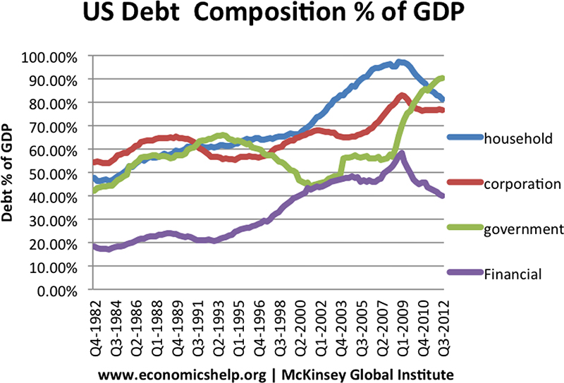
Exhibit 1: Rising Debt in the US, 1982–2012
The graph is titled “US Debt Composition % of GDP.” The x-axis lists the years and y-axis is scaled from 0.00% to 100.00% with a gap of 10.00% and labeled “Debt % of GDP.” The data shown by the graph, with approximate values, are tabulated below:
| Years | Debt % of GDP | |||
| Household | Corporation | Government | Financial | |
| Q4-1982 | 48% | 54% | 42% | 18% |
| Q3-1984 | 48% | 55% | 44% | 19% |
| Q2-1986 | 50% | 60% | 50% | 20% |
| Q1-1988 | 56% | 64% | 56% | 24% |
| Q4-1989 | 60% | 66% | 58% | 22% |
| Q3-1991 | 62% | 61% | 62% | 21% |
| Q2-1993 | 62% | 58% | 63% | 22% |
| Q1-1995 | 63% | 57% | 63% | 25% |
| Q4-1996 | 64% | 58% | 60% | 28% |
| Q3-1998 | 65% | 60% | 55% | 35% |
| Q2-2000 | 68% | 66% | 50% | 40% |
| Q1-2002 | 73% | 68% | 47% | 45% |
| Q4-2003 | 83% | 67% | 50% | 48% |
| Q3-2005 | 90% | 68% | 58% | 48% |
| Q2-2007 | 97% | 70% | 58% | 48% |
| Q1-2009 | 98% | 84% | 70% | 59% |
| Q4-2010 | 87% | 78% | 85% | 47% |
| Q3-2012 | 82% | 78% | 91% | 40% |
The text at the bottom of the graph reads:
“www.economicshelp.org|McKinsey Global Institute”
Source: Pettinger, T. (2013), “Total US Debt, Public + Private”, Economicshelp, available at: www.economicshelp.org/blog/6775/debt/total-us-debt-public-private/ (accessed 7 July 2018).
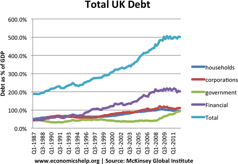
Exhibit 2: Rising Debt in the UK, 1987–2011
The graph is titled “Total UK Debt.” The x-axis lists the years and y-axis is scaled from 0.0% to 600.0% with a gap of 100.0% and labeled “Debt as % of GDP.” The data shown by the graph, with approximate values, are tabulated below:
| Years | Debt as % of GDP | ||||
| Households | Corporations | Government | Financial | Total | |
| Q1-1987 | 50% | 50% | 50% | 50% | 190% |
| Q3-1988 | 55% | 55% | 55% | 55% | 195% |
| Q1-1990 | 70% | 70% | 40% | 70% | 220% |
| Q3-1991 | 75% | 75% | 40% | 60% | 230% |
| Q1-1993 | 75% | 75% | 45% | 75% | 240% |
| Q3-1994 | 75% | 75% | 45% | 80% | 230% |
| Q1-1996 | 75% | 75% | 50% | 90% | 260% |
| Q3-1997 | 75% | 75% | 55% | 110% | 280% |
| Q1-1999 | 80% | 80% | 51% | 120% | 285% |
| Q3-2000 | 80% | 85% | 45% | 125% | 300% |
| Q1-2002 | 85% | 90% | 40% | 135% | 330% |
| Q3-2003 | 90% | 90% | 40% | 135% | 340% |
| Q1-2005 | 95% | 95% | 45% | 160% | 400% |
| Q3-2006 | 95% | 100% | 45% | 170% | 415% |
| Q1-2008 | 100% | 110% | 45% | 220% | 460% |
| Q3-2009 | 100% | 115% | 70% | 220% | 480% |
| Q1-2011 | 100% | 110% | 90% | 190% | 500% |
The text at the bottom of the graph reads:
“www.economicshelp.org | Source: McKinsey Global Institute”
Source: Pettinger, T. (2013), “Total US Debt, Public + Private”, Economicshelp, available at: www.economicshelp.org/blog/6775/debt/total-us-debt-public-private/ (accessed 7 July 2018).
Exhibit 3: New Issue Volume of Asset-Backed Securities in the US From 2000 to 2016
In the graph, x-axis lists the asset-backed securities and left y-axis is scaled from 0 to 1400 with a gap of 200 units and labeled “US$ Billion” and right y-axis is scaled from 0 to 12 with a gap of 2 units. The data shown by the graph, with approximate values, are tabulated as follows:
| Asset-backed securities | 2000 (lhs) | 2007 (lhs) | Relative Increase from 2000 to 2007 (rhs) |
| CDO-Squared | 10 | 290 | 11 |
| CDO | 180 | 1000 | 6.5 |
| RMBS | 200 | 1250 | 6.3 |
| ABS | 260 | 420 | 1.8 |
| ABCP | 690 | 1180 | 2 |
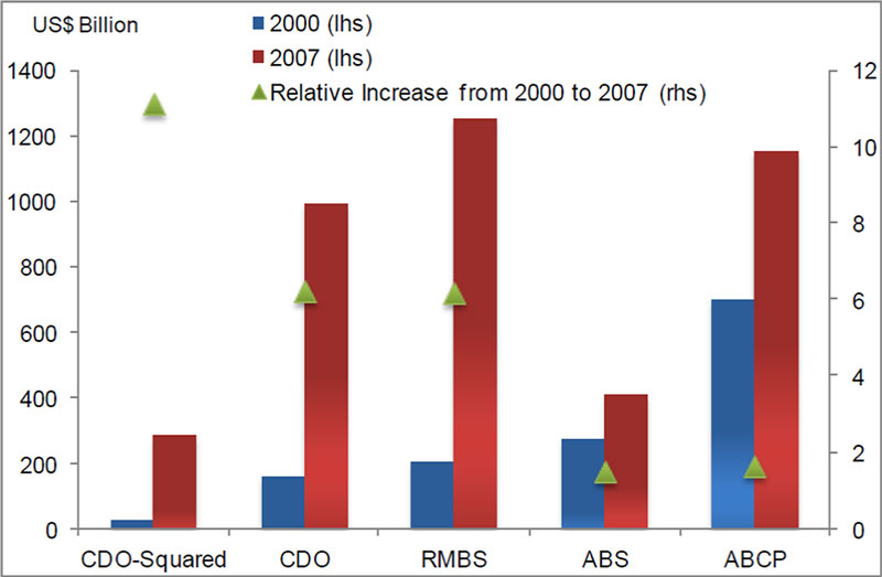
CDO = collateralised debt obligation; RMBS = residential mortgage-backed security; ABS = asset-backed security; ABCP = asset-backed commercial paper.
Notes: CDO-squared denotes CDOs whose collateral was generally sourced from other ABS-CDO tranches, either of the cash or the synthetic type. RMBS here includes residential mortgage subprime ABS, which are excluded from the ABS category in this figure.
Source: IMF staff (2009) in Segoviano, M., Jones, B., Lindner, P. and Blankenheim, J. (2013), “Securitisation: Lessons Learned and the Road Ahead”, International Monetary Fund Working Paper WP/13/255, November, available at: www.imf.org/en/Publications/WP/Issues/2016/12/31/Securitization-Lessons-Learned-and-the-Road-Ahead-41153 (accessed 19 September 2018).
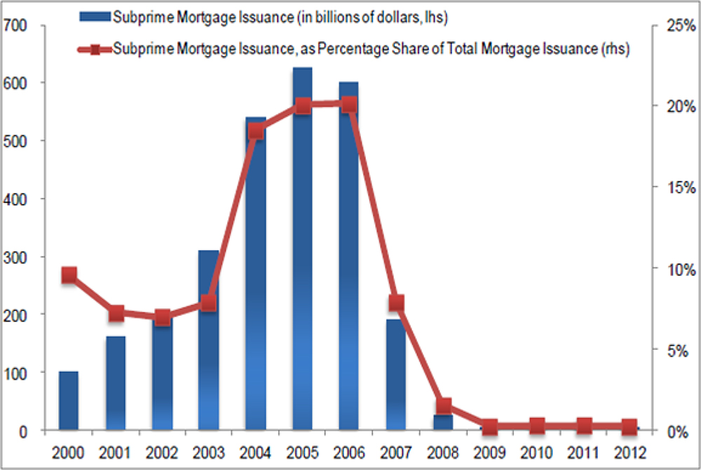
Exhibit 4: US Subprime Mortgage Issuance 2000–2012
In the graph, x-axis lists the years and left y-axis is scaled from 0 to 700 with a gap of 100 units and right y-axis is scaled from 0% to 25% with a gap of 5%. The data shown by the graph, with approximate values, are tabulated as follows:
| Years | Subprime Mortgage Issuance (in billions of dollars, lhs) | Subprime Mortgage Issuance, as Percentage Share of Total Mortgage Issuance (rhs) |
| 2000 | 100 | 9% |
| 2001 | 170 | 7% |
| 2002 | 200 | 6.5% |
| 2003 | 320 | 8% |
| 2004 | 540 | 18% |
| 2005 | 630 | 20% |
| 2006 | 600 | 20% |
| 2007 | 190 | 8% |
| 2008 | 20 | 2% |
| 2009 | 0 | 0% |
| 2010 | 0 | 0% |
| 2011 | 0 | 0% |
| 2012 | 0 | 0% |
Source: Inside Mortgage Finance and IMF staff in Segoviano, M., Jones, B., Lindner, P. and Blankenheim, J. (2013), “Securitisation: Lessons Learned and the Road Ahead”, International Monetary Fund Working Paper WP/13/255, November, available at: www.imf.org/en/Publications/WP/Issues/2016/12/31/Securitization-Lessons-Learned-and-the-Road-Ahead-41153 (accessed 19 September 2018).
Exhibit 5: Example of Sloppy Lending Practices
The text reads: “1% Low Staff Rate, Stated Income, No Documentation Loans, 100% Finance Available, Interest Only Loans, Debt Consolidation, SE HABLA ESPANOL.”

Source: Bernanke, B. (2012), “Lecture 3: The Federal Reserve’s Response to the Financial Crisis”, p. 12, available at: www.federalreserve.gov/newsevents/files/bernanke-lecture-three-20120327.pdf (accessed 2 March 2018).
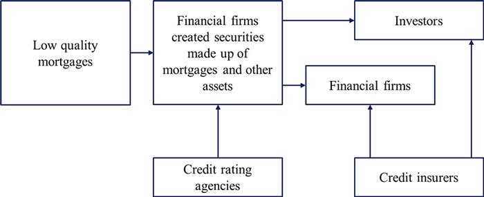
Exhibit 6: Lending Pattern That Arose in Build-Up to the Crisis
The illustration is in the form of a chart. The text inside the box on the left reads: “Low quality mortgages.” A rightward arrow from the box points at another box that reads: “Financial firms created securities made up of mortgages and other assets.” An upward arrow points at it from a box below that reads: “Credit rating agencies.” Two rightward arrows from the box labeled “Financial firms created securities made up of mortgages and other assets” point at boxes labeled “Investors” and “Financial firms,” respectively. At the bottom is a box that reads: “Credit insurers.” Two upward arrows from it point at Investors and Financial firms, respectively.
Source: Bernanke, B. (2012), “Lecture 3: The Federal Reserve’s Response to the Financial Crisis”, p. 16, available at: www.federalreserve.gov/newsevents/files/bernanke-lecture-three-20120327.pdf (accessed 2 March 2018).
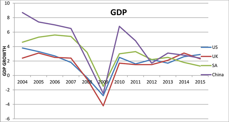
Exhibit 7: GDP Growth Figures for the US, UK, South Africa and China 2004–2015
In the graph, x-axis lists the years and y-axis is scaled from −6 to 10 with a gap of 2 units and labeled “GDP growth.” The data shown by the graph, with approximate values, are tabulated as follows:
| Years | GDP Growth | |||
| US | UK | SA | China | |
| 2004 | 3.9 | 2.4 | 4.8 | 8.4 |
| 2005 | 3.3 | 3.2 | 5.4 | 7.5 |
| 2006 | 2.9 | 2.4 | 5.7 | 6.8 |
| 2007 | 1.9 | 2.4 | 5.5 | 6.5 |
| 2008 | −0.9 | 0 | 4.0 | 2.0 |
| 2009 | −2.5 | −4.2 | −1.6 | −2.7 |
| 2010 | 2.3 | 1.8 | 3.1 | 6.8 |
| 2011 | 1.8 | 1.7 | 3.3 | 4.9 |
| 2012 | 2.1 | 1.6 | 2.3 | 1.8 |
| 2013 | 1.9 | 2.0 | 2.4 | 3.2 |
| 2014 | 2.7 | 3.0 | 1.7 | 2.8 |
| 2015 | 2.9 | 2.6 | 1.5 | 2.6 |
Source: Created from statistics obtained from World Bank data, available at: http://databank.worldbank.org/data/indicator/NY.GDP.MKTP.KD.ZG/1ff4a498/Popular-Indicators (accessed 6 July 2018).
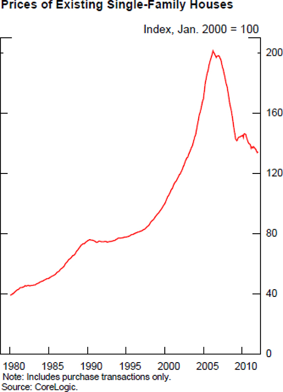
Exhibit 8: The Rise and Fall of Housing Prices
The graph is titled “Prices of Existing Single-Family Houses.” Text below it reads: Index, Jan. 2000=100. The x-axis lists the years and y-axis is scaled from 0 to 200 with a gap of 40 units. The data shown by the graph, with approximate values, are tabulated below:
| Year | Housing Prices |
| 1980 | 40 |
| 1985 | 55 |
| 1990 | 78 |
| 1995 | 80 |
| 2000 | 95 |
| 2005 | 200 |
| 2010 | 140 |
The text at the bottom of the graph reads:
“Note: Includes purchase transactions only.
Source: CoreLogic.”
Source: Bernanke, B. (2012), “Lecture 4: The Aftermath of the Crisis”, p. 32, available at: www.federalreserve.gov/newsevents/files/bernanke-lecture-four-20120329.pdf (accessed 2 March 2018).
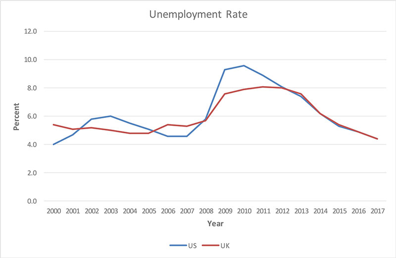
Exhibit 9: Unemployment in the UK and US, 2000–2017
The graph is titled “Unemployment Rate.” The x-axis lists the years and y-axis is scaled from 0.0% to 12.0% with a gap of 2.0%. The data shown by the graph, with approximate values, are tabulated as follows:
| Years | US | UK |
| 2000 | 4.0% | 5.6% |
| 2001 | 5.4% | 5.4% |
| 2002 | 5.4% | 5.9% |
| 2003 | 6.0% | 5.0% |
| 2004 | 5.7% | 5.0% |
| 2005 | 5.2% | 5.2% |
| 2006 | 4.8% | 5.6% |
| 2007 | 4.8% | 5.5% |
| 2008 | 5.7% | 5.7% |
| 2009 | 9.5% | 7.8% |
| 2010 | 9.7% | 8.0% |
| 2011 | 9.0% | 8.0% |
| 2012 | 8.2% | 8.0% |
| 2013 | 6.7% | 6.8% |
| 2014 | 6.2% | 6.2% |
| 2015 | 5.8% | 5.8% |
| 2016 | 5.0% | 5.0% |
| 2017 | 4.4% | 4.4% |
Source: Created from statistics obtained from The Statistics Portal, available at: www.statista.com/statistics/279898/unemployment-rate-in-the-united-kingdom-uk/ (accessed 27 January 2109) and www.statista.com/statistics/217029/forecast-to-the-unemployment-rate-in-the-united-states/ (accessed 27 January 2019).
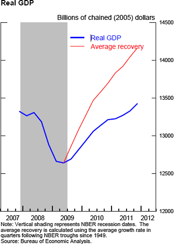
Exhibit 10: Economic Recovery Slower Than Previous Post-World War II Average Recoveries
The graph is titled “Real GDP.” The text below it reads: “Billions of chained (2005) dollars.” The x-axis lists years and y-axis is scaled from 12000 to 14500 with a gap of 500 units. The data shown by the graph, with approximate values, are tabulated below:
| Years | Real GDP | Average recovery |
| 2007 | 13300 | – |
| 2008 | 12600 | – |
| 2009 | 12800 | 13100 |
| 2010 | 13200 | 13500 |
| 2011 | 13400 | 14200 |
| 2012 | – | – |
The text below the graph reads: “Note: Vertical shading represents NBER recession dates. The average recovery is calculated using the average growth rate in quarters following NBER troughs since 1949.
Source: Bureau of Economic Analysis.”
Source: Bernanke, B. (2012), “Lecture 4: The Aftermath of the Crisis”, p. 27, available at: www.federalreserve.gov/newsevents/files/bernanke-lecture-three-20120327.pdf (accessed 2 March 2018).
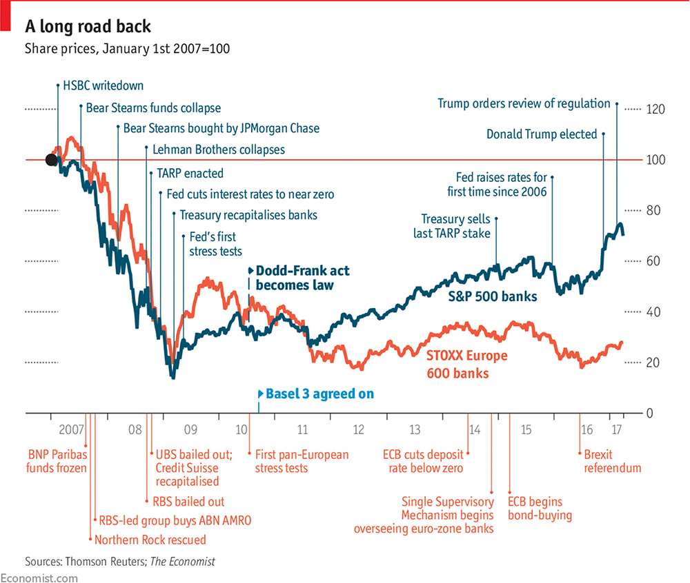
Exhibit 11: The Banks’ Slow Recovery
The text on the top reads: “A long road back. Share prices, January 1st 2007=100.” The x-axis is scaled from 2007 to 2017 and lists the events and y-axis is scaled from 0 to 120 with a gap of 20 units. The data shown by the graph, with approximate values, are listed as follows:
| Year | S&P 500 banks | STOXX Europe 600 banks |
| 2007 |
|
|
| 2008 |
|
|
| 2009 |
|
|
| 2010 |
|
|
| 2011 |
|
|
| 2012 |
|
|
| 2013 |
|
|
| 2014 |
|
|
| 2015 |
|
|
| 2016 |
|
|
| 2017 |
|
|
The text below the graph reads:
“Source: Thomson Reuters; The Economist
Economist.com”
Source: Economist.com in Lane, P. (2017), “A decade after the crisis, how are the world’s banks doing?”, The Economist, 6 May, available at: www.economist.com/special-report/2017/05/06/a-decade-after-the-crisis-how-are-the-worlds-banks-doing (accessed 6 July 2018).
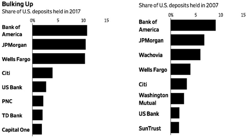
Exhibit 12: Relative Sizes of Largest Commercial Banks in the US in 2017 and 2007, Measured by Share of Deposits Held
The graph is titled “Bulking Up”. In the left graph, the text reads: “Share of U.S. deposits held in 2017.” The horizontal scale shows 0% to 15% with a gap of 5% and the vertical scale lists the banks. The data shown by the graph, with approximate values, are tabulated as follows:
| Commercial Banks | Percentage |
| Bank of America | 10.9% |
| JPMorgan | 10.7% |
| Wells Fargo | 10.5% |
| Citi | 4.0% |
| US Bank | 3.0% |
| PNC | 2.5% |
| TD Bank | 2.3% |
| Capital One | 2.0% |
| Commercial Banks | Percentage |
| Bank of America | 9% |
| JPMorgan | 7% |
| Wachovia | 6% |
| Wells Fargo | 4% |
| Citi | 3.5% |
| Washington Mutual | 3% |
| US Bank | 2% |
| SunTrust | 2% |
Source: De Luce, A. (2018), “Too big to fail banks, they continue to get bigger and bigger”, The Gold Telegraph, 29 March, available at: www.goldtelegraph.com/too-big-to-fail-bigger-and-bigger (accessed 9 September 2018).
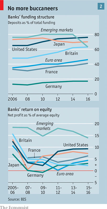
Exhibit 13: Improved Funding Models of the Banks, Resulting in Lower Profits
The title reads: “No more buccaneers.” The top graph is titled “Bank’s funding structure. Deposits as % of total funding.” The x-axis lists the years and y-axis is scaled from 0 to 80 with a gap of 20 units. The data shown by the graph, with approximate values, are tabulated as follows:
| Year/Country | Emerging Markets | Japan | United States | Britain | Euro area | France | Germany |
| 2006 | 77 | 74 | 64 | 44 | 37 | 35 | 14 |
| 2008 | 77 | 75 | 64 | 44 | 39 | 33 | 13 |
| 2010 | 80 | 76 | 70 | 52 | 40 | 37 | 15 |
| 2012 | 80 | 71 | 75 | 54 | 40 | 38 | 17 |
| 2014 | 80 | 69 | 76 | 62 | 44 | 39 | 18 |
| 2016 | 63 | 70 | 77 | 63 | 49 | 41 | 18 |
| Year/Country | Emerging Markets | Japan | United States | Britain | Euro area | France | Germany |
| 2005–06 | 19 | 14 | 13 | 16 | 11 | 16 | 7 |
| 2007–08 | 18 | 0 | 4 | 5 | 4 | 6 | 0 |
| 2009–10 | 15 | 7 | 2 | 5 | 4 | 7 | −1 |
| 2011–12 | 17 | 8 | 8 | 2.5 | 0 | 4 | 2.5 |
| 2013–14 | 16 | 9 | 9 | 2.3 | 3 | 5 | 2.3 |
| 2015–16 | 14 | 8 | 9 | 2 | 4.9 | 7 | 3 |
The text at the bottom of the graph reads:
“Source: BIS”
The Economist
Source: The Economist (2018), “Briefing: the financial crisis: unresolved”, The Economist Print Edition, 8 September, available at: www.economist.com/briefing/2018/09/06/lehman-ten-years-on-more-has-changed-than-meets-the-eye (accessed 10 September 2018).
Exhibit 14: A Brief History of Economic Crises
| Episode | Type | Global financial centres most affected | At least two distinct regions | Number of countries in each region |
| The crisis of 1825–1826 | Global | United Kingdom | Europe and Latin America | Greece and Portugal defaulted, as did practically all of newly independent Latin America. |
| The panic of 1907 | Global | United States | Europe, Asia and Latin America | Notably France, Italy, Japan, Mexico and Chile suffered from banking panics. |
| The Great Depression, 1929–1938 | Global | United States and France | All regions | Widespread defaults and banking crises across all regions. |
| Debt crisis of the 1980s | Multicountry (developing countries and emerging markets) | United States (affected, but crisis was not systemic) | Developing countries in Africa, Latin America and, to a lesser extent, Asia | Sovereign default, currency crashes and high inflation were rampant. |
| The Asian crisis of 1997–1998 | Multicountry, extending beyond Asia in 1998 | Japan (affected, but by then it was five years into the resolution of its own systemic banking crisis) | Asia, Europe and Latin America | Affected South-east Asia initially. By 1998, Russia, Ukraine, Colombia and Brazil were affected. |
| The Global Contraction of 2008 | Global | United States, United Kingdom | All regions | Banking crises proliferated in Europe, and stock market and currency crashes versus dollar cut across the regions. |
Source: Reinhart, C. and Rogoff, K. (2009), This Time is Different: Eight Centuries of Financial Folly, Chapter 16, Loc 3912 of 7805, Princeton NJ: Princeton University Press.
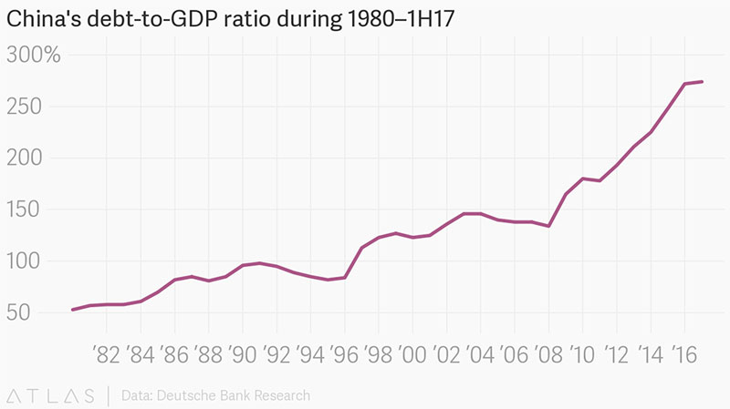
Exhibit 15: China’s Debt-to-GDP Ratio 1980 to First Half 2017
In the graph, x-axis lists the years and y-axis is scaled from 50% to 300% with a gap of 50%. The data shown by the graph, with approximate values, are tabulated as follows:
| Years | Percentages |
| 1982 | 50% |
| 1984 | 57% |
| 1986 | 85% |
| 1988 | 70% |
| 1990 | 98% |
| 1992 | 95% |
| 1994 | 86% |
| 1996 | 85% |
| 1998 | 125% |
| 2000 | 125% |
| 2002 | 140% |
| 2004 | 148% |
| 2006 | 140% |
| 2008 | 130% |
| 2010 | 180% |
| 2012 | 200% |
| 2014 | 250% |
| 2016 | 255% |
The text at the bottom of the graph reads:
“ATLAS | Data: Deutsche Bank Research”
Source: Huang, Z. (2018), “China’s economy will cool this year – but it’s a good thing”, Quartz, 18 January, available at: www.qz.com/1182504/chinas-economy-will-cool-this-year-but-its-a-good-thing/ (accessed 6 February 2019).
This case study is provided in this Sage Business collection primarily as a basis for classroom discussion or self-study and is not meant to illustrate either effective or ineffective management styles. Nothing herein shall be deemed to be an endorsement of any kind. This case study is for scholarly, educational, or personal use only within your university, and cannot be forwarded outside the university or used for other commercial purposes.
© 2026 Sage Publications, Inc. All Rights Reserved.
Get a 30 day FREE TRIAL
-
 Watch videos from a variety of sources bringing classroom topics to life
 -
Read modern, diverse business cases
-
Explore hundreds of books and reference titles

Read next

More like this
Sage Recommends
We found other relevant content for you on other Sage platforms.
Have you created a personal profile? Login or create a profile so that you can save clips, playlists and searches